
10 Wedding Monograms We Loved Designing This Year
A monogram is often the very first visual detail a couple commits to, and one of the most enduring. It becomes the foundation of a wedding’s visual identity, appearing across stationery, websites, and on-the-day details, quietly tying everything together.
This year, we had the pleasure of designing monograms that range from minimal to expressive, classic to contemporary — each one shaped by the couple’s story, aesthetic, and intention.
Here are ten wedding monograms we loved designing this year, and why each one stands out.

1. C & S — The Cool Classic
Timeless, elegant, with a modern twist
This monogram was designed for a couple who wanted something unmistakably classic — but never traditional. Clean letterforms and balanced proportions give it longevity, while subtle detailing adds a sense of modern ease. It’s a perfect example of how timeless design can still feel fresh, relaxed, and quietly fun.
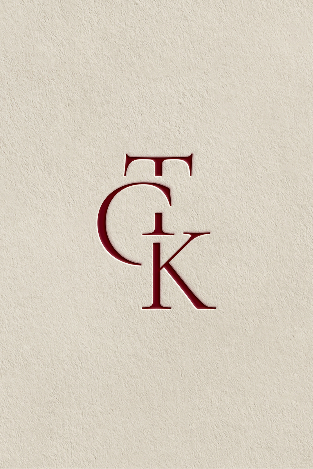
2. TK & C — Modern Elegance Through Negative Space
Three letters, one refined composition
Using negative space to merge three initials, this monogram feels architectural and intentional. The letters are carefully intertwined, allowing space and form to work together rather than compete. The result is modern, elegant, and beautifully restrained — a design that rewards a closer look.
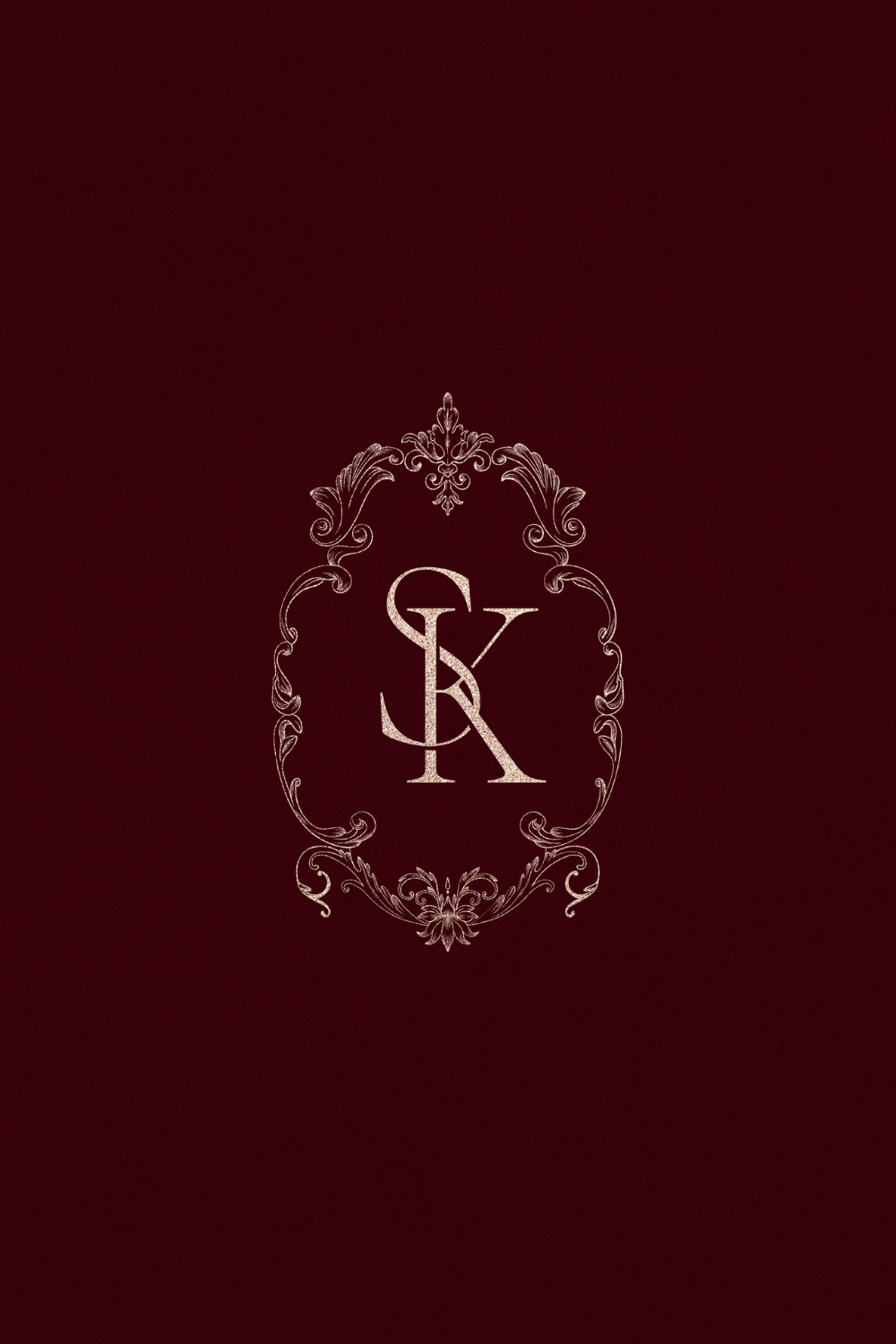
3. S & K — Framed Elegance
Ornamental, but impeccably refined
A statement frame gives this monogram a sense of presence and formality, while the typography keeps it light and sophisticated. Every detail was carefully considered to ensure the result feels elevated rather than ornate — classic elegance with a contemporary sensibility.
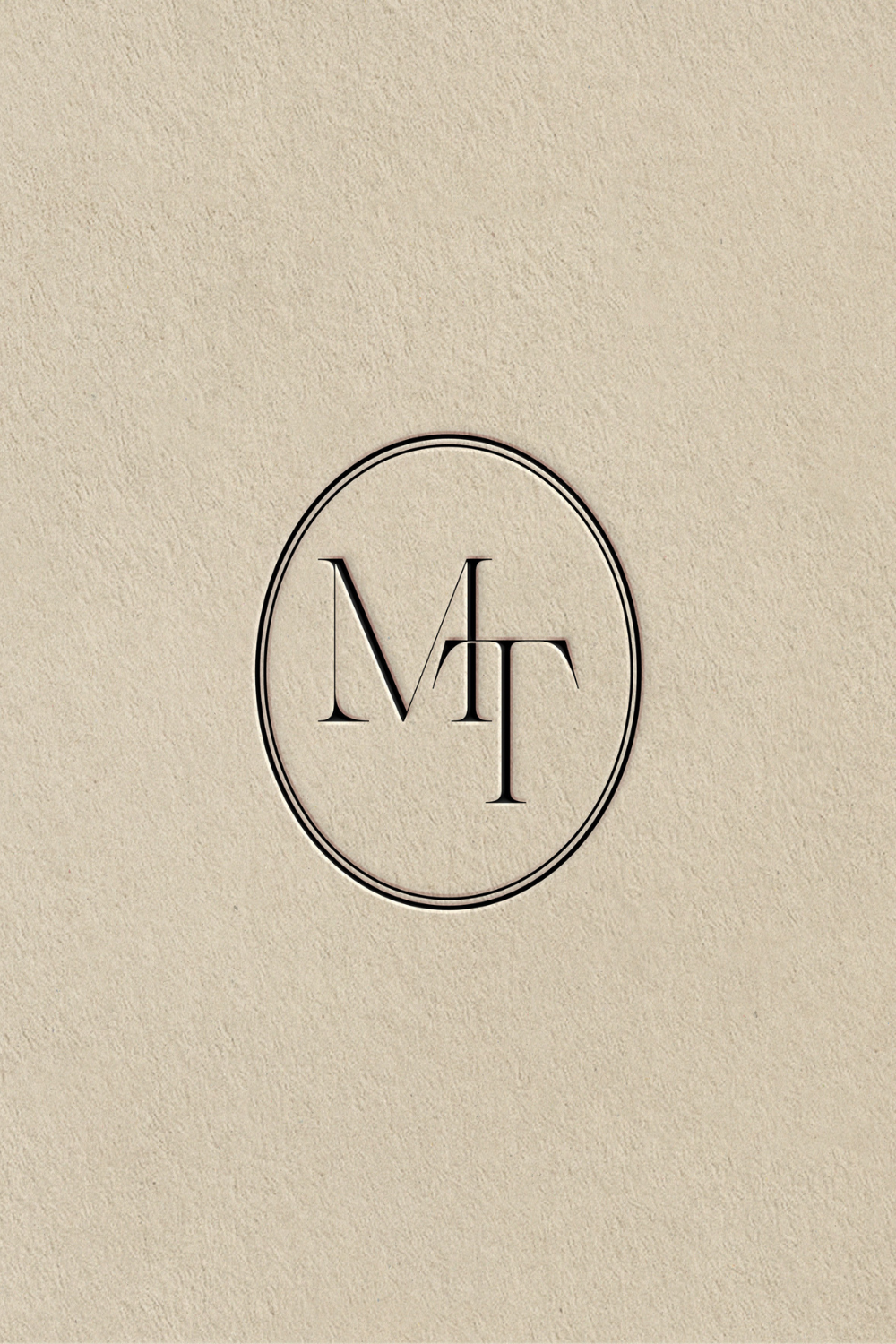
4. M & T — Minimal and Effortless
Quiet confidence through simplicity
This monogram embraces restraint. Clean lines, generous spacing, and a pared-back structure create a design that feels calm and confident. It’s proof that minimalism, when done well, can feel deeply intentional and endlessly versatile.
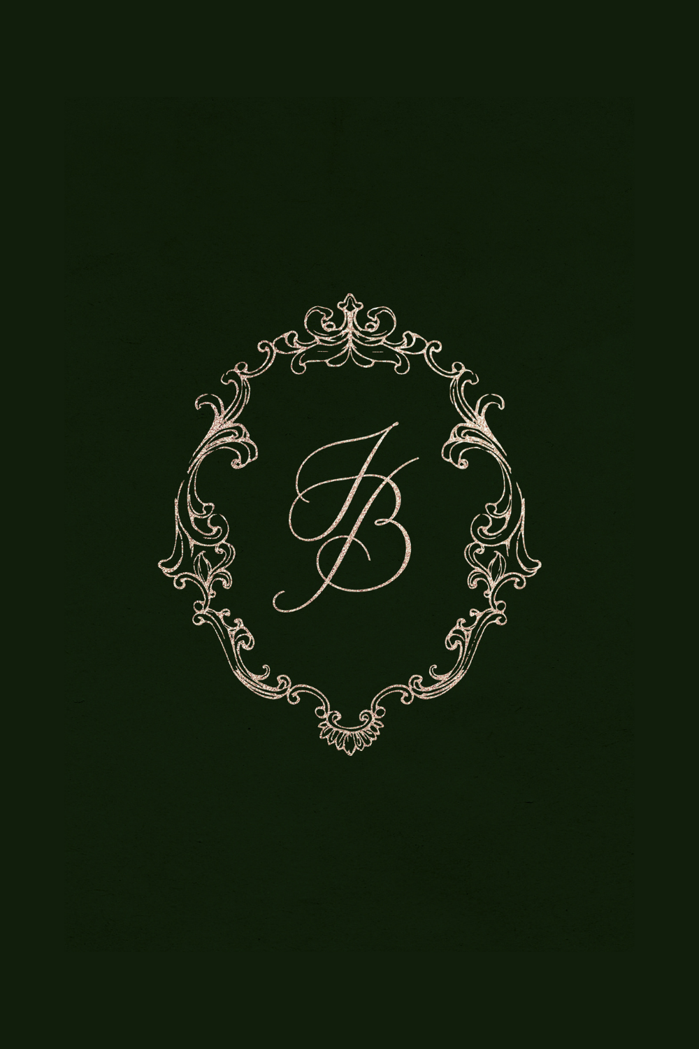
5. J & B — Romantic and Regal
A sense of ceremony and softness
Designed with romance in mind, this monogram balances graceful curves with a regal structure. It feels timeless, expressive, and slightly ceremonial — perfect for couples drawn to classic weddings with an elevated, romantic atmosphere.
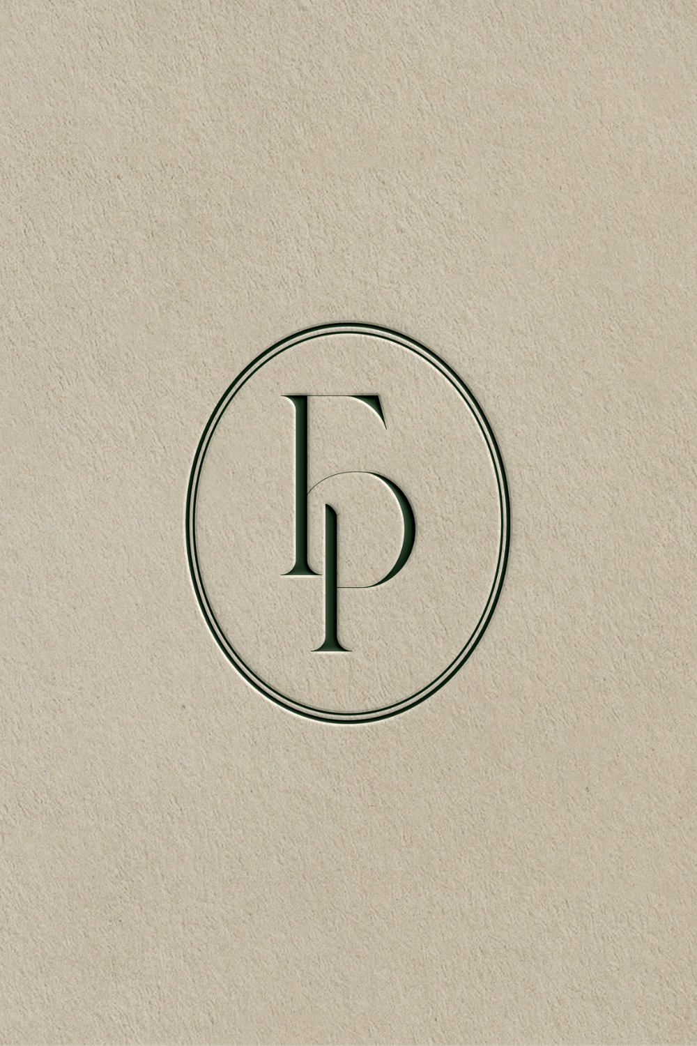
6. F & P — Letter Merging with Purpose
Where typography becomes design
Here, negative space and letter merging take centre stage. The initials interlock naturally, creating a cohesive mark that feels both clever and elegant. This approach allows the monogram to feel modern without losing its sense of refinement.
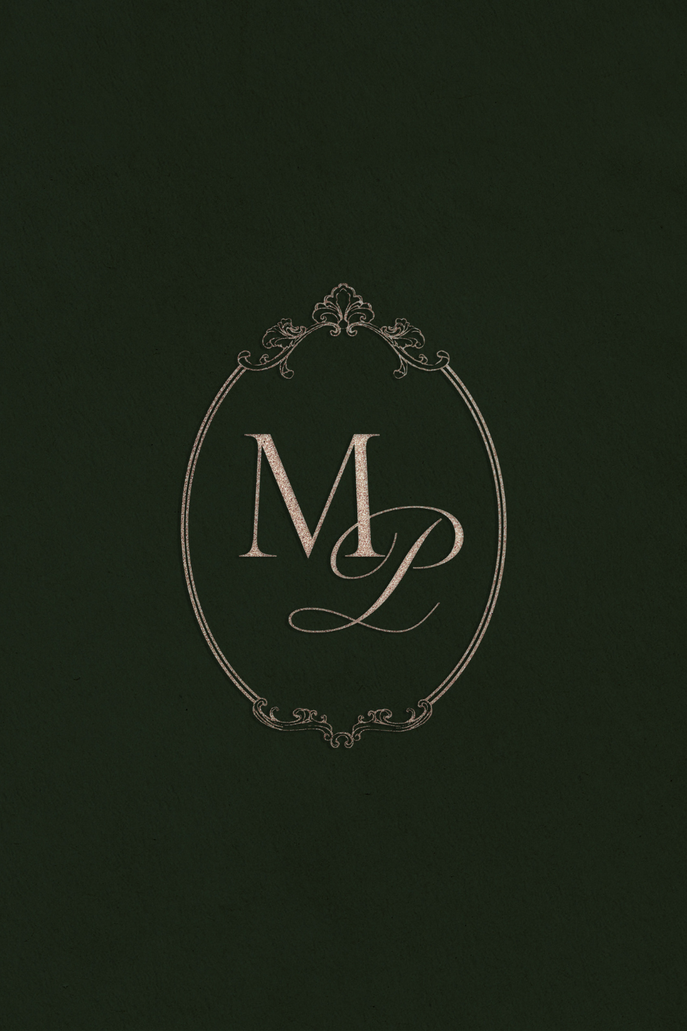
7. M & P — A Delicate Balance
Classic serif meets playful script
This monogram brings together two contrasting typographic styles: a structured serif and a soft, flowing script. The result is balanced and harmonious, with a very gentle frame adding definition without overpowering the letters. A beautiful blend of tradition and personality.

8. P & P — Playing with Double Letters
Expressive, distinctive, and graphic
Designing monograms with identical initials invites experimentation. Here, double letters and an ampersand are merged into a single, cohesive form. The composition feels playful yet controlled — graphic, memorable, and full of character.
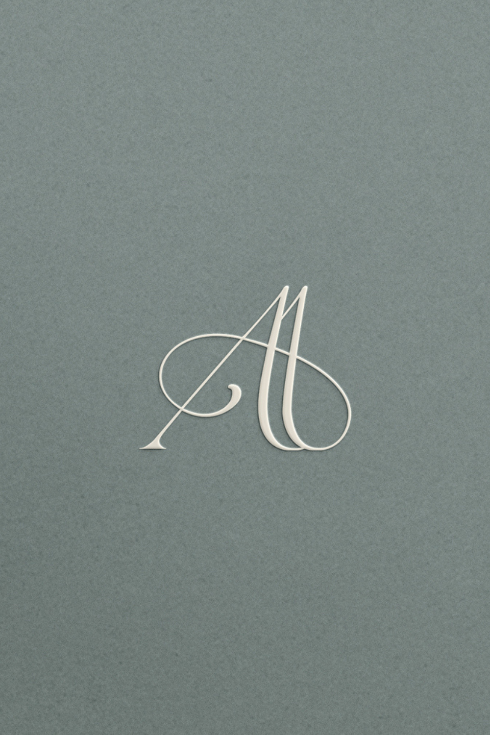
9. A & A — Minimal Double Initials
Subtle variation, refined restraint
Another exploration of double letters, but with a more minimal approach. Clean typography and precise alignment allow the form itself to do the work. It’s understated, elegant, and quietly confident — designed to feel timeless rather than decorative.
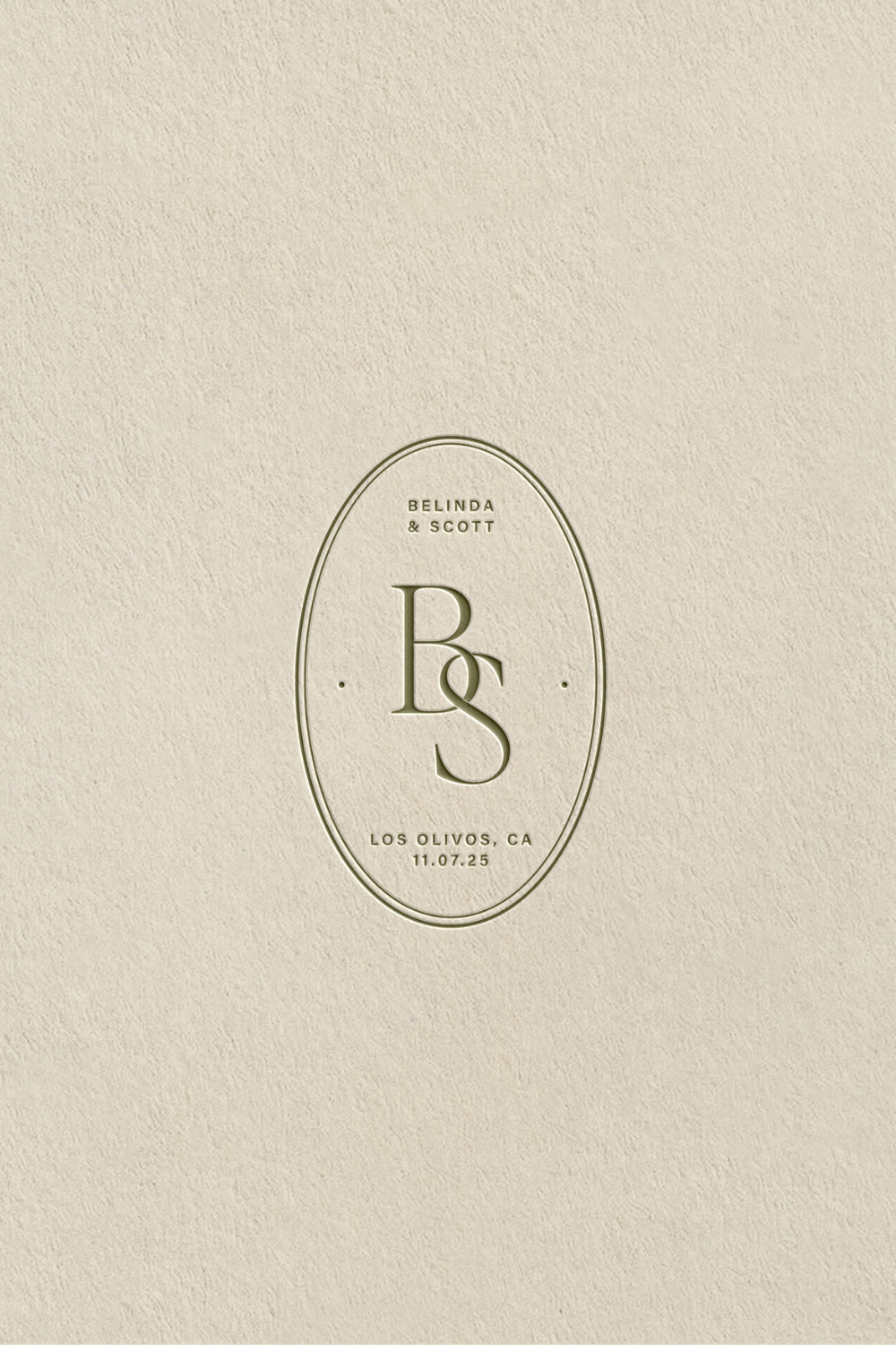
10. B & S — A Fuller Expression
Layered, detailed, and rich
This monogram embraces detail. Fuller letterforms, subtle embellishments, and a strong overall presence make it ideal for couples who love a more expressive aesthetic. Despite its richness, the design remains balanced and refined — never overwhelming.
Each monogram begins with initials, but ends with identity. Whether minimal or ornate, modern or classic, the most successful designs are those rooted in intention — shaped by the couple’s story and the atmosphere they want to create.
If you’re dreaming of a monogram that feels personal, timeless, and considered, we’d love to design something just for you.
read more

