
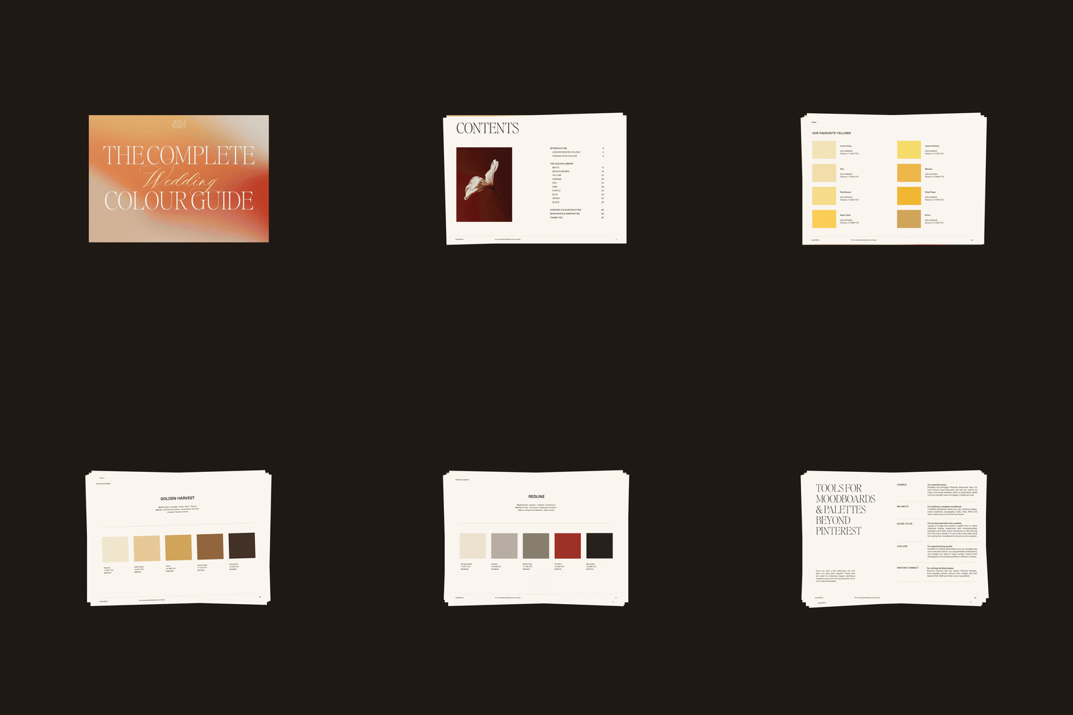
The Complete Wedding
Colour Guide
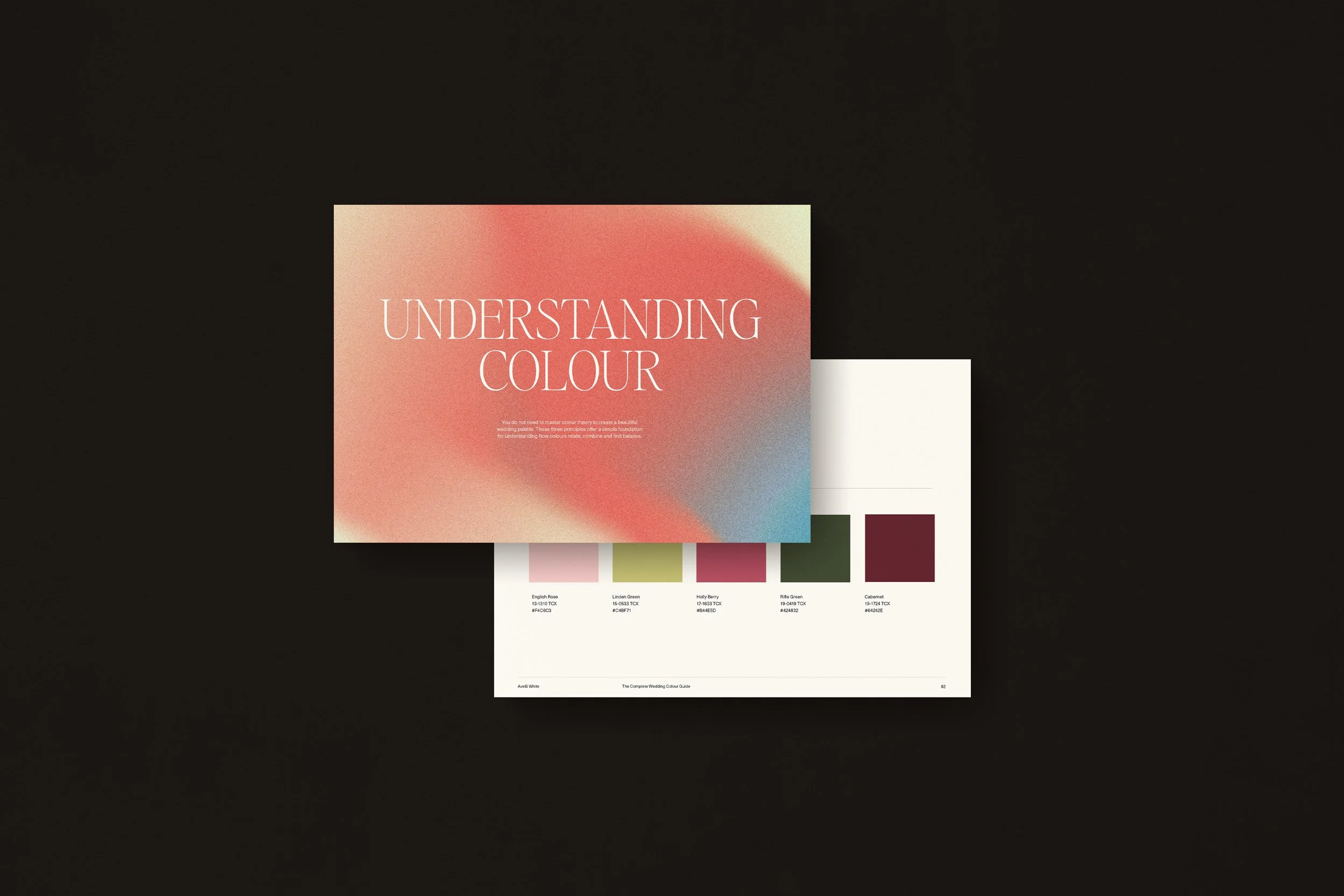
The Complete Wedding Colour Guide is an in-depth design resource for building a wedding colour palette with greater intention. Part colour theory, part reference library and part curated palette collection, it brings together the way we think about colour at Avelã White — from undertone and proportion to mood, material and setting.
€79
Colour Foundations
A clear introduction to harmony, temperature, saturation, value, contrast and proportion — distilled into the principles that are genuinely useful when designing a wedding.
10 Colour Families, Studied in Depth
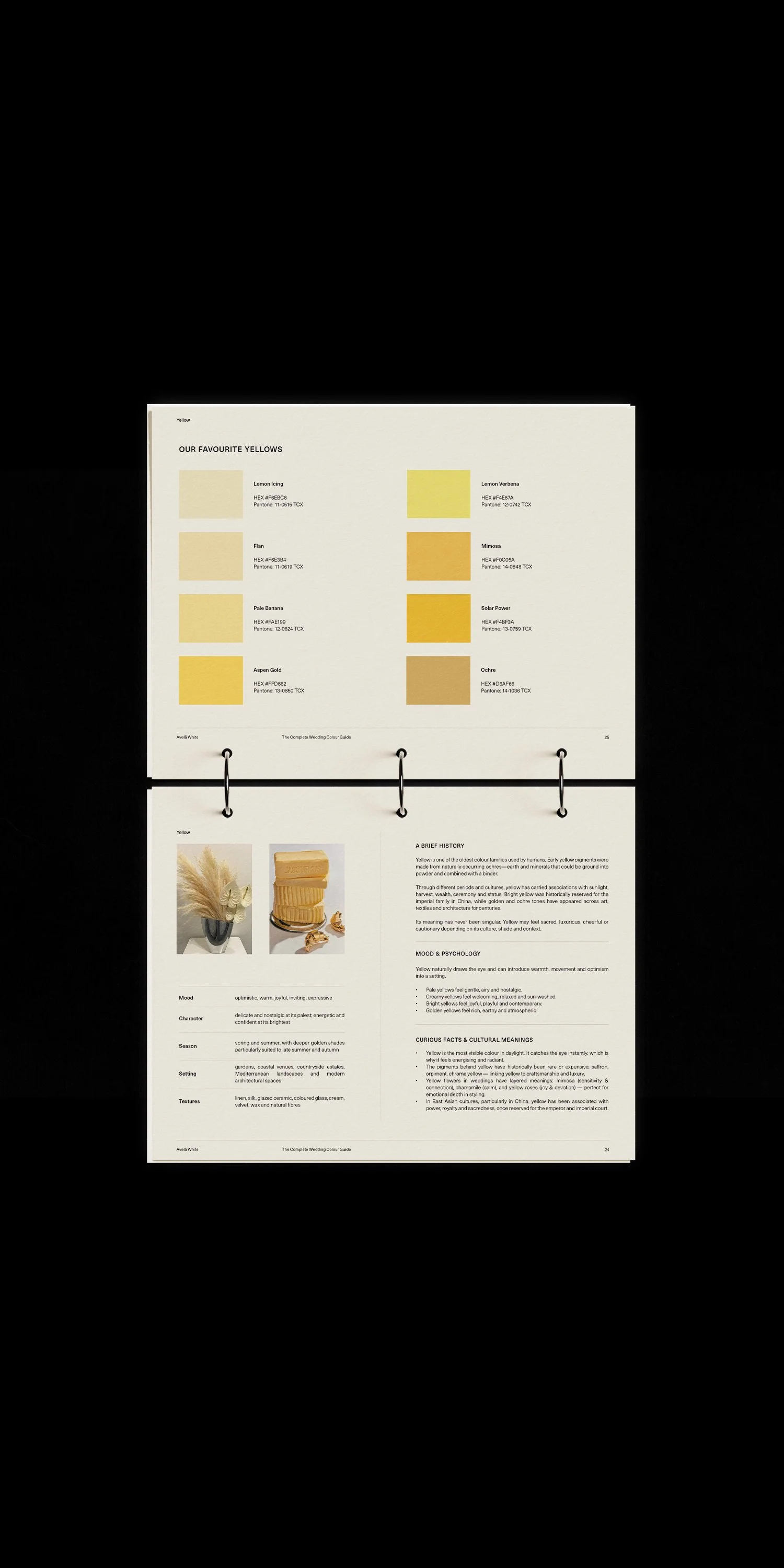
White, Beige & Brown, Yellow, Orange, Red, Pink, Purple, Blue, Green and Black — explored through their history, psychology, visual character, selected shades and considered pairings.
30 Curated Wedding Colour Palettes
Professionally developed five-colour combinations across five distinct visual directions, from softly romantic to intimate and dramatic.
HEX + Pantone References
Practical colour references throughout the guide, making it easier to translate your palette into digital design and communicate it with creative suppliers.
Colour Beyond the Screen
Guidance on how colour changes across paper, printing, flowers, textiles, materials and light.
Moodboard & Palette Resources
Our preferred tools for collecting references, extracting colour and developing a more considered visual direction.
A considered approach to colour for weddings
Colour foundations
A clear introduction to colour harmony, temperature, saturation, value, contrast and proportion — edited down to what is genuinely useful when designing a wedding.
10 colour families explored in depth
White, Beige & Brown, Yellow, Orange, Red, Pink, Purple, Blue, Green and Black — with history, psychology, favourite shades, pairings and practical notes on how each colour behaves.
30 curated wedding colour palettes
Professionally developed five-colour combinations spanning soft romantic tones, natural and nostalgic palettes, joyful colour, refined neutrals and deeper dramatic schemes.
HEX + Pantone references
Colour references throughout the guide to make it easier to translate your palette into digital design and communicate colour with creative suppliers.
Moodboard & palette resources
Our favourite tools for collecting references, extracting colour and developing a more considered visual direction.
Colour Foundations
A clear introduction to harmony, temperature, saturation, value, contrast and proportion — distilled into the principles that are genuinely useful when designing a wedding.
10 Colour Families, Studied in Depth
White, Beige & Brown, Yellow, Orange, Red, Pink, Purple, Blue, Green and Black — explored through their history, psychology, visual character, selected shades and considered pairings.
30 Curated Wedding Colour Palettes
Professionally developed five-colour combinations across five distinct visual directions, from softly romantic to intimate and dramatic.
HEX + Pantone References
Practical colour references throughout the guide, making it easier to translate your palette into digital design and communicate it with creative suppliers.
Colour Beyond the Screen
Guidance on how colour changes across paper, printing, flowers, textiles, materials and light.
Moodboard & Palette Resources
Our preferred tools for collecting references, extracting colour and developing a more considered visual direction.
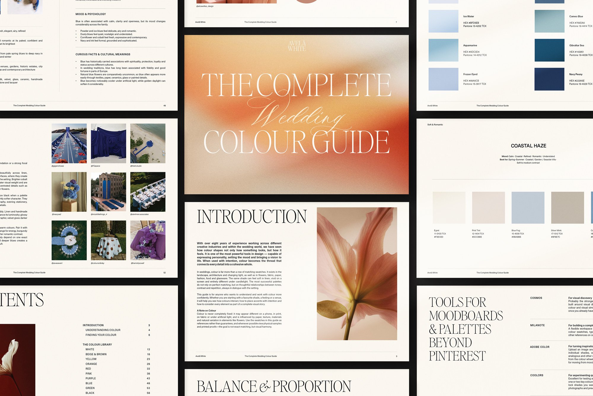
What Is Inside the Wedding Colour Guide?
-
Understand Why Some Palettes Simply Work.
You do not need to become a colour theorist to make sophisticated colour decisions.
The opening chapter introduces the principles that have the greatest impact on a wedding palette: hue, saturation, value, temperature, harmony, contrast and proportion.
You’ll explore the relationships between analogous, complementary, split-complementary, triadic, tetradic and monochromatic colour schemes, alongside guidance on balancing dominant, supporting and accent colours.
Rather than prescribing rules, the chapter gives you a visual framework for understanding why a combination feels harmonious — and when breaking those rules can make it more interesting.
-
Start With Atmosphere, Not a Trend.
Before deciding whether your wedding should be blue, red or green, consider something more useful:
How should it feel?
A sun-washed Mediterranean celebration asks something very different of colour than an intimate evening surrounded by candlelight and dark wood. The architecture of a venue, the quality of natural light and even the materials already present in a space all become part of the palette.
This chapter explores mood, colour psychology, venue, season and light, helping you translate an emotional direction into something visual.
-
10 Colour Families, Studied in Detail
The heart of the guide is an extensive colour reference built around:
White · Beige & Brown · Yellow · Orange · Red · Pink · Purple · Blue · Green · Black
Every family is approached as more than a broad colour category.
Red might mean vivid scarlet, faded brick, garnet or deep wine. Blue can feel powdery, coastal, tailored or almost black. Even white changes completely depending on whether its undertone is creamy, chalky, cool or grey.
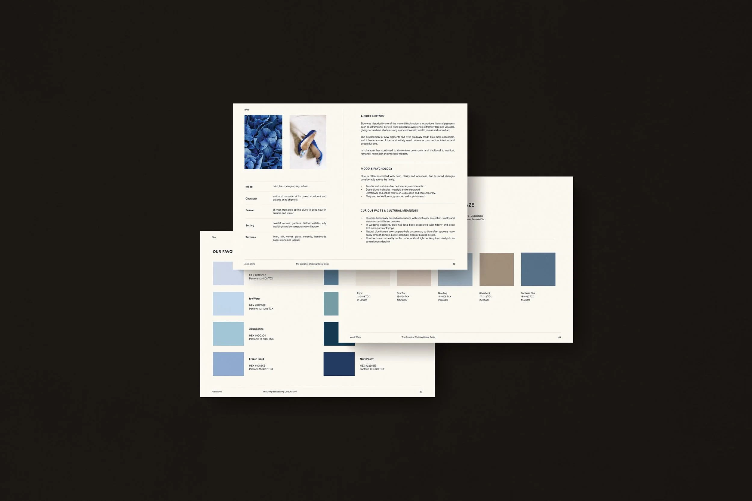
For each colour family, we explore its history and associations, emotional character, favourite shades, ideal settings and seasons, complementary textures and considered colour pairings.
It is designed as a section you can return to throughout the planning process whenever you need to compare, refine or rethink a colour.
-
Five Distinct Visual Directions
The palette library brings everything together through 30 professionally curated five-colour combinations.
Rather than organising palettes around short-lived wedding trends, we grouped them by the atmosphere they create:
Soft & Romantic
Luminous neutrals, faded rose, powdery colour and gentle tonal contrast.Natural & Nostalgic
Weathered neutrals, olive, ochre, terracotta and colours with a sense of place and patina.Joyful & Playful
Unexpected pairings, clearer colour and expressive accents for celebrations with more visual energy.Refined & Modern
Architectural neutrals, controlled contrast and sophisticated colour with an editorial sensibility.Intimate & Dramatic
Wine, plum, navy, chocolate and near-black tones designed around depth, shadow and evening atmosphere.
Every palette includes its five shades with HEX and Pantone FHI TCX references, alongside notes on its mood, setting, season and level of contrast.
Use a palette exactly as it is, adapt a shade to suit your venue, or use it as the beginning of a completely different direction.
-
Turn References Into a Visual Direction
The final section is designed to help you continue beyond the guide.
Discover our preferred tools for building moodboards, collecting visual references, extracting colour from imagery and refining palettes, including Cosmos, Milanote, Adobe Color, Coolors and Pantone Connect.
Because the strongest wedding colour palettes do not necessarily begin with another wedding.
They can begin with an interior, a landscape, a painting, a piece of clothing, an old photograph or simply a colour you cannot stop returning to.
Colour Foundations
A clear introduction to harmony, temperature, saturation, value, contrast and proportion — distilled into the principles that are genuinely useful when designing a wedding.
10 Colour Families, Studied in Depth
White, Beige & Brown, Yellow, Orange, Red, Pink, Purple, Blue, Green and Black — explored through their history, psychology, visual character, selected shades and considered pairings.
30 Curated Wedding Colour Palettes
Professionally developed five-colour combinations across five distinct visual directions, from softly romantic to intimate and dramatic.
HEX + Pantone References
Practical colour references throughout the guide, making it easier to translate your palette into digital design and communicate it with creative suppliers.
Colour Beyond the Screen
Guidance on how colour changes across paper, printing, flowers, textiles, materials and light.
Moodboard & Palette Resources
Our preferred tools for collecting references, extracting colour and developing a more considered visual direction.
Why you’ll LOVE it
( I )
Move Beyond Pinterest
Instead of saving hundreds of disconnected wedding colour ideas, learn how to identify the visual thread running through the references you already love.
( II )
See Colour in Context
Understand undertones, contrast, proportion and mood so you can judge why a palette works rather than relying solely on instinct.
( III )
Create a More Cohesive Wedding
Develop one colour direction that can move naturally through your wedding website, invitations, flowers, table settings, signage and on-the-day stationery.
( IV )
Use Palettes as a Starting Point
Work from 30 professionally curated colour systems — adapt them, borrow from them or make them entirely your own.
Made for the Design Process
The guide was created primarily for couples who want their wedding to feel visually connected, but do not necessarily know how to get from inspiration to a clear palette.
It is particularly useful if you:
have saved dozens of references but cannot see what connects them;
know the atmosphere you want, but not the colours that create it;
need to communicate a visual direction to your planner, florist or stationer;
or simply want to make colour decisions with more confidence.
It also works as an ongoing reference for wedding planners, stylists, florists and designers developing palettes for client projects.
Colour Foundations
A clear introduction to harmony, temperature, saturation, value, contrast and proportion — distilled into the principles that are genuinely useful when designing a wedding.
10 Colour Families, Studied in Depth
White, Beige & Brown, Yellow, Orange, Red, Pink, Purple, Blue, Green and Black — explored through their history, psychology, visual character, selected shades and considered pairings.
30 Curated Wedding Colour Palettes
Professionally developed five-colour combinations across five distinct visual directions, from softly romantic to intimate and dramatic.
HEX + Pantone References
Practical colour references throughout the guide, making it easier to translate your palette into digital design and communicate it with creative suppliers.
Colour Beyond the Screen
Guidance on how colour changes across paper, printing, flowers, textiles, materials and light.
Moodboard & Palette Resources
Our preferred tools for collecting references, extracting colour and developing a more considered visual direction.
Colour + Typography
Two Sides of the Same Visual Language
Colour creates atmosphere. Typography introduces character.
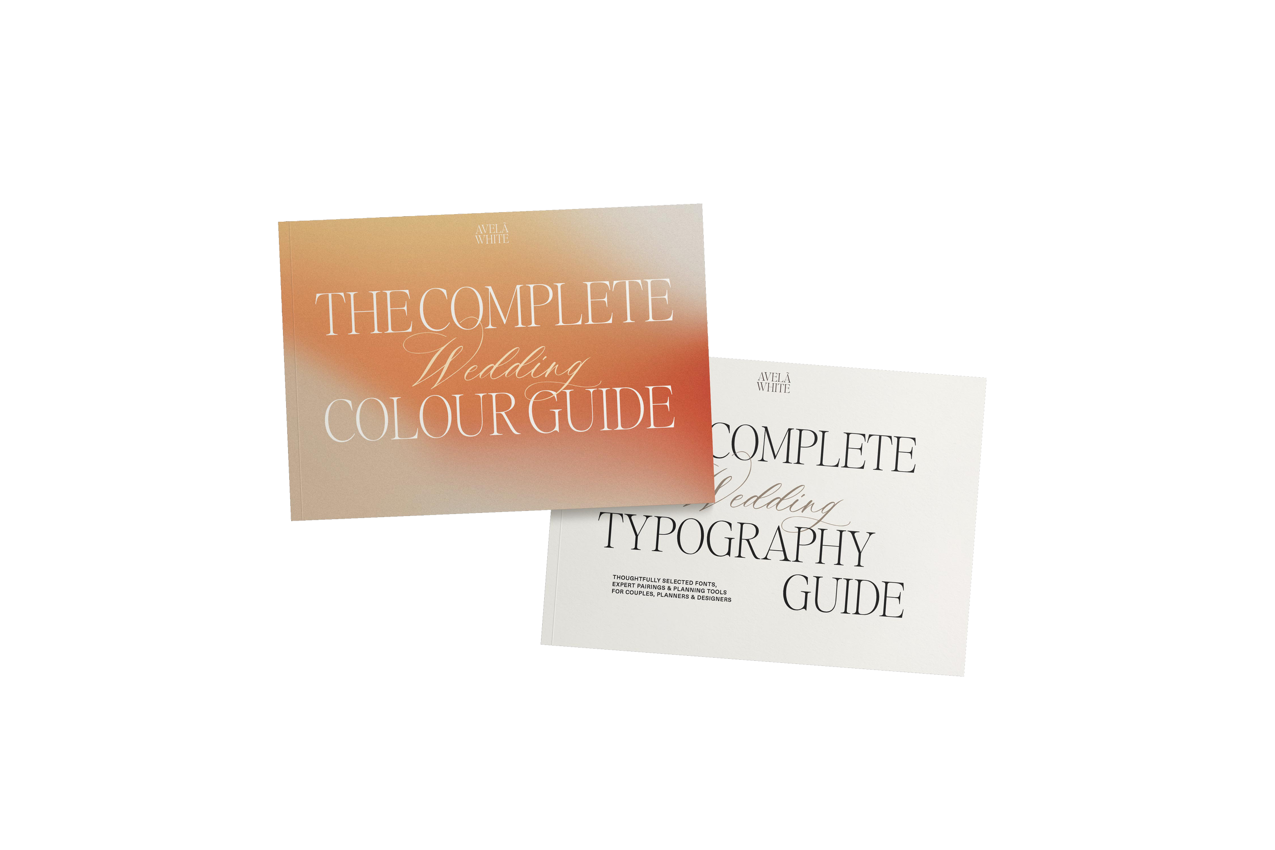
Together, The Complete Wedding Colour Guide and The Complete Wedding Typography Guide give you two of the most important foundations for creating a cohesive visual identity across invitations, websites, stationery and wedding-day details.
The Design Bundle · €120
Colour + Typography, considered together.
A cohesive wedding identity rarely comes from one beautiful detail. It comes from the relationship between them — the way colour, typography, paper, florals, signage and digital design all speak the same visual language.
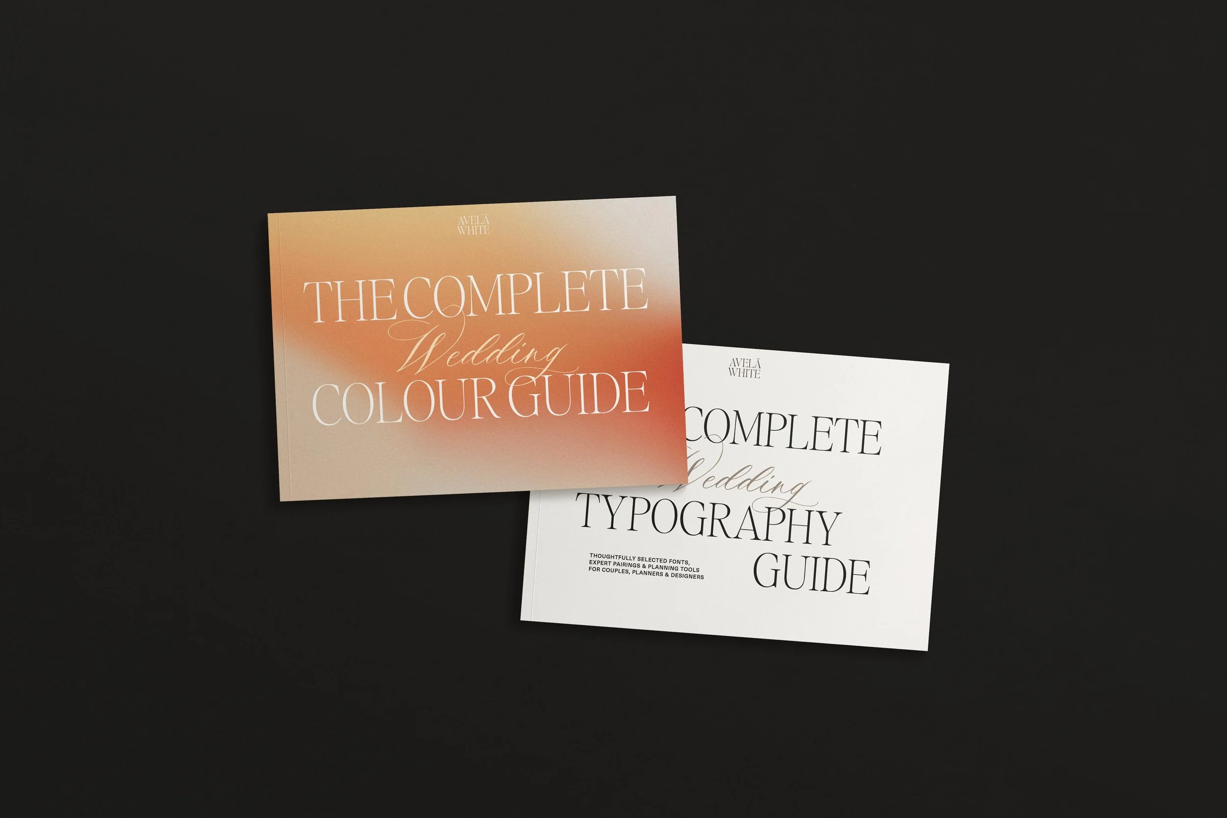
The Wedding Design Bundle brings together two of Avelã White’s most comprehensive design resources: The Complete Wedding Colour Guide and The Complete Wedding Typography Guide.
Together, they give you the foundations for building a wedding aesthetic that feels intentional from the first save to the final printed detail.
Inside the bundle
The Complete Wedding Colour Guide
An in-depth approach to colour for weddings, including colour theory, psychology, 10 colour families, selected shades and pairings, 30 curated five-colour palettes, HEX + Pantone references, and practical guidance for print, materials and moodboards.
The Complete Wedding Typography Guide
A curated reference for choosing and combining fonts with confidence, including 85 selected typefaces, 25 considered pairings, practical typography guidance and tools for creating a more cohesive visual identity.
Designed to work together
Colour creates the atmosphere. Typography gives it character.
Use the two guides side by side to develop your wedding website, invitations, stationery and on-the-day details with a clearer sense of direction — whether you are starting from scratch or refining ideas you already have.
Created for couples, planners, stationers and wedding creatives who want a more thoughtful approach to visual design.
Frequently Asked Questions
-
Yes. The Wedding Colour Guide is delivered as a digital PDF, so you can keep it on your desktop or tablet and return to it throughout the planning process.
-
No. The theory is deliberately concise and visual. It is there to help you make decisions, not to turn the guide into a design textbook.
-
Yes — or treat them as a starting point. You can change one shade, work with tonal variations or simply use a palette to identify the direction you are drawn to.
-
HEX makes the colours easy to reference digitally. Pantone FHI TCX offers an additional physical reference when discussing colour with creative suppliers. Neither replaces physical sampling when exact reproduction matters.
-
Yes. Planners, florists, stationers and designers can use it as a professional reference for client projects. The guide itself may not be copied, shared, reproduced or resold.
Download The Wedding Design Edit
Sign up and receive The Wedding Design Edit — a beautifully designed PDF with five complete pairings, each including a font combination, a curated colour palette with hex codes, and guidance on where to use each one. The starting point for every wedding we design. Now yours, free.