Behind the Design: The Kerry Collection
Kerry began with a wedding invitation. And with a question we could not stop asking on the drive afterwards.
Why does so much Irish wedding design look the same?
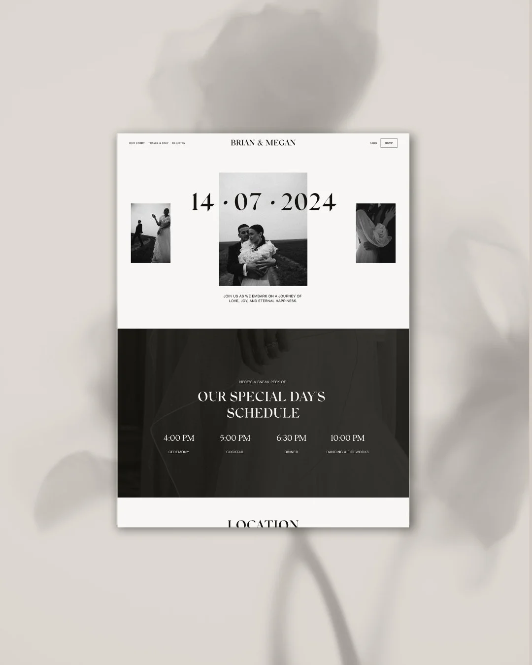
Home page
The Inspiration
A close friend married in Ireland. Travelling there — through some of the most dramatic and genuinely extraordinary landscape in Europe — we noticed something that stayed with us long after the celebration was over. The wedding design world in Ireland, for all the beauty surrounding it, had settled into a remarkably consistent visual language. Green and gold, almost universally. Curving, ornate font combinations. Celtic motifs and florals layered together until nothing could breathe. Each element individually understandable, the overall effect collectively too much — and too similar to everything else.
Ireland deserves better than that. A country with centuries of history pressed into every stone wall and clifftop. Coastlines that look like the beginning of the world. A cultural weight and a wildness that has nothing to do with shamrocks and gilt lettering. We wanted to make a collection that was genuinely inspired by Ireland — not by its clichés, but by its character. Its strength. Its purity. Its history.
Kerry takes its name from the county on Ireland's south-western coast — one of the most beautiful places in Europe, where the mountains meet the Atlantic and the landscape feels ancient in a way that is difficult to explain and impossible to forget. The collection carries that feeling. Not Ireland as it is packaged for weddings. Ireland as it actually is.
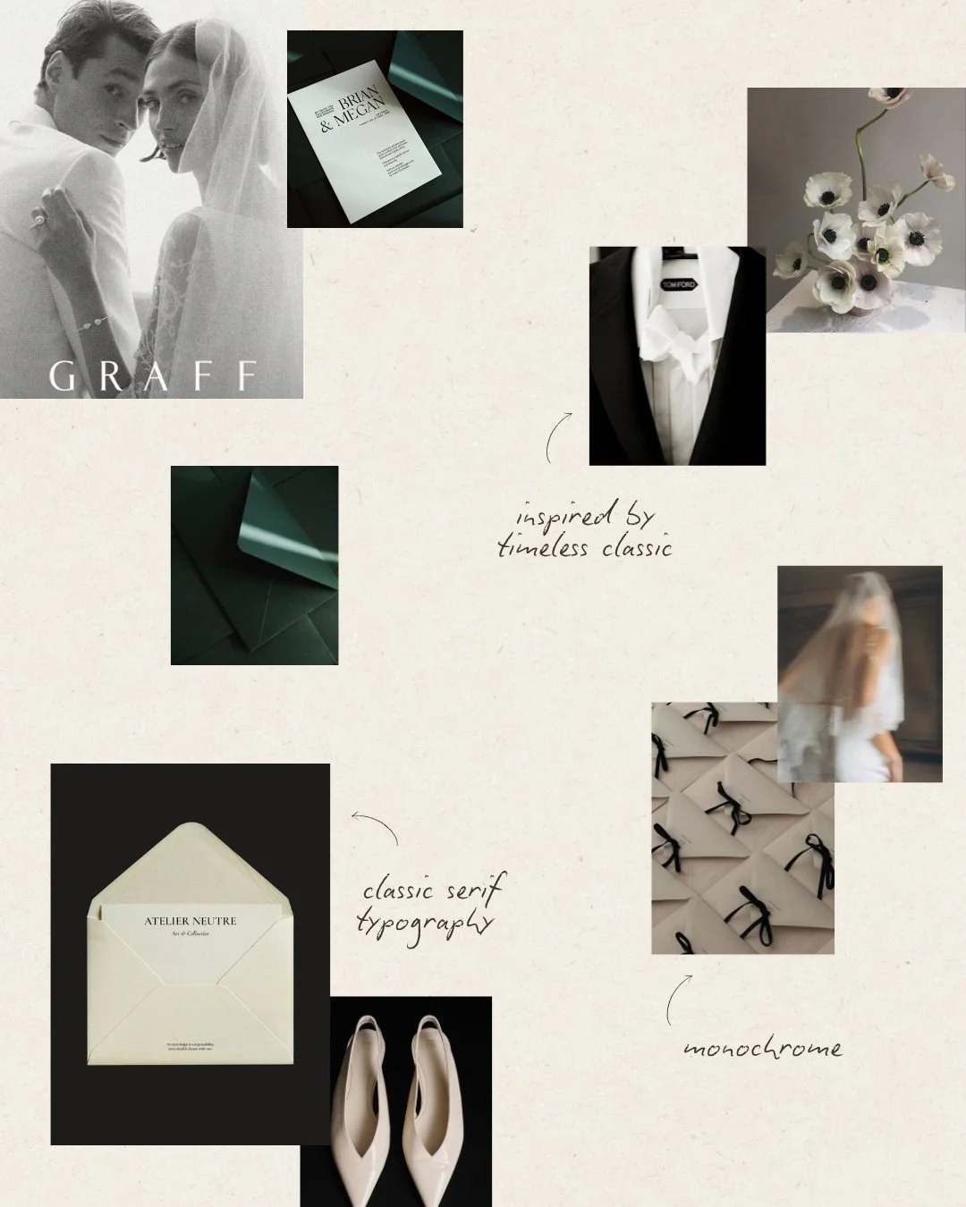
Mood Board
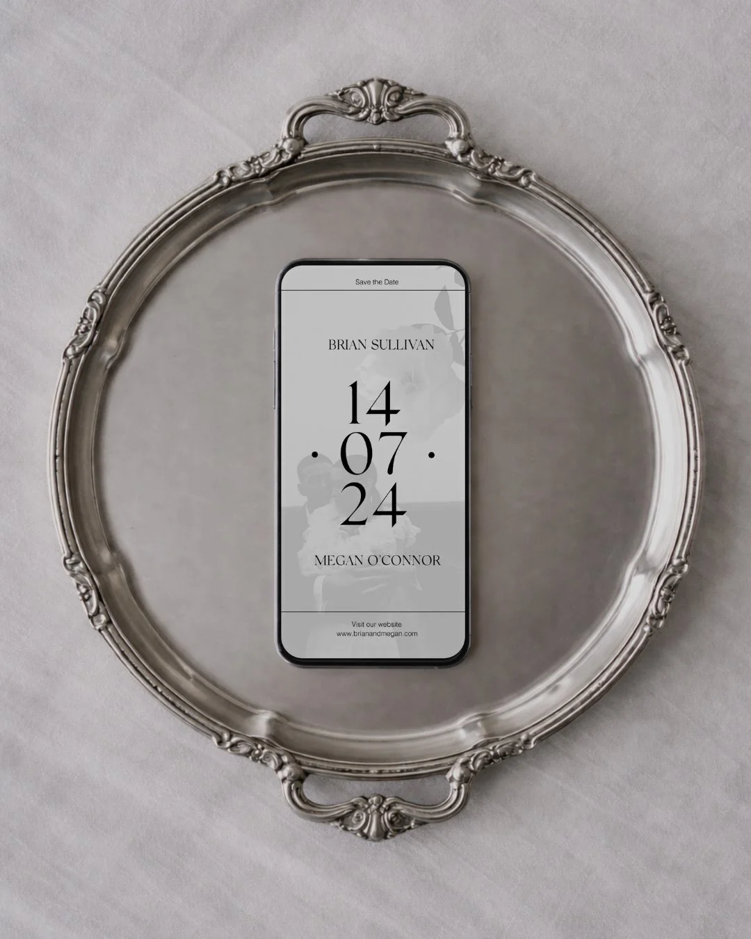
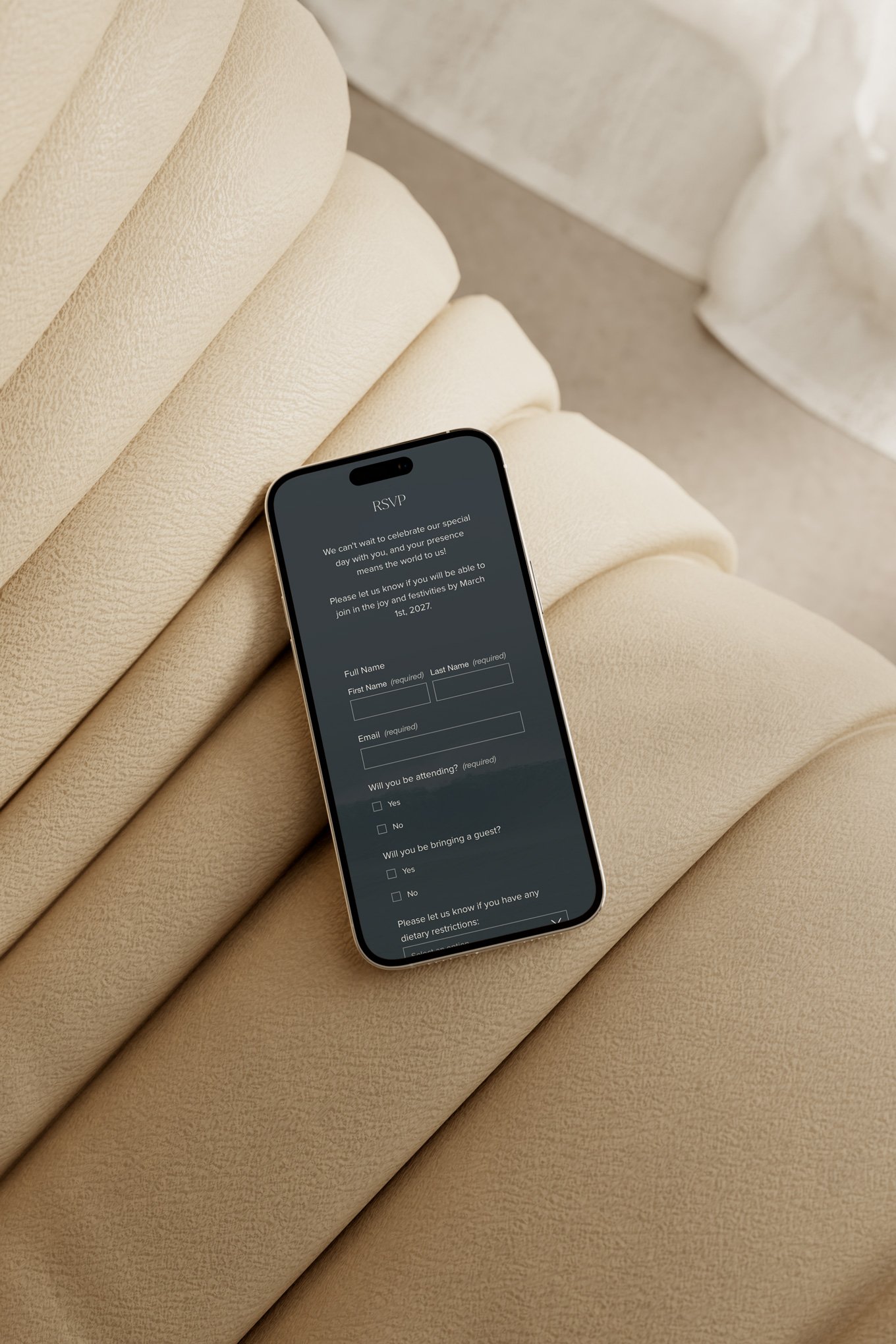
Mobile view
What the Collection Is For
Kerry was made for the couple who sees Ireland — or anywhere, for that matter — clearly. Who is not drawn to the expected version of a place or an occasion, but to something truer and more considered beneath it. Who understands that the most powerful response to a saturated aesthetic is not to do it better, but to step outside it entirely.
They may be marrying in Ireland — in Kerry itself, in the wild landscapes of Connemara, in a restored country house in Wicklow, in a stone barn with views of the Atlantic. Or they may be marrying somewhere else altogether, drawn to the collection not for its geography but for its philosophy: the belief that a wedding should look like a genuine decision, not a default.
They want to make an impression that is unmistakable and entirely their own. Not through decoration, but through conviction.
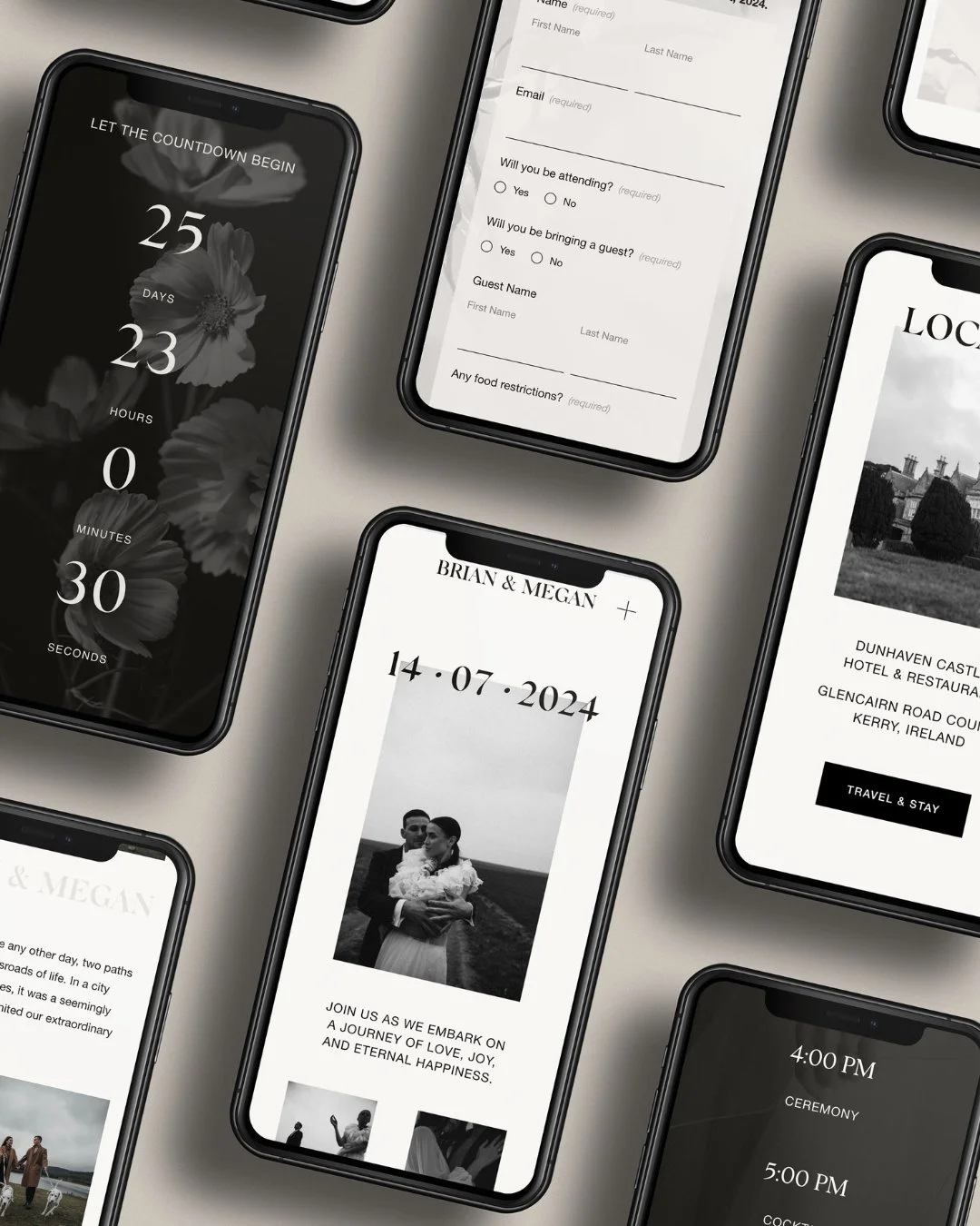
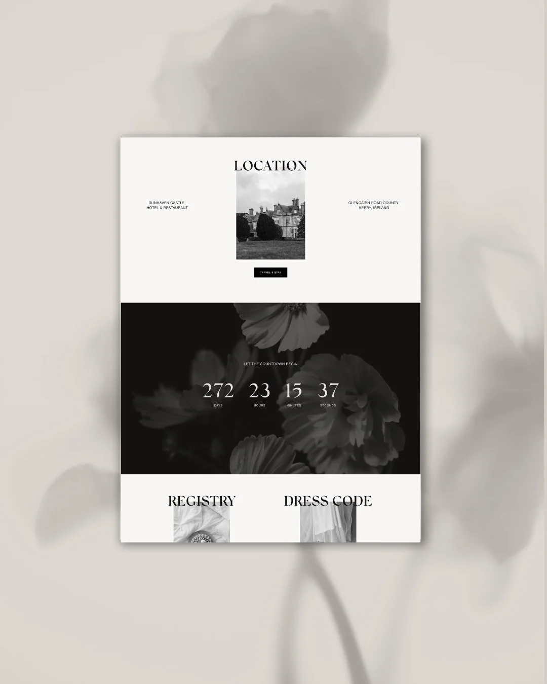
The Design
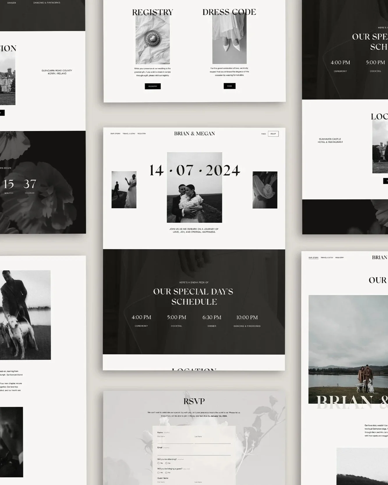
The decision to make Kerry monochrome was made early and held to completely.
Not because black and white is a safe or simple choice — it is neither — but because it was the most direct possible statement of the collection's intent. If the problem was too much colour used without purpose, the answer was to remove colour entirely and discover what remained. What remained was proportion. Typography. Space. The quality of a design that has nowhere to hide and nothing to apologise for.
The default palette is black and white — pure, high-contrast, unambiguous. But Kerry is designed to carry any monochrome: deep navy and cream, charcoal and warm white, slate and ivory. The framework is strong enough to hold any two tones that share that same clarity of contrast. The couple who wants the starkness of pure black and white has it. The couple who wants something slightly softer, or warmer, can make it their own without losing a single note of the collection's character.
Typography was the most considered decision of all. Silk Serif — elegant, classical, with the quiet authority of a typeface that has been doing this for a long time — carries the headings. It does not shout. It does not need to. Its serifs are precise, its letterforms assured, its presence on a page the typographic equivalent of something genuinely well-made. Helvetica handles the body: clean, direct, without flourish or affectation. Together they create a typographic system that is both classical and contemporary — the old and the new in exactly the proportion the collection requires. Formal without being cold. Precise without being severe.
White space is used as generously as the landscape Kerry is named after. Each element has room to stand alone. Each detail earns its place not through decoration but through placement — the deliberate, considered positioning of things that belong exactly where they are.
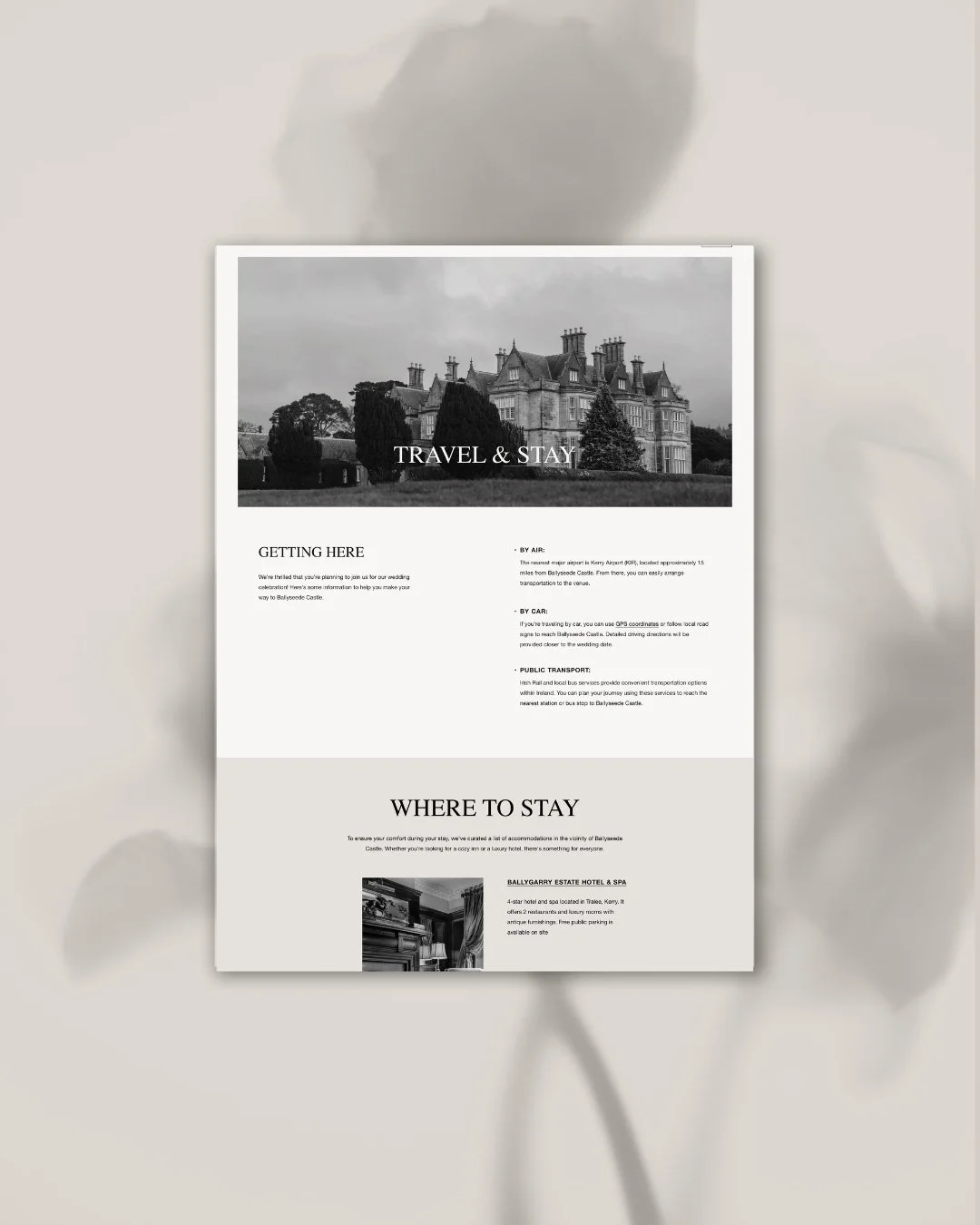
Travel and Stay Page
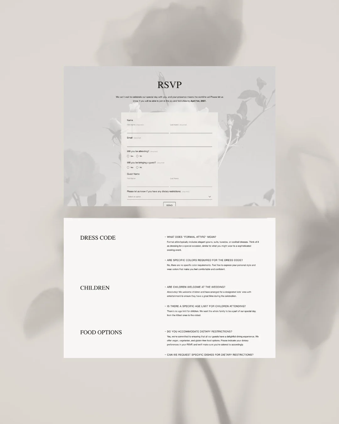
Registry Page. FAQ Page.
What It Carries
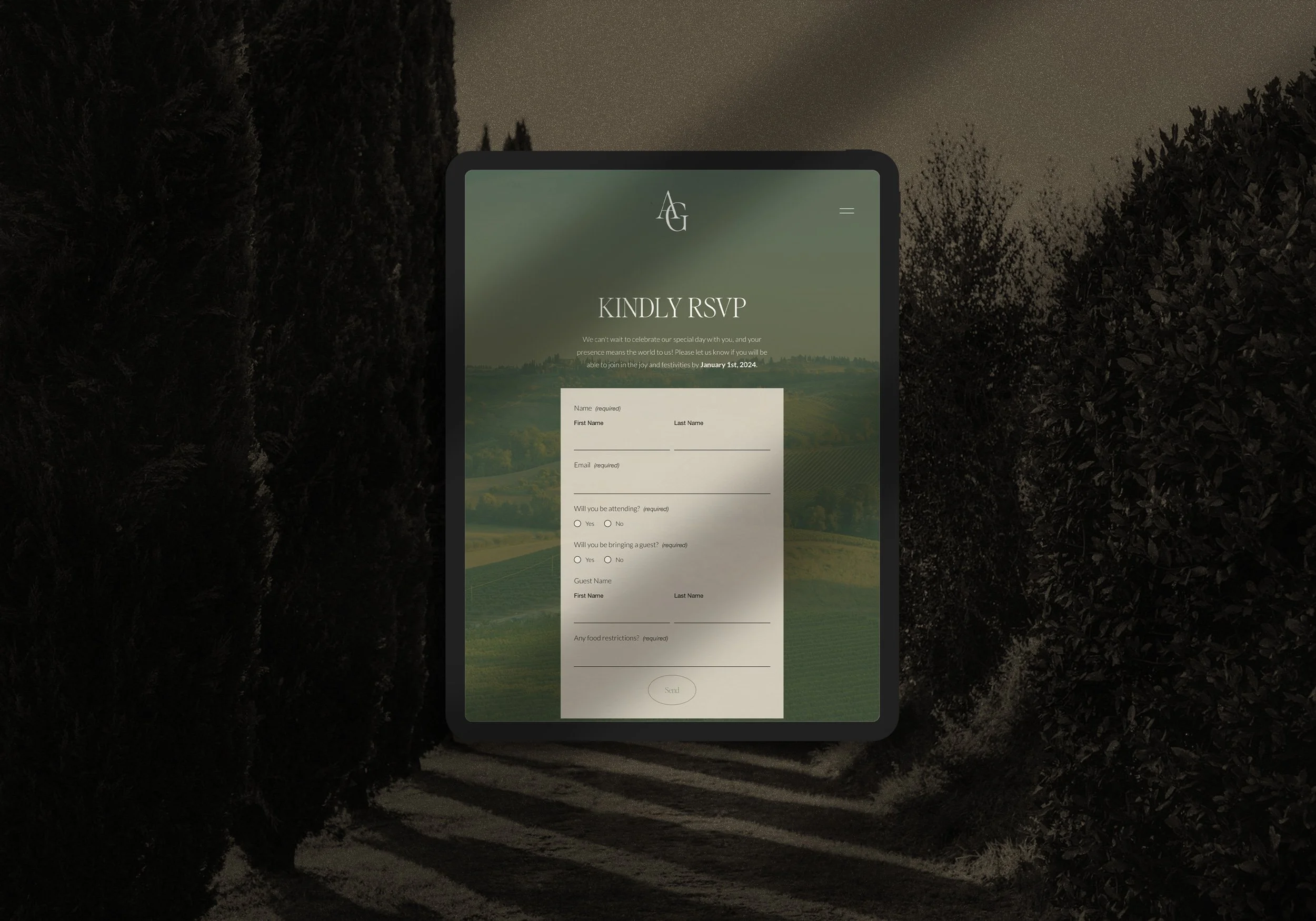
The Kerry website moves through its nine pages — Welcome, Our Story, Travel & Stay, FAQs, Event, Registry, Menu, RSVP, Save the Date — with the composure of a design that knows precisely what it is doing. The navigation is clear. The hierarchy is immediate. The experience of being a guest on the website is as considered as the experience of being a guest at the wedding itself.
What the design carries, beneath the typography and the palette, is the spirit of the place it is named after. Something old and strong and completely without pretence. A design that does not try to be beautiful — it simply is, in the way that a stone wall on a Kerry clifftop is, in the way that anything made with genuine intention and kept honest eventually is.
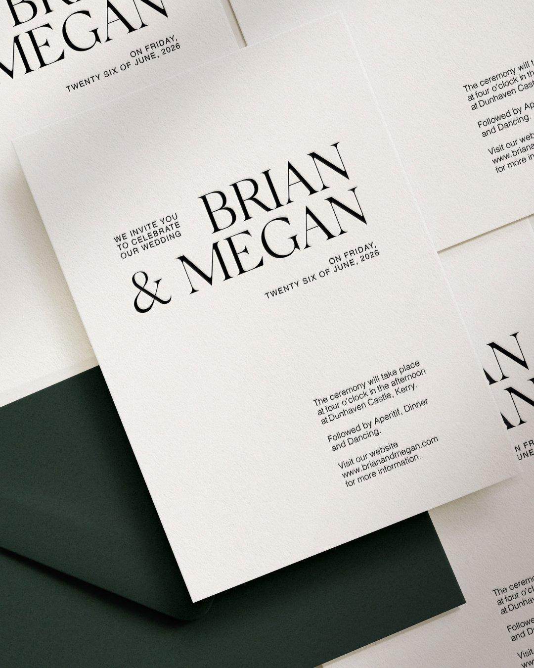
Stationary
Kerry Collection
A Collection with a Point of View
Kerry was made as a response to something — and it still carries that energy. The energy of a decision made clearly, of a direction chosen not because it was expected but because it was right. The energy of a design that breaks with convention not to be difficult, but to be true.
If your wedding has that quality — if you are drawn to the strength and purity of monochrome, to typography that carries authority without demanding attention, to a design that looks like a genuine choice rather than a familiar option — Kerry was made for you.
The demo site is open to explore, and we are currently taking enquiries for the Kerry Collection across both the Light (from €950) and Core (from €1,500) packages.
read more