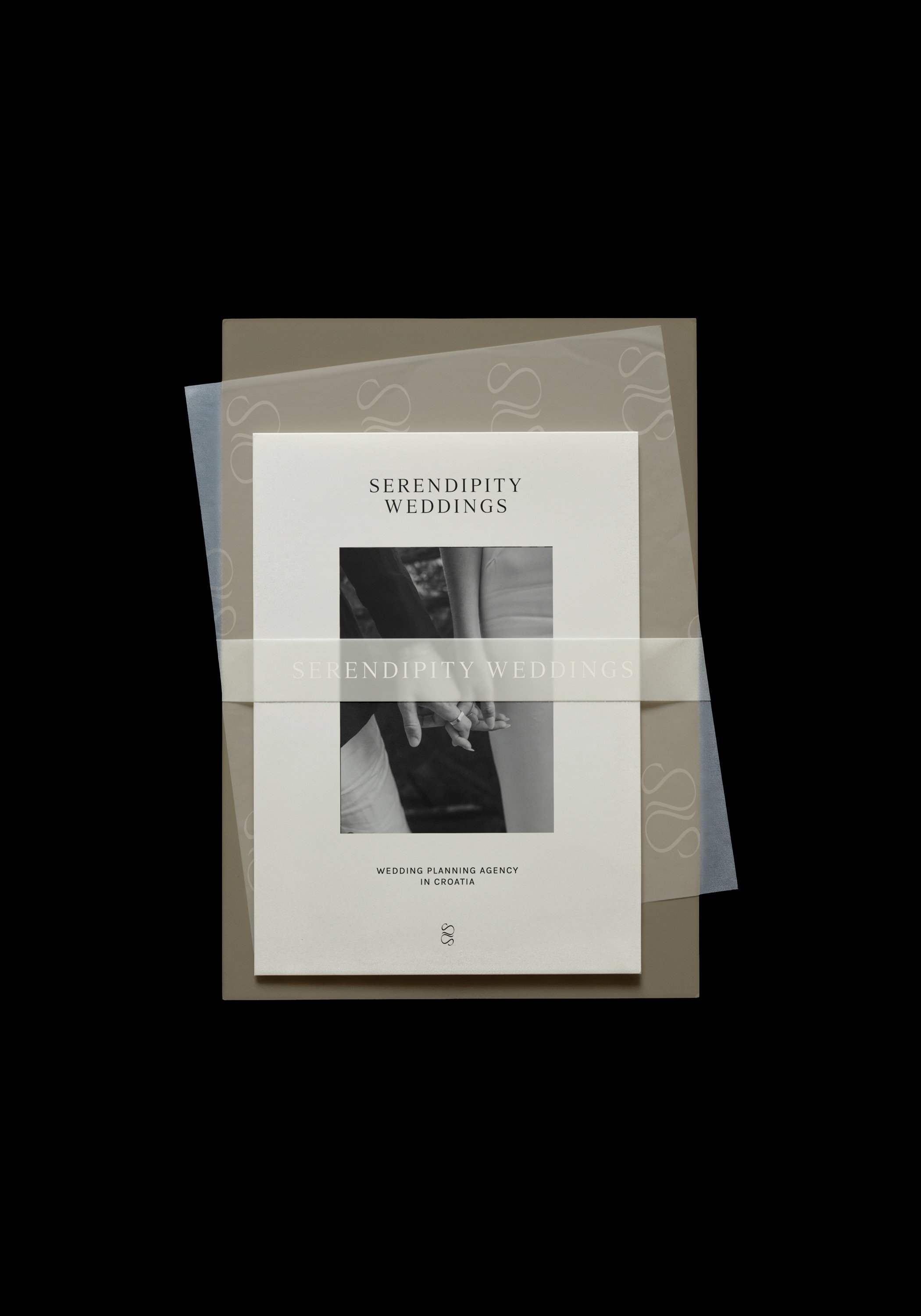
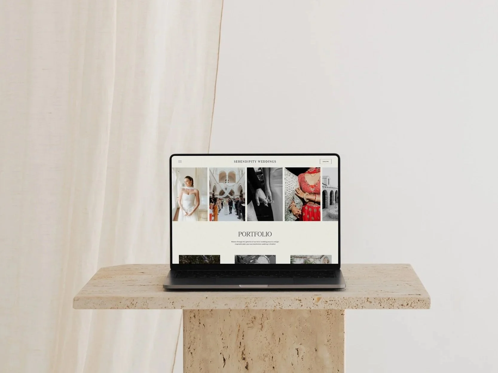
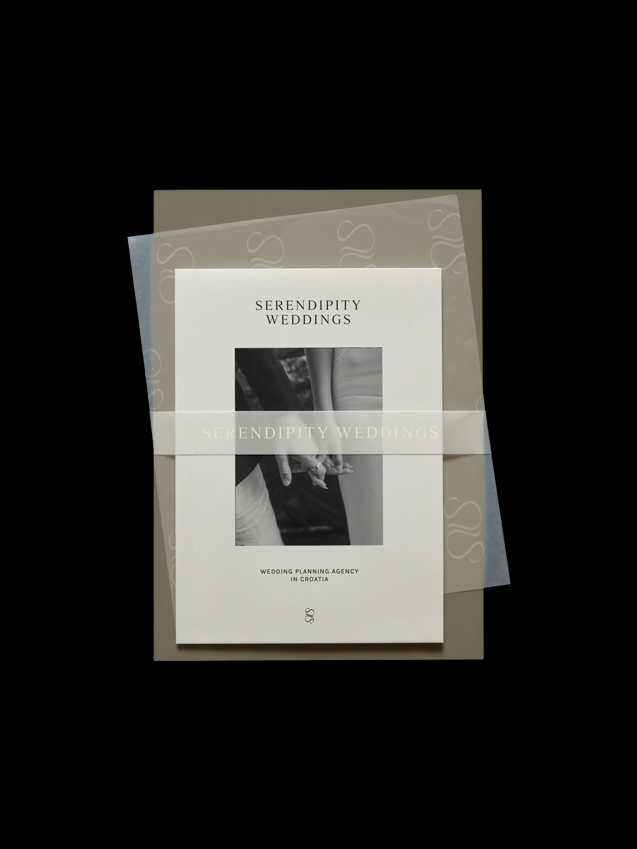
The fashion houses that define luxury never need to raise their voice. A single stitch, a particular weight of fabric, a silhouette that took a decade to perfect — the statement is always there, but it's never loud. You feel it before you can explain it. That's the standard the best wedding brands are quietly working towards, whether they realise it or not.
Most branding advice in this industry stops at logos and colour palettes. Real luxury branding is built on four things: emotion, exclusivity, experience, and extension.
The Four E's of Luxury Marketing
Emotion is what a client feels before they can articulate why.
Exclusivity is the sense that this isn't available to everyone, everywhere.
Experience is what it actually feels like to be a client, from the first enquiry to the final email.
Extension is whether that feeling holds across every touchpoint, or falls apart the moment someone leaves your website for your Instagram grid.
Most brands are strong on one or two of these and quietly weak on the rest. What follows is where that gap tends to show up, and how to close it.

Emotion: The Soul You Can Feel
Every founder has a reason they do this work the way they do it — a particular eye, a formative experience, a stubborn belief about what a celebration should feel like. That reason is the actual brand. The logo is just where it becomes visible.
Treat your brand as an investment in understanding that difference, not a cosmetic layer applied at the end. What makes your eye different from the planner down the road? What do you notice in a room that others miss? The answer should be traceable, almost tactile, across everything a client touches: the way a proposal is written, the pacing of a gallery, the words chosen for an about page. Story, done properly, isn't a paragraph on a website. It's a thread running through the whole experience.
Exclusivity: An Air of Exclusivity
Exclusivity isn't about turning people away for the sake of it — it's about a brand that clearly knows what it is and isn't for. Clients at this level are drawn to businesses that feel considered rather than available to everyone, everywhere, at every budget. A narrow, well-defined offering reads as more valuable than a broad one, even when the broad one is more accommodating.
This shows up in small decisions: a portfolio that's curated rather than exhaustive, an enquiry process that feels like a conversation rather than a form, language that describes a specific kind of client rather than trying to speak to all of them.
Considering whether your own positioning is doing this work for you, or against you? It's the first thing we look at with every studio we work with.
Experience: The Website as an Experience
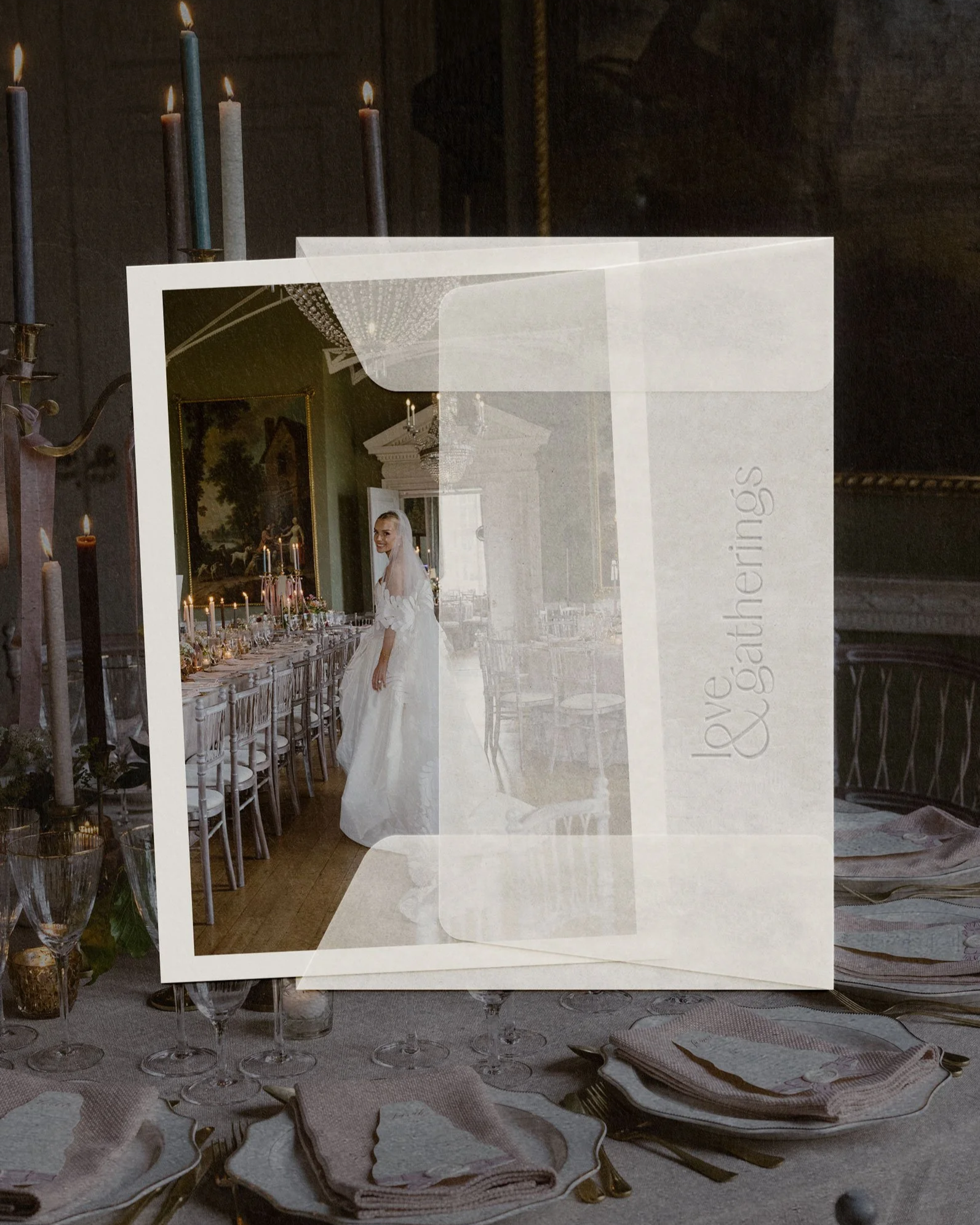
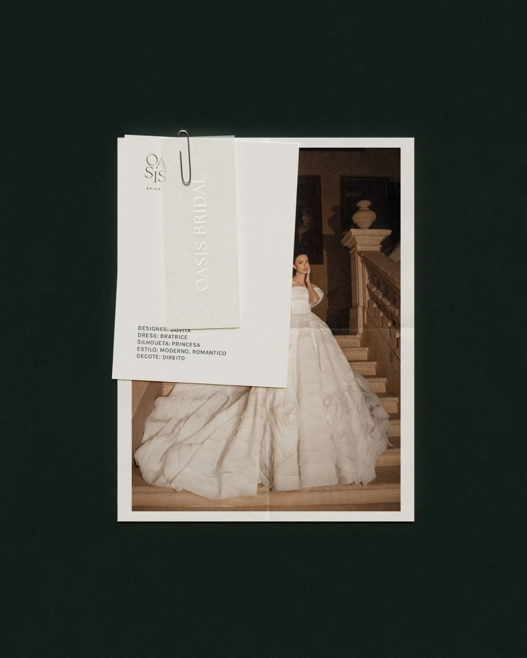
For most clients, the website is the first time they experience how it feels to work with you, before the first call, before the proposal. Soft transitions, a thoughtful page order, pacing that gives each section room to land: these aren't decorative choices. They're a preview of the process itself. A hurried, cluttered site suggests a hurried, cluttered planning experience. A considered one suggests the opposite.
Think about the structure the way you'd think about a wedding day timeline — what a guest, or in this case a client, needs to feel at each stage, and in what order. The result should feel less like a brochure and more like being walked through a door.
Extension: Consistency Across Every Touchpoint
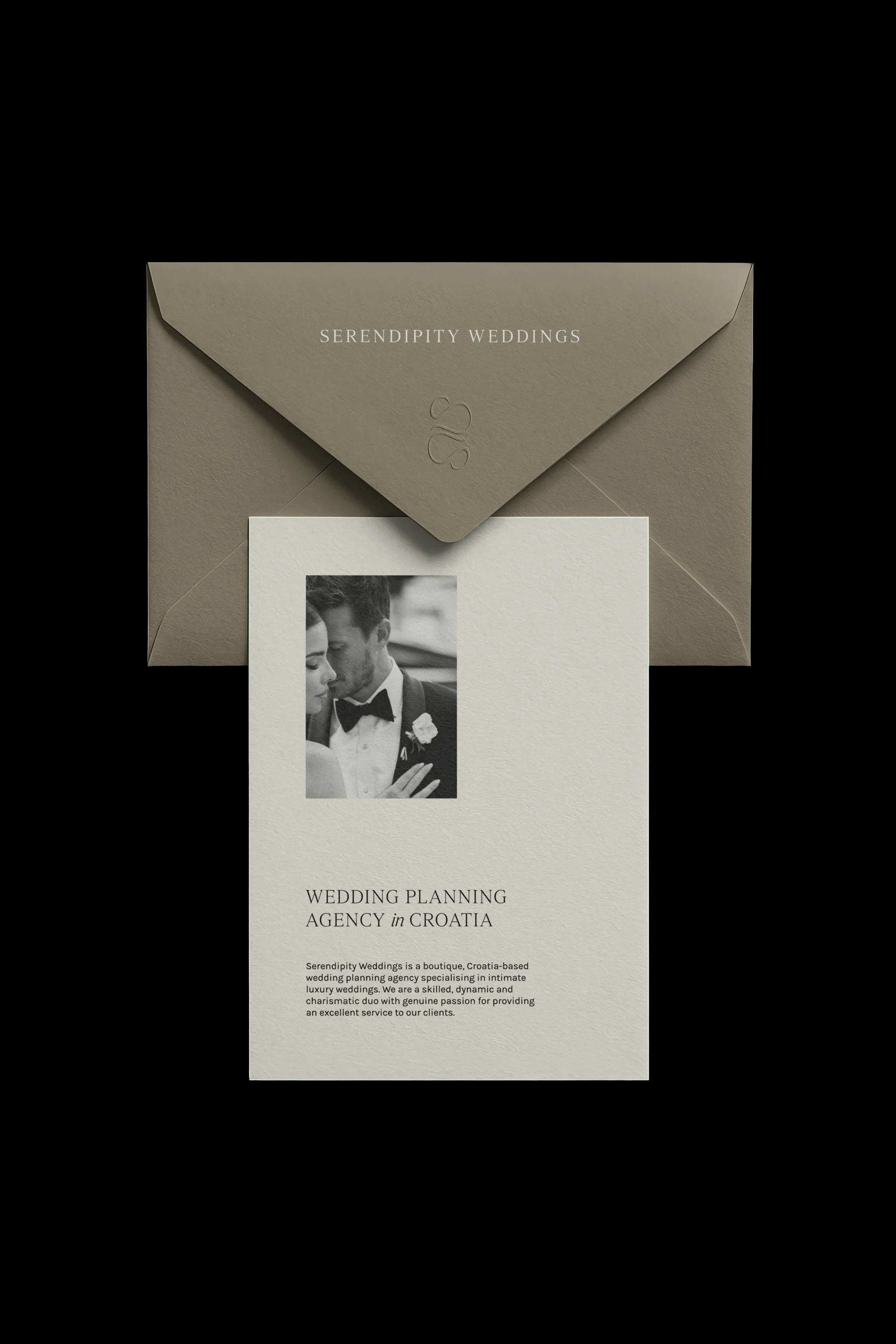
A beautifully designed website paired with an inconsistent Instagram grid, a generic email signature, and a proposal template built in a decade-old font tells a client that the brand is a surface, not a system. Luxury is felt in the accumulation of small, consistent decisions — the same palette, the same typographic voice, the same level of care, whether a client is looking at your homepage or receiving your third follow-up email.
This is where most rebrands quietly fail: the logo changes, but the ecosystem around it doesn't.
Specificity Sells; Generality Doesn't
"We create unforgettable celebrations for every couple" tells a prospective client nothing. It could describe almost any wedding business in the country. Luxury clients are drawn to specificity: a particular sensibility, a defined point of view, evidence that you say no to the wrong-fit clients as often as you say yes to the right ones.
If your brand copy could be lifted and placed on a competitor's site without anyone noticing, it isn't doing its job. The fix isn't more adjectives. It's naming the actual thing you do differently: the design references you return to, the kind of celebration you're best suited to, the part of the process where you're most exacting.
Your Portfolio Is an Argument, Not an Archive
Many portfolios are organised chronologically, which means the order is dictated by your calendar rather than your standards. A luxury client doesn't need to see everything you've ever done, they need to see your best work, sequenced to build a case for what you can do for them specifically.
Curate hard. Six exceptional weddings outperform twenty uneven ones. And consider what the sequence itself communicates: leading with your most editorial work signals where your taste sits before a single caption is read.
Stay True to Yourself
The strongest luxury brands in this industry don't look luxurious in the abstract, they look like the specific person and the specific work behind them. Borrowing another studio's aesthetic, tone, or structure might produce something polished, but it won't produce something believable. Clients at this level have seen enough brands to recognise a copy when they meet one.
The test is simple: if a client saw your brand and your actual work side by side, would they recognise them as the same sensibility, the same hand, the same taste? If not, that gap is worth closing before anything else.
Where to Start
Building a brand that attracts high-end clients isn't about a bigger budget for design, it's about being more exacting with what you already have. Find the thread that's actually yours. Let restraint do the talking. Design the website as an experience, not a brochure. And resist the pull to look like everyone else operating at the same level.
If you'd like a second opinion on where your brand sits against these four E's, that's exactly the conversation we have with planners, photographers and stylists before any design work begins — get in touch to start one.
read more