The wedding website has become almost standard. According to The Knot’s 2026 Real Weddings Study, 90% of surveyed couples created one. The same research points to a broader shift towards weddings that feel increasingly intentional and highly personalised. So the interesting question in 2026 is no longer whether couples want a wedding website. It is what they expect that website to do.
Looking through the enquiries we receive at Avelã White, one thing becomes particularly clear: couples are asking far more of their websites than a beautiful homepage, an RSVP form and somewhere to place the venue address. They are planning multi-day celebrations. Destination weddings. Weddings bringing together different countries and cultures. Events with several guest groups. Weekends that begin with a welcome dinner and finish days later with a farewell brunch. And, at the same time, they are putting more thought into how all of it feels.
The website has become part invitation, part guest guide, part planning tool and part visual identity. Here are some of the shifts we are seeing most clearly.
1. The Website Needs to Feel Like the Wedding
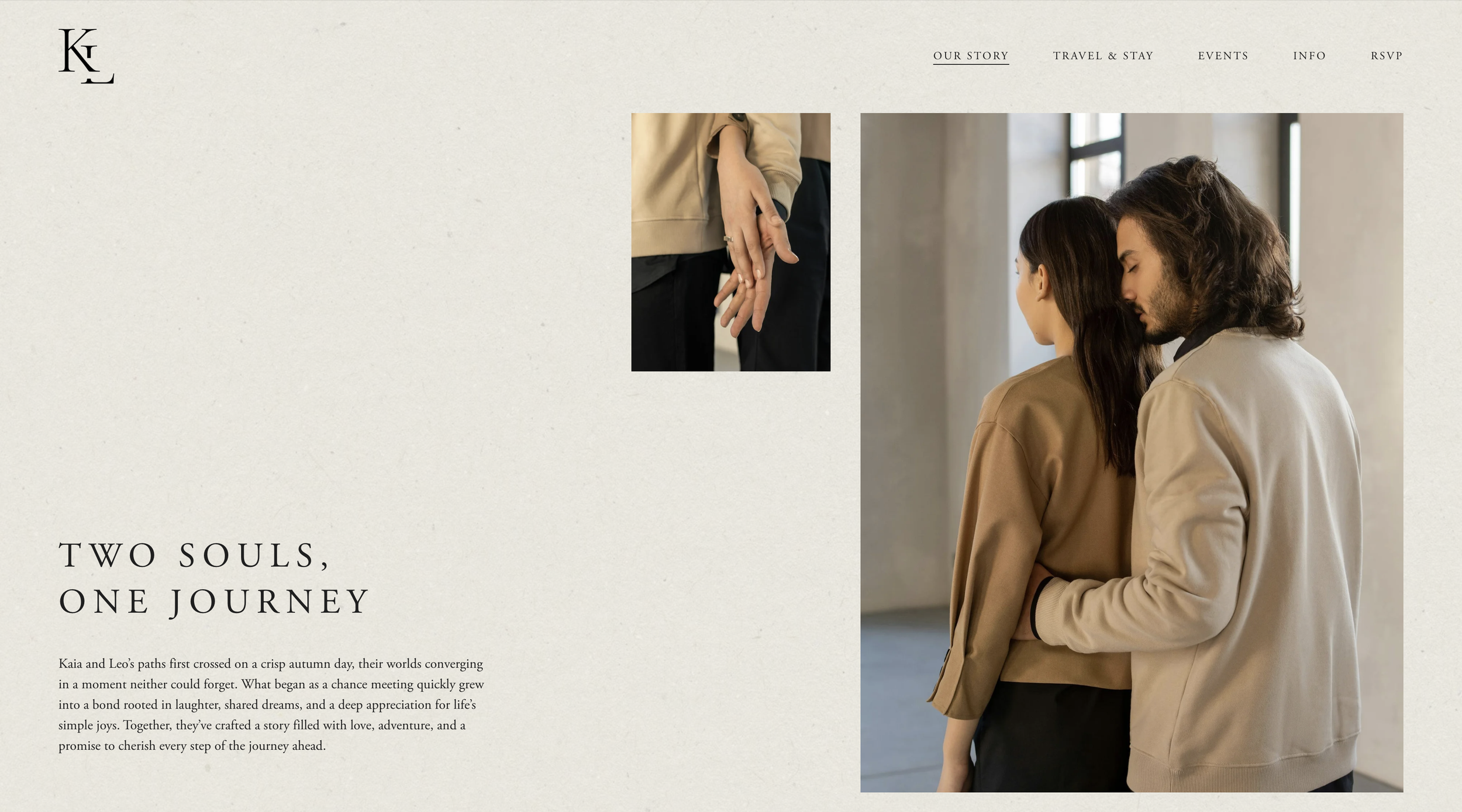
Perhaps the strongest pattern in our recent enquiries is that couples do not see the wedding website as a standalone digital product. They talk about the website alongside the invitation, monogram, save the date, signage, menus and other details. Some explicitly describe wanting all of these pieces to create one continuous experience for their guests. That is an important change.
The old model of the wedding website was mostly functional: choose a template, upload a photograph, change a few colours and enter the logistical information. But if the invitation has been carefully art-directed, the stationery is printed on beautiful paper and the celebration has its own distinct aesthetic, sending guests to a generic template immediately breaks that visual story.
Couples increasingly want continuity. A monogram introduced on the save the date might appear again on the website. Typography can move from digital to print. A particular colour combination can begin online and later reappear in menus, florals or table details. Illustrations created for an invitation can be translated into movement. Photography can become part of the composition rather than simply filling a rectangular image block.
The website does not have to replicate the stationery exactly. It should feel as though it belongs to the same world.
2. Personalisation Is Becoming More Specific
“Personalised” used to mean putting the couple's names at the top of a template. That is not really what the couples coming to us mean anymore. They are talking about place, culture, family, fashion, architecture, art and shared history.
Recent briefs have asked us to interpret Asian culture in a contemporary rather than literal way; subtly combine different cultural backgrounds; evoke landscapes and destinations without turning them into obvious themes; and incorporate personal handwriting, existing illustrations, family-made artwork or other visual elements into the wedding identity.
The common thread is specificity.
A destination wedding in Sicily does not automatically need lemons.
A wedding in Greece does not automatically need blue and white.
A celebration in Tuscany does not automatically need olive branches and handwritten script.
Increasingly, couples want the design to communicate their relationship to a place, rather than simply reproducing the most recognisable visual shorthand for it. The same applies to cultural references.
Good personalisation is rarely about placing every meaningful symbol onto one page. Often it is about interpreting something more subtly through colour, typography, imagery, language, pattern or movement.
The result feels personal because it could not belong to just any couple.
3. Multi-Day Weddings Need Much Smarter Websites
One of the clearest practical shifts we see is the increasing complexity of the wedding itinerary.
Couples ask us about two-day, four-day and even week-long celebrations. Some events are optional. Some are restricted to certain groups. Some guests need transport information that others do not. Some celebrations combine different ceremonies or traditions that need additional explanation.
Recent enquiries have specifically asked about selectively displaying events, handling different RSVP options across several days, creating extended itineraries and managing additional activities separately.
This changes what a wedding website needs to be. A simple schedule followed by one RSVP button is no longer enough for every wedding. Instead, the website may need to answer:
Which events am I invited to?
Do I need to RSVP separately for each one?
Is this activity optional?
What should I wear?
Is transportation provided?
Where should I be and when?
Can I bring my partner?
What happens between the ceremony and dinner?
Which cultural traditions should I know about beforehand?
The best guest experience is the one where these questions rarely need to be asked privately. That requires thoughtful information architecture behind the beautiful design.
A Wedding Website Designed Around Your Wedding
No two celebrations have exactly the same logistics — so the website should not have to behave as though they do.
At Avelã White, our custom and semi-custom wedding websites are designed around the visual identity, events and guest experience of each celebration.
4. Couples Want Guests to See the Right Information — Not All the Information
More information is not necessarily better information. For multi-event weddings, one of the most useful forms of personalisation is actually deciding what each guest needs to see. A relative joining the entire weekend may need details for a welcome dinner, ceremony, reception and farewell brunch. Another guest may only be invited to the wedding day. Someone staying at the recommended hotel may need shuttle information that is irrelevant to somebody staying elsewhere.
This is why selective event information and guest-specific RSVP journeys are becoming so valuable. Instead of publishing every event publicly and then privately explaining who is invited where, the digital experience can do part of that work. Done well, the technology almost disappears. The guest simply sees a clear, relevant experience. And the couple avoids a surprising amount of follow-up administration.
5. They Want Digital Design to Feel Less Digital
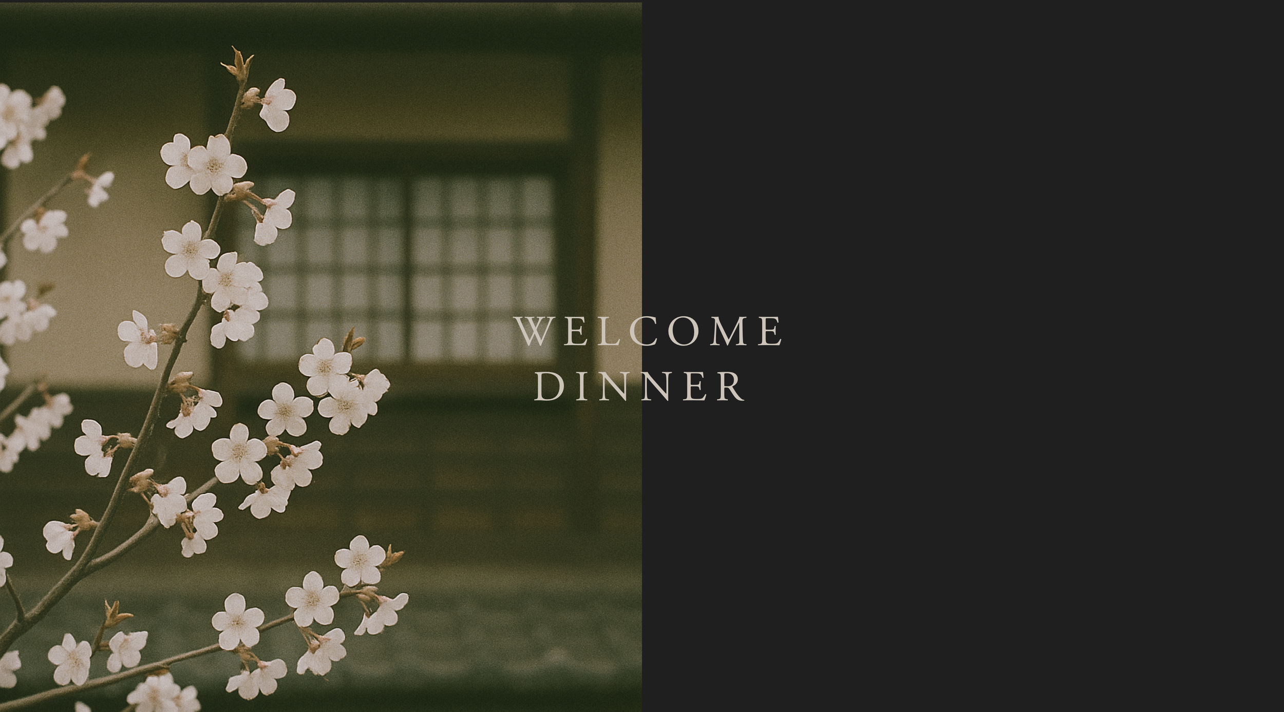
One of the most interesting requests we received recently came from a couple who loved textured paper and wanted their website to recreate some of the feeling of a paper invitation.
It is a good description of what many couples are looking for, even when they do not express it in exactly those words. Digital design does not need to feel flat. The tactile qualities of stationery can be translated in other ways:
through texture
through typography
through movement
through pacing
through scale
through illustration
through photography
through small interactive moments
We've also seen enquiries asking whether hand-drawn illustrations can be animated, whether existing crests can be incorporated, whether custom handwriting can become part of the identity, and whether video can sit naturally within the website experience.
These details are not simply decoration. They allow the digital experience to communicate some of the personality that beautifully made stationery communicates through paper, printing and touch. A website cannot replicate letterpress. It can do something paper cannot do instead.
6. Couples Are Launching Their Websites in Stages
Another interesting pattern is that couples do not necessarily need the entire website at once. The planning journey has several communication moments.
First comes the date → Later come travel plans → Then invitations → Then detailed weekend information → Then RSVPs → Then final logistics
Several recent enquiries reflect exactly this structure: couples and planners wanting a save-the-date or simple landing page first, followed by a fuller website later and stationery afterwards. This makes sense. If guests need to reserve a weekend eighteen months in advance, there may be no reason to delay sending them to a website simply because the restaurant recommendations or Sunday brunch time have not yet been confirmed.
A wedding website can evolve.
Phase One
Names, date, destination and an initial save-the-date experience.
Phase Two
Full itinerary, travel and accommodation information, dress codes and registry.
Phase Three
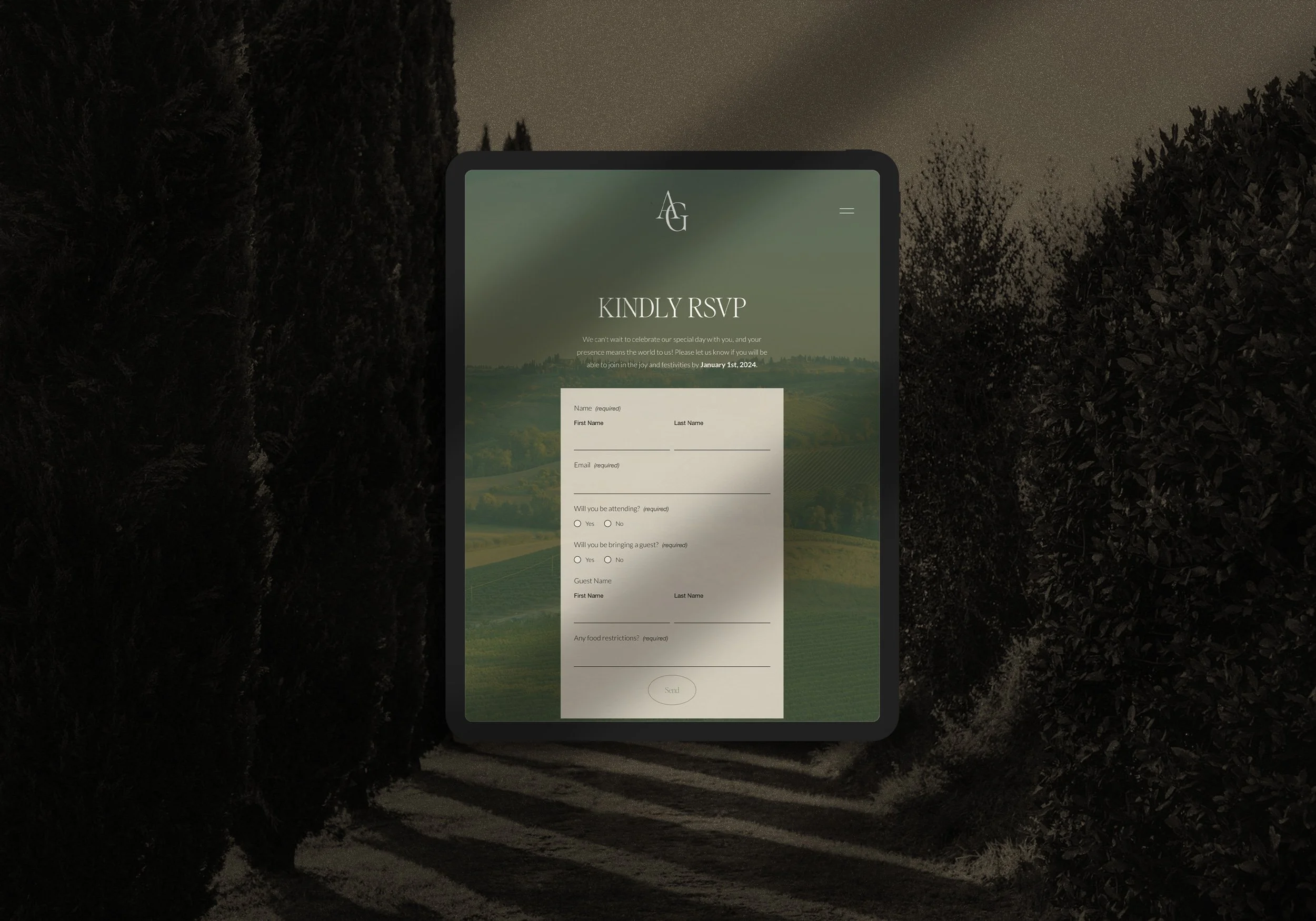
RSVP functionality, final transport information, FAQs and updated guest details.
Thinking about the website this way takes pressure off the couple to know everything immediately. It also makes the digital experience more useful throughout the planning process rather than launching once and remaining unchanged.
7. Destination Weddings Need a Private Travel Guide
Destination weddings are particularly demanding digitally. Many of the couples who enquire with Avelã White live in one country, marry in another and host guests arriving from several more.
Their guests need more than an address. They need context.
Which airport makes the most sense?
Should they hire a car?
Is there a transfer?
Which area should they stay in?
How many nights should they book?
What will the weather be like?
What kind of plug adapter do they need?
What currency will they use?
Do they need a visa?
Where should they have dinner the night they arrive?
What can they do with a free afternoon?
For these weddings, the website increasingly functions like a beautifully edited destination guide. The goal is not to publish everything that could possibly be known about Mallorca, Sicily, Jaipur or Lake Como. It is to curate what this particular group of guests needs to know about being there for this particular wedding. That distinction matters.
8. Mobile Is Not a Smaller Version of Desktop
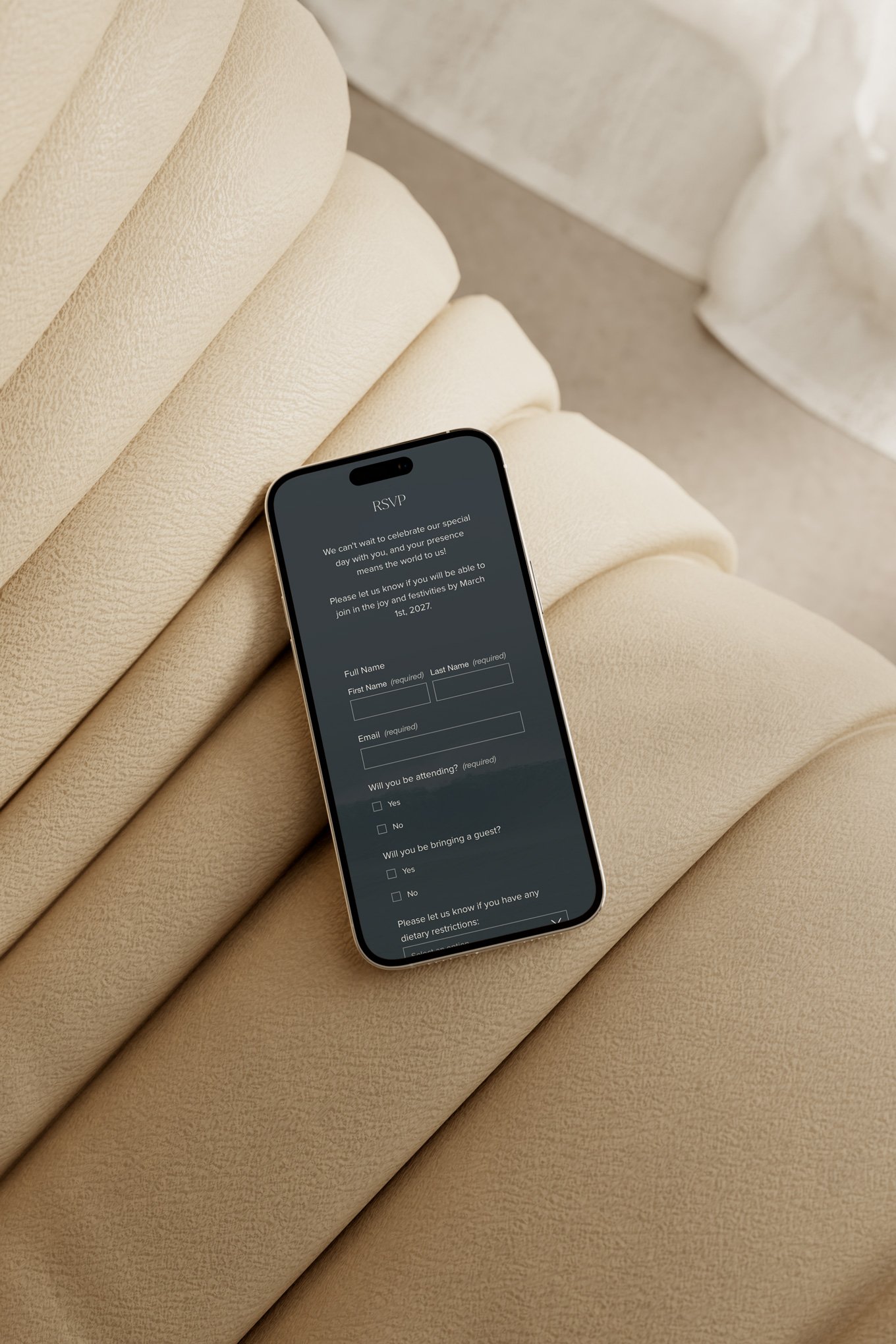
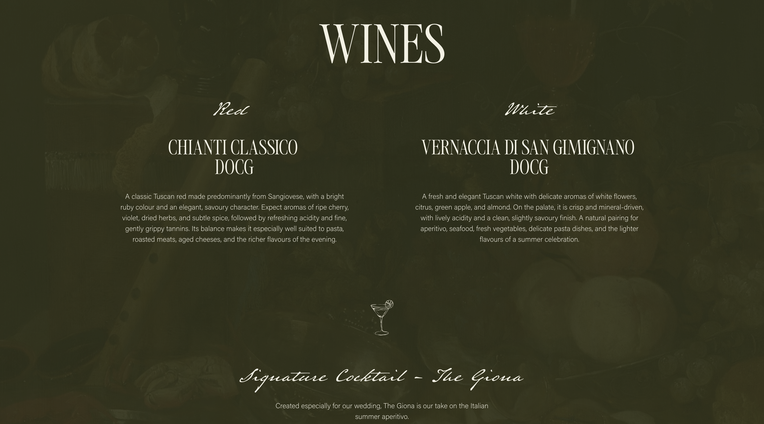
Couples care deeply about how their website looks. Guests are often looking at it while standing outside a hotel trying to find a shuttle. These are two very different contexts.
Recent enquiries have specifically mentioned mobile interfaces and ease of use alongside aesthetic concerns. A wedding website therefore has to work at both scales.
On desktop, there may be room for dramatic typography, generous imagery and immersive transitions.
On mobile, the hierarchy needs to be particularly disciplined.
A guest should be able to find an address, time or dress code within seconds.
Buttons need to be easy to tap.
Maps should open intuitively.
RSVP forms should not become exhausting.
Text needs to remain readable.
And an elaborate interaction should never stand between a guest and essential information. Luxury is not complexity. Often, it is the feeling that everything simply works.
9. Couples Want Flexibility Without Having to Start From Nothing
This is particularly visible in semi-custom enquiries. Couples often fall in love with the typography, spacing, composition or overall feeling of an existing design, but still want to know:
Can we change the colours?
Can we change the fonts?
Can we incorporate our own illustrations?
Can the itinerary work differently?
Can we add another page?
Can we bring in an existing monogram?
Can we adapt the package to what we actually need?
Those questions appear repeatedly in our enquiries. It reveals an interesting middle ground. Not every couple wants a blank canvas. Many actually prefer beginning from a strong creative direction — as long as there is enough flexibility for the result to feel like theirs.
The desire is not necessarily for unlimited choice. It is for considered choice.
10. They Want Less Administrative Friction
Underneath almost every functional request is the same desire: make this easier.
Couples want one place where guests can find what they need.
They want to stop answering the same travel question in six different WhatsApp conversations.
They want RSVPs collected coherently.
They want dietary requirements organised.
They want multiple events handled without multiple spreadsheets.
They want planners to be able to access the information they need.
They want to update one location rather than resend a PDF every time something changes.
And they want guests to feel looked after without the couple manually guiding every person through the weekend.
This is where the wedding website becomes more than a design object. Good digital design quietly removes work.
11. But They Don't Want Efficiency at the Expense of Emotion
This may be the most important distinction.
People could organise all of this in a spreadsheet. They could send guests a Google Doc. They could use a basic form for the RSVP and email the itinerary later. What couples are increasingly asking for is a way to make the practical experience feel like part of the celebration.
One enquiry described the graphics, signage and stationery as an important part of how people experience an event. Another spoke about creating a complete visual experience that could extend into unexpected details throughout the celebration. That is ultimately what the best wedding websites do.
They communicate information, but they also create anticipation. Before guests see the venue, hold the invitation suite, sit at the dinner table or watch the ceremony begin, they have already encountered the visual world of the wedding. The website can be the first place where that world becomes real.
What Couples Actually Want in 2026
Looking across the requests we receive, the priorities are remarkably consistent.
Couples want personalisation without cliché.
They want beautiful design without sacrificing usability.
They want complex celebrations to feel simple for their guests.
They want digital and physical design to feel connected.
They want flexibility without losing creative direction.
And above all, they want the website to feel as intentional as the wedding itself.
With 90% of couples in The Knot's latest US study already creating a wedding website, simply having one is no longer particularly distinctive.
What matters now is what happens when a guest opens it.
Do they immediately understand where they are going?
Does it feel unmistakably connected to the celebration?
Does it answer the question they came looking for?
Does it make planning their journey easier?
And, perhaps most importantly, does it make them a little more excited to be there?
More Than a Wedding Website
At Avelã White, we design wedding websites as part of the wider experience of the celebration — connecting visual identity, digital stationery, guest communication and thoughtful functionality in one cohesive world.
Whether you begin with one of our semi-custom collections or create something entirely bespoke, the goal is the same: a website that looks beautiful, works effortlessly and feels entirely yours.
read more