Most collections begin with sunshine. Chelsea begins with fog.
Not the grey uncertainty of an overcast day — the particular, romantic haze that settles over London in the early morning, when the city is still and the Georgian terraces of Mayfair and Chelsea emerge from the mist as if they have always been there and always will be. There is a quality of restraint to London that no other city quite replicates. A belief that beauty does not need to announce itself. That confidence, properly understood, is quiet. Chelsea was built on that belief.
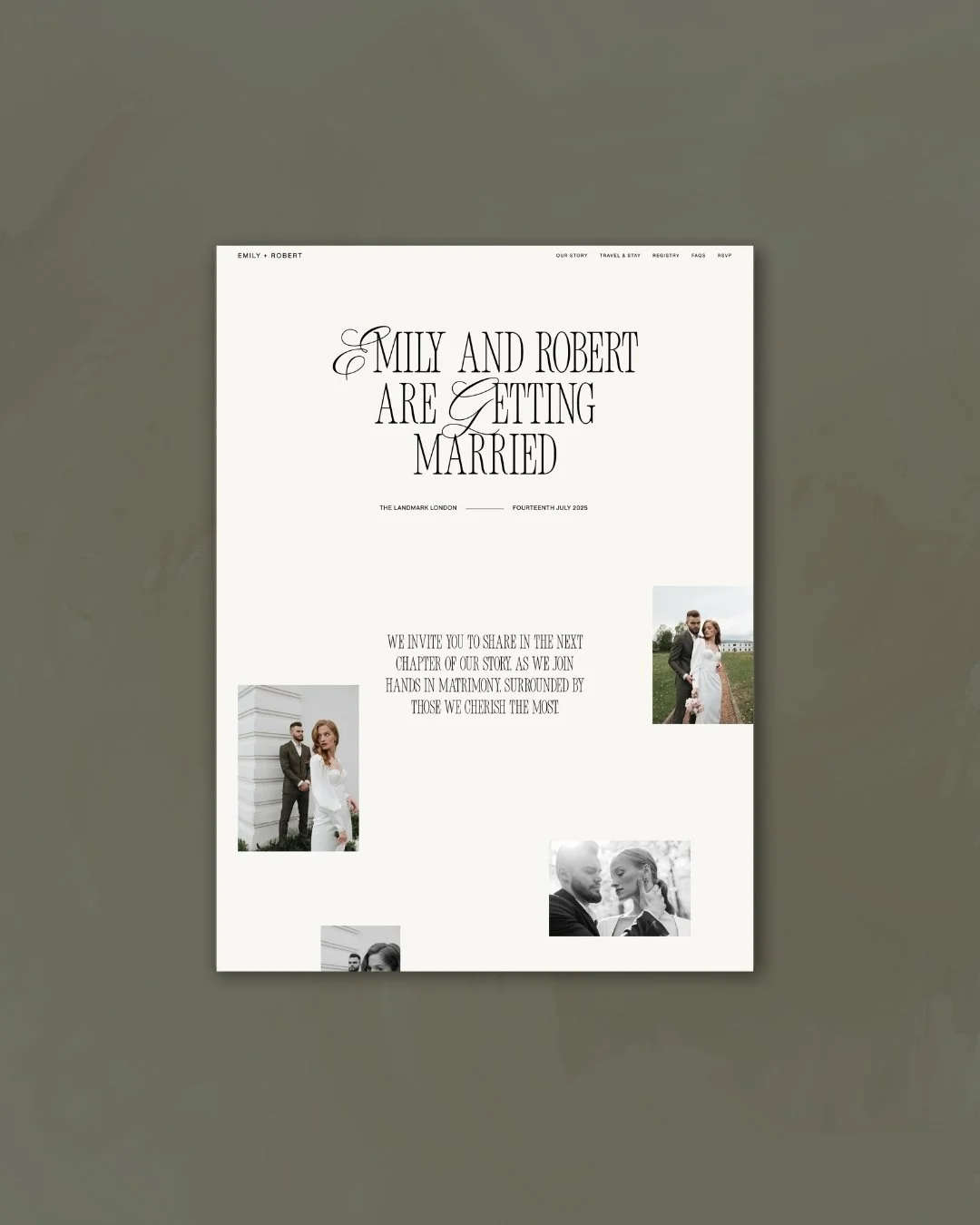
Home page
The Inspiration
The collection takes its name from the London neighbourhood — and from everything that name carries with it. Chelsea is not the loudest part of the city. It is one of the most considered. Its streets are lined with Georgian terraces and garden squares, the architecture precise and proportioned, the palette the particular range of stone and slate and cream that London does so well. History is present in every facade, but it does not feel heavy. It feels lived in — elegant without effort, refined without distance.
That atmosphere — sophisticated, a little moody, deeply rooted in place — became the emotional foundation of the collection. Not London as tourist landmark, but London as the city its residents love: the quieter streets, the private gardens, the light through tall sash windows on a grey morning. The particular charm of a city that has been doing elegance for long enough to make it look effortless.
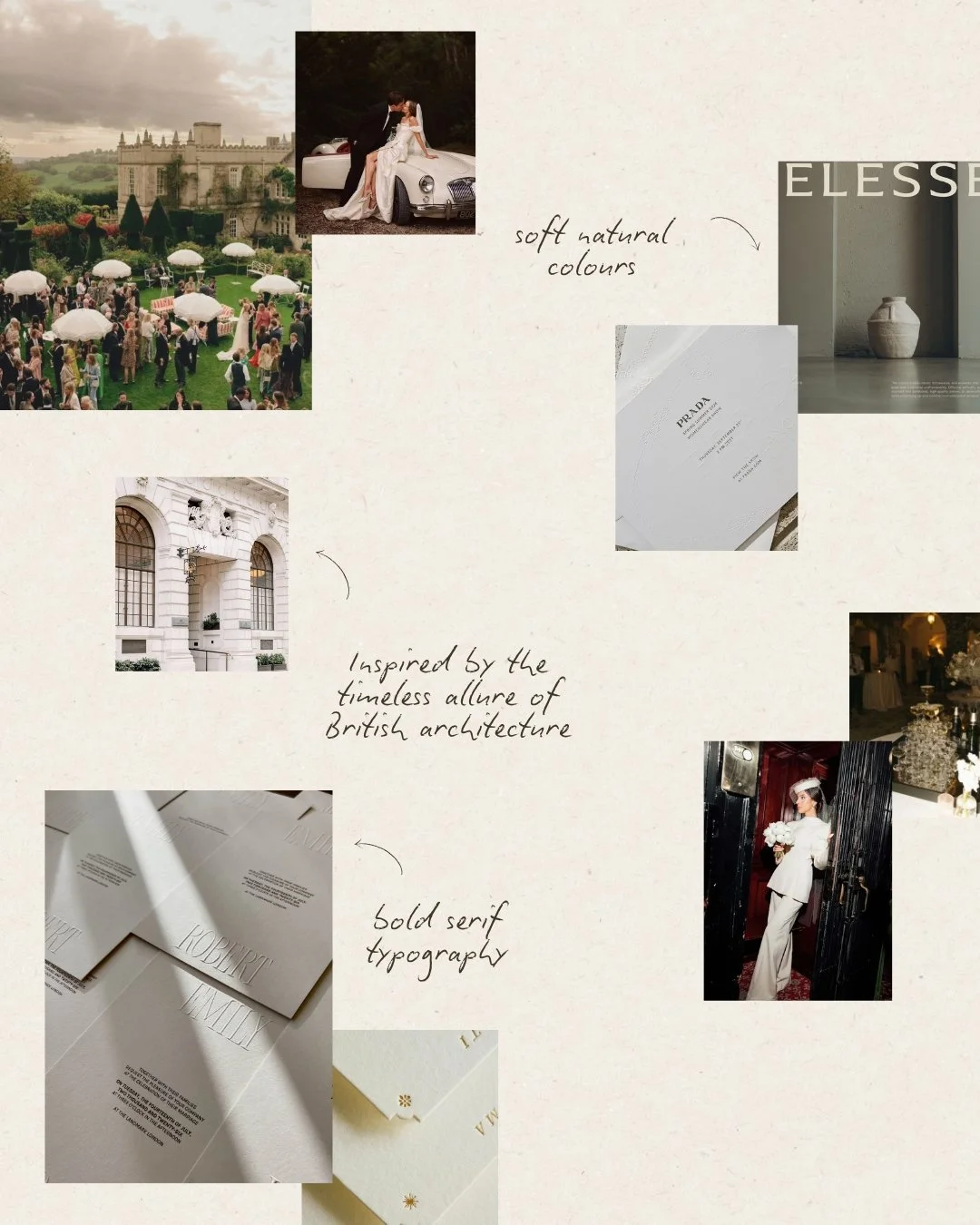
Mood board
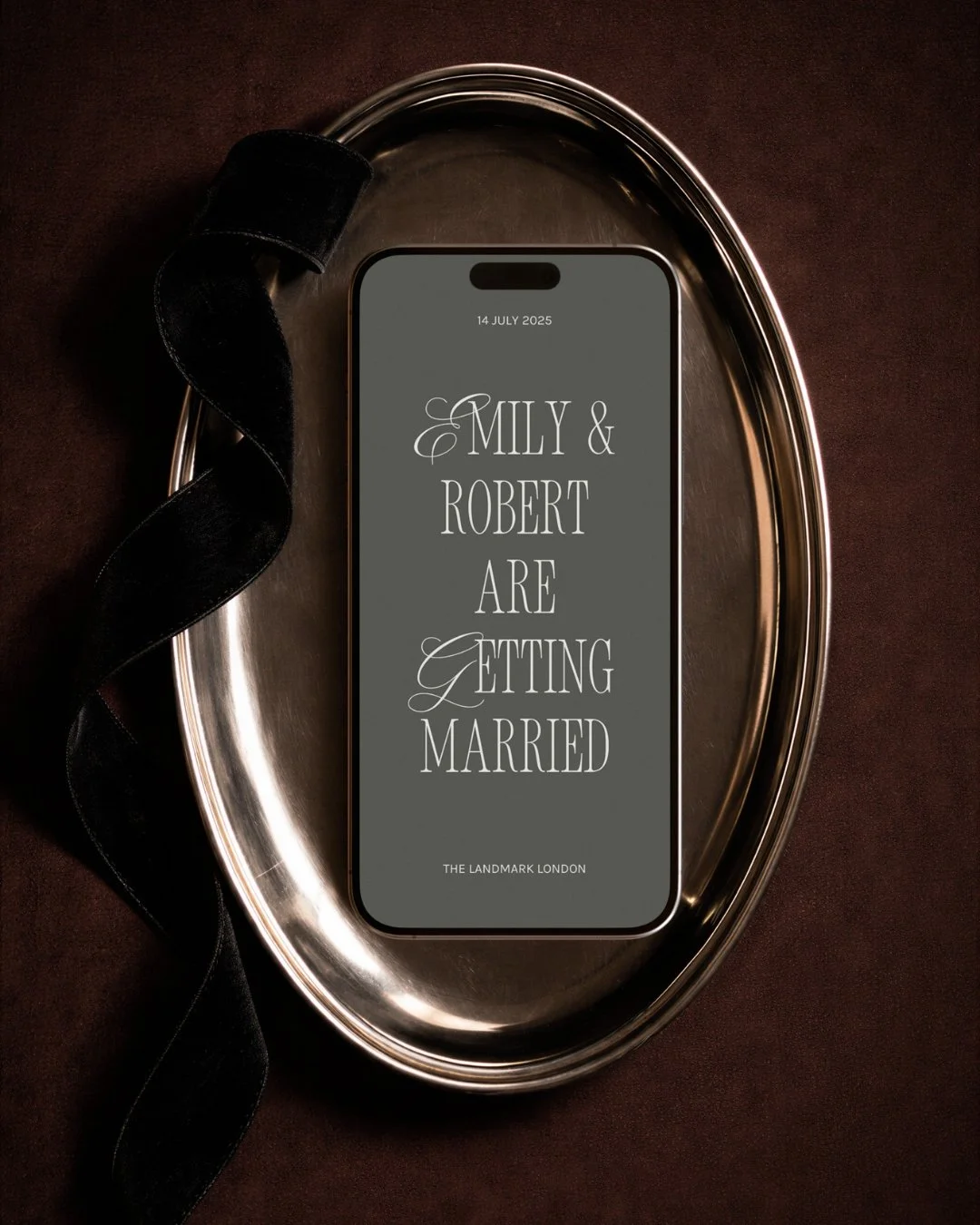
Mobile view
What the Collection Is For
Chelsea was made for the couple who does not need to be told what luxury looks like. They already know. They are drawn to things that are considered rather than conspicuous — the weight of good furniture, the proportions of a well-designed room, the way a restaurant earns its reputation quietly rather than loudly. Their aesthetic is refined and deeply personal, and it has nothing to do with trend.
They may be marrying in London — a Chelsea townhouse, a Mayfair private members' club, a garden in Kensington. Or they may be marrying elsewhere entirely — at a country house in the Cotswolds, a Georgian estate in Edinburgh, a beautifully proportioned venue in Dublin — and finding in Chelsea's aesthetic a reflection of how they see the world and the kind of wedding they want to give their guests. The location matters less than the sensibility: architectural, intimate, quietly and entirely luxurious.
The Design
The first decision was the palette, and the palette was an act of restraint.
Grey and soft beige — not the warm tones that most wedding design reaches for, but something cooler and more architectural. The grey of London stone on a clear day. The soft beige of aged plaster, of Georgian stucco, of a letter written on heavy paper. Together they create a foundation that feels inherently sophisticated — the kind of palette that improves with time, that looks as considered in the wedding photographs five years later as it does on the day.
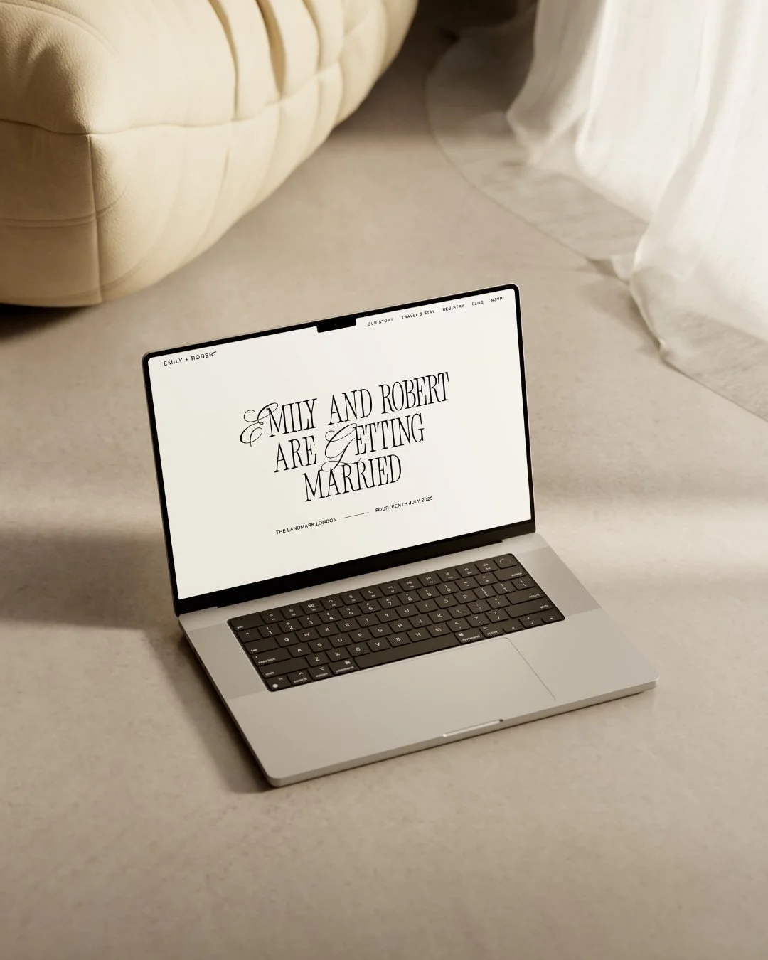
Against this, white space functions not as absence but as architecture. The generous breathing room between elements — the deliberate emptiness that frames each detail — is borrowed directly from Georgian design logic, where the proportions of what is not there matter as much as what is. In Chelsea, white space is structural. It gives the bold typography room to command attention without overwhelming. It makes the website feel composed rather than crowded — calm, clear, entirely in control.
Colour blocking adds a further layer of considered structure. Each section of the page is defined by tone, the eye moving naturally from one to the next, the transitions purposeful rather than decorative. It is the same logic that makes the facades of Belgravia so satisfying: repetition, proportion, and a confidence in the beauty of the whole over any individual part.
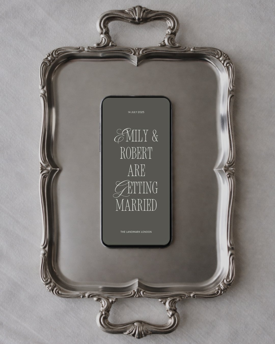
Typography is where Chelsea makes its most defining statement. New Icon Serif — a bold, high-contrast serif with genuine architectural authority — commands each page with the confidence of a well-chosen title on a well-designed book. It does not try to charm. It simply is. Paired with PP Neue Montreal, a clean and contemporary geometric sans-serif that carries the body of the website with quiet precision, the typographic system holds a tension that is entirely Chelsea: formal and warm, architectural and human, confident and genuinely inviting. The contrast between them — one bold and historical, one clean and contemporary — mirrors the collection's central idea: that London's enduring appeal lies in exactly this kind of productive tension between the old and the new.
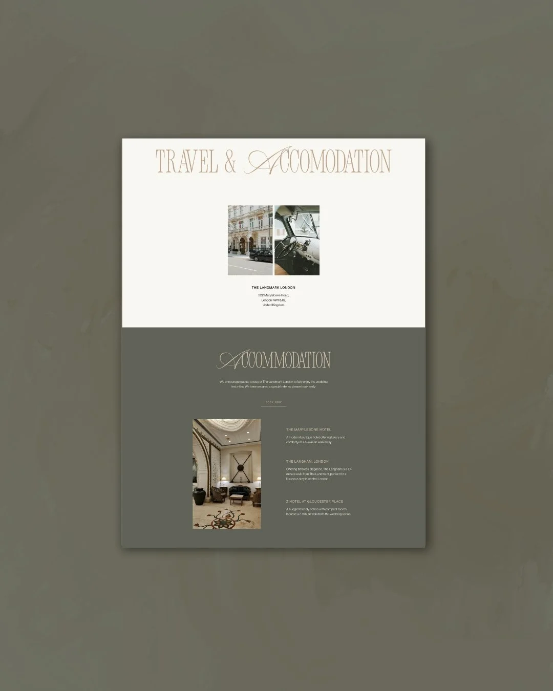
Travel and Accomodation Page
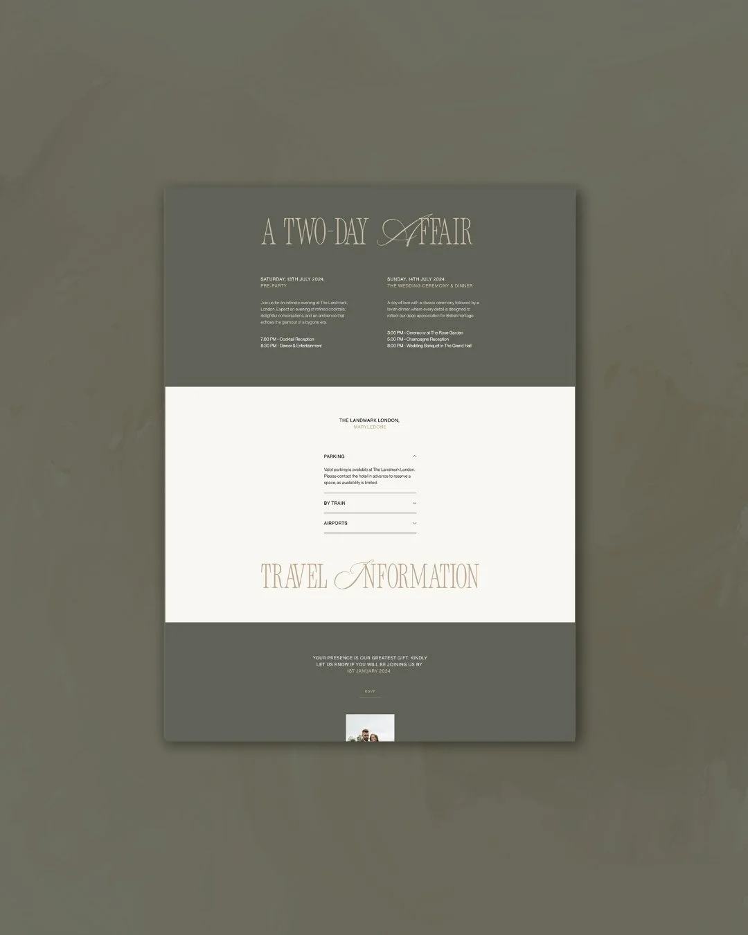
Event Page
What It Carries
The Chelsea wedding website moves through its nine pages — Welcome, Our Story, Travel & Stay, FAQs, Event, Registry, Menu, RSVP, Save the Date — with the unhurried authority of a place that knows exactly what it is. Each section is given room to breathe. The navigation is clear and intuitive. The hierarchy of information is immediately legible without any element needing to compete for attention.
What the design carries, beneath the typography and the palette, is a particular quality of care. The kind of care that does not draw attention to itself — that is felt rather than noticed. Guests arrive at the website and understand, before they have read a single detail, that every decision here has been made with intention. That the wedding this website represents is going to be beautiful, and beautifully run.
The printed stationery suite extends the collection into the physical world: bold architectural typography on refined, textured materials, the design logic consistent across every touchpoint from the first save the date to the last table card. When a Chelsea couple hands a guest their invitation, the world of the wedding has already begun.
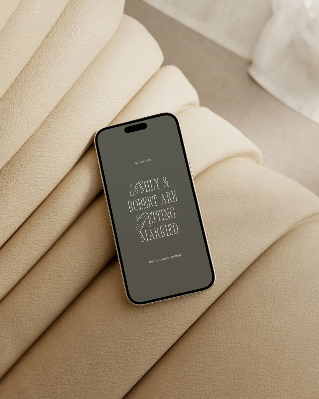
Home Page. Mobile view.
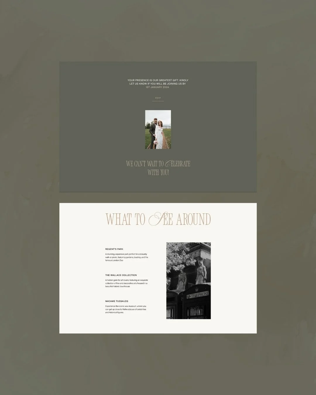
Travel & Stay Page
A Collection with a Point of View
Chelsea does not try to appeal to everyone. It is for the couple who finds beauty in restraint — who understands that a well-proportioned room says more than an elaborately decorated one, that typography can be as emotional as a photograph, that quiet confidence is the most enduring form of luxury.
If your wedding has that quality — if you are drawn to the considered, the architectural, the deeply and unapologetically refined — Chelsea may be exactly the right collection for you.
The demo site is open to explore, and we are currently taking enquiries for the Chelsea Collection across both the Light (from €950) and Core (from €1,500) packages.
read more