Behind the Design: The Giona Collection — Italian Wedding Website Inspiration
Some collections begin with a mood board. Some begin with a colour that refuses to leave you alone, or a typeface discovered somewhere unexpected that immediately feels like the answer to a question you had not yet asked.
Giona began with a wedding — and with a gap that two designers, looking at the world through professionally trained eyes, found they simply could not overlook.
Where it started
Before Avelã White existed, we ran Avelã Creative — a web design and branding studio we founded over eight years ago. We have spent that time building brands and digital experiences for businesses across Europe and beyond: considered, precise, built to communicate something specific about who a client is and what they stand for. Design has always been the language we think in.
When we began planning our own destination wedding in Italy, we brought that same eye with us — and found, quickly, that nothing in the wedding industry reflected the level of thought we were used to applying to everything else. The platforms were functional. The templates were interchangeable. There was nothing that could hold both the beauty and the logistical complexity of an international celebration at the same time. Nothing that felt as considered as the wedding itself was going to be.
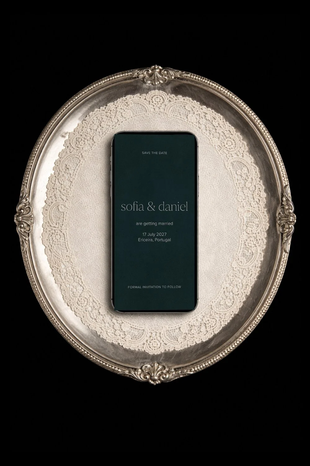
“We wanted a website that would make our guests feel something before they ever arrived,” says Katerina, Creative Director and co-founder. “Something that would set the tone, create real anticipation — and also quietly answer every question before it was asked. That combination — emotional and practical, beautiful and considered — didn’t exist. So we built it.”
That gap became Avelã White.
And the first collection we designed — the one that established the studio’s early voice and direction — was Giona.
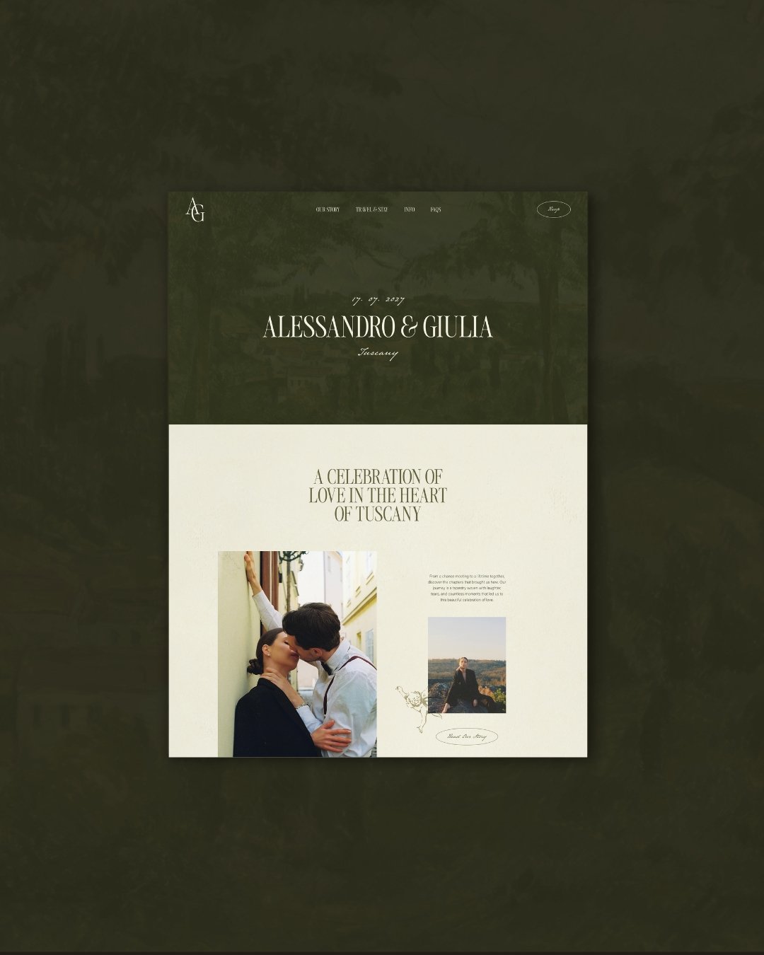
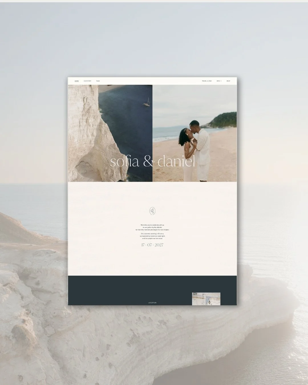
Home page
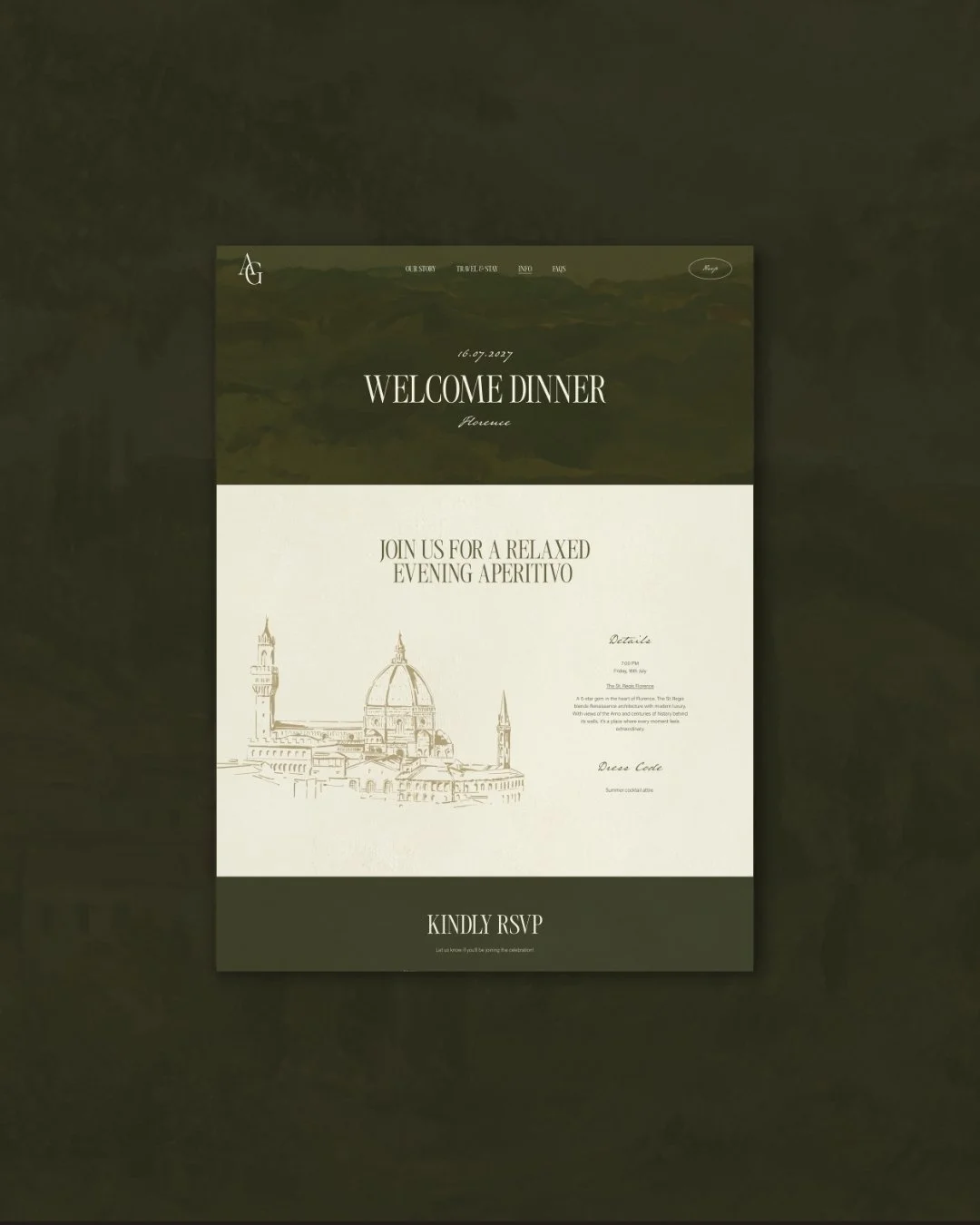
Event page
The name
Giona takes its name from a sixteenth-century villa set in the hills above Verona, in the heart of the Valpolicella wine region. It is the kind of place that exists, seemingly, entirely outside of time. Long avenues of cypress trees, ancient gardens, vineyards tended across generations, stone walls that carry the warmth of every summer they have ever absorbed. The architecture is Renaissance, the landscape is Italian in the most essential sense — considered, beautiful, and completely without pretension.
It was this world — the atmosphere of an Italian estate, of celebrations held in spaces that feel at once vast and intimate — that shaped the collection from the beginning. Not as direct reproduction, but as a feeling translated into design. The particular quality of a summer afternoon in the Veneto. The unhurried elegance of stone and shade and old linen. The kind of beauty that does not announce itself.
What the collection is for
Giona was designed for a specific kind of couple: one drawn to Italy not because it is fashionable, but because something in it — the history, the light, the pace, the way beauty is simply woven into the landscape — speaks to who they are and how they want their wedding to feel. It suits celebrations in Tuscany, the Veneto, Amalfi, Sicily, Puglia.
It suits couples who are not marrying in Italy but whose aesthetic lives in that world — who love old paintings and warm stone, the texture of aged paper, the handwriting in letters that have lasted for centuries. This is not a collection for couples chasing a trend. It is for those who feel something specific when they look at an ancient garden in afternoon light, and want their guests to feel it too.
Giona is not a collection that announces itself. It reveals itself — quietly, the way Italy itself does, the more time you give it.
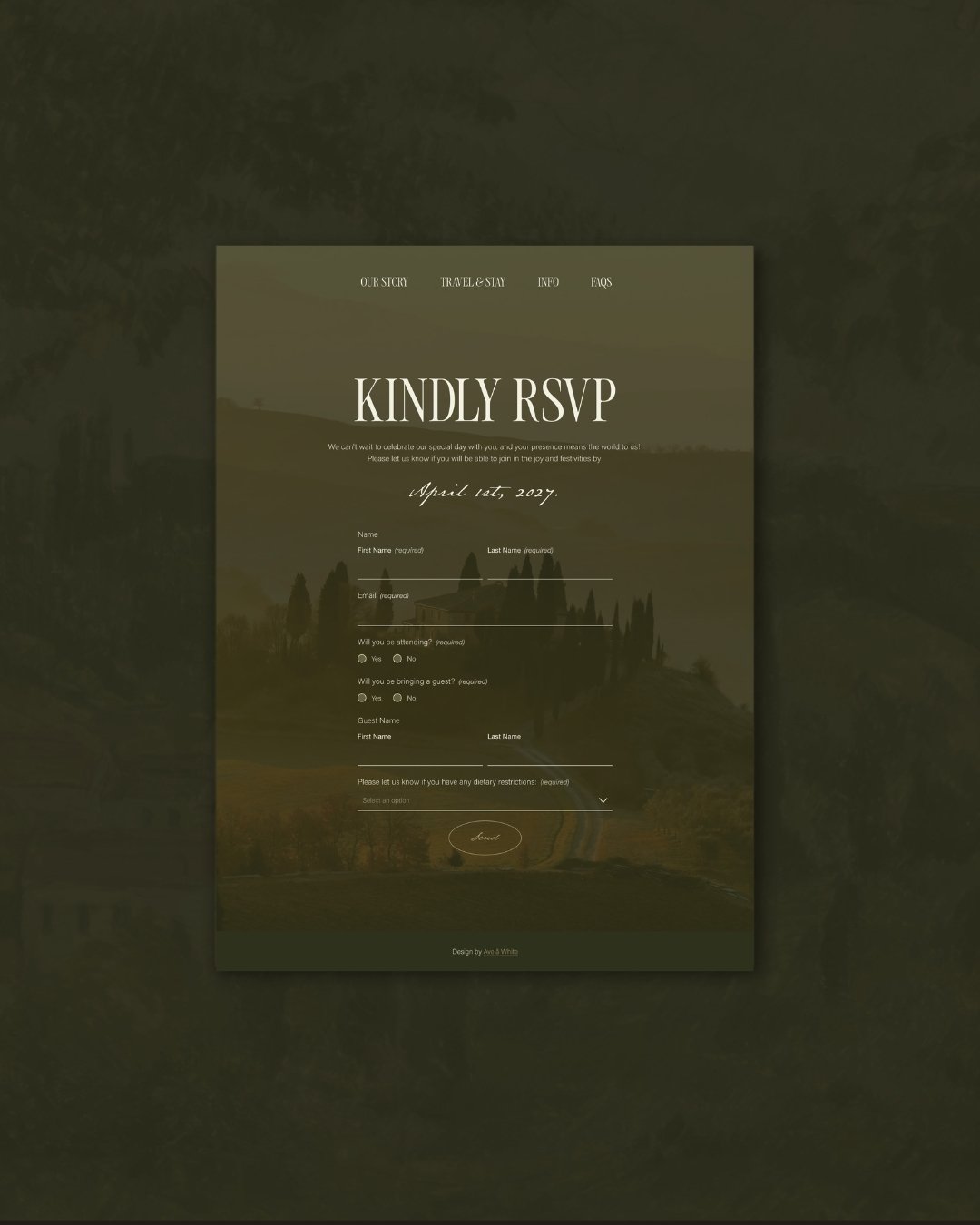
RSVP page
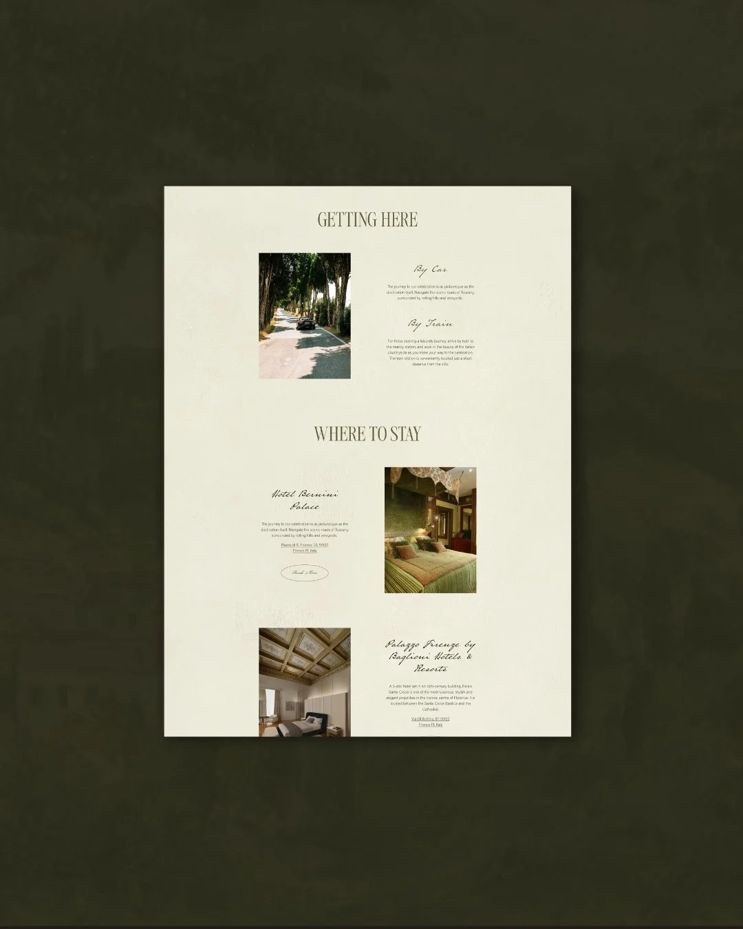
Travel and Stay page
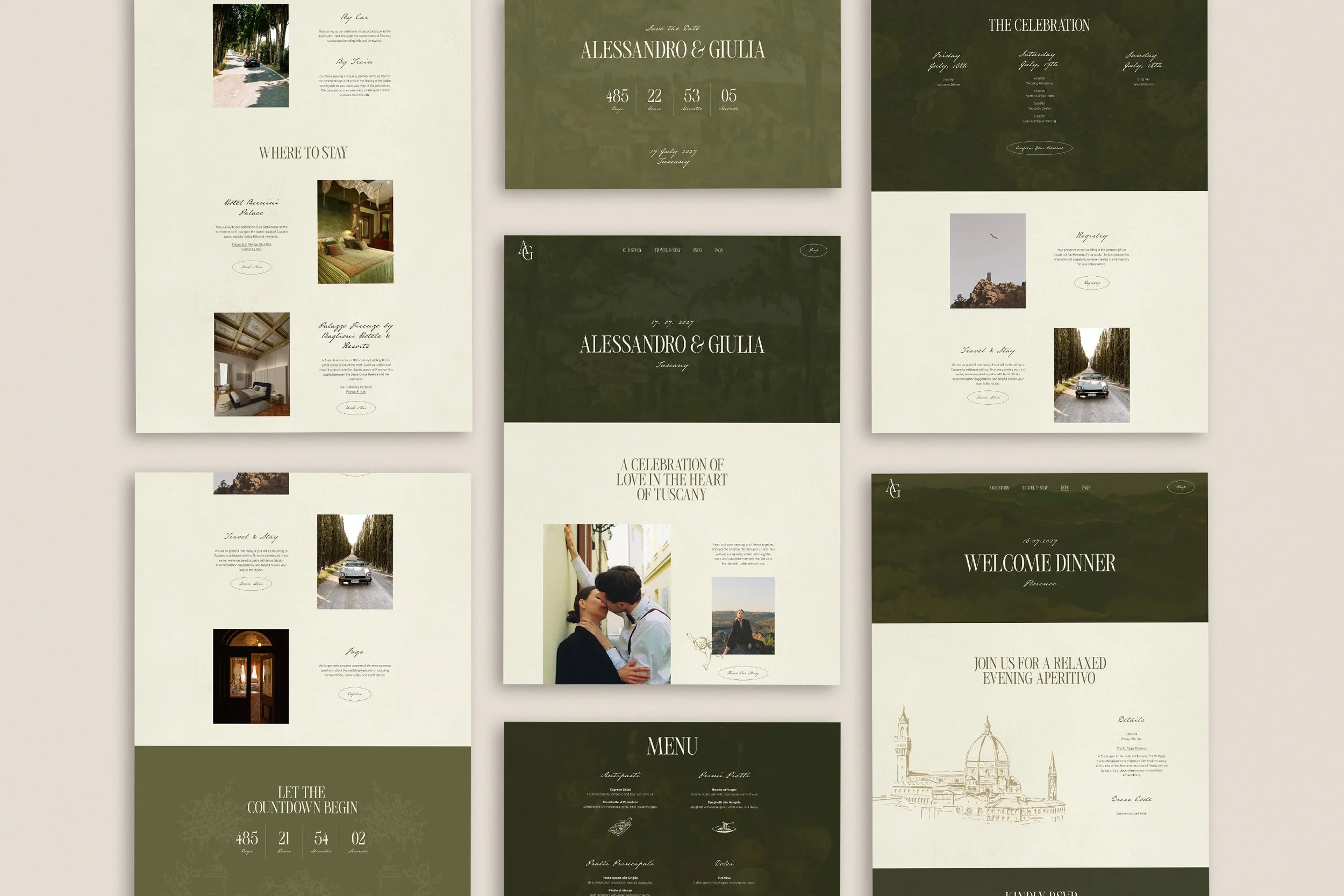
The design
The redesign of Giona — the new edition, released this year — began with a single question: what does an Italian summer actually feel like, translated into type and colour and line? That the work landed when it did was not entirely coincidental. The timing fell on our civil wedding anniversary — a quiet symmetry that felt right for a collection rooted, from the very beginning, in the story of how this studio came to exist.
The answer arrived slowly, as the right answers usually do. Warm but never loud. Regal but never stiff. With the quality of something old that has been cared for — not preserved behind glass, but lived in, loved, and still very much in use.
Typography was the first decision and, as always, the most consequential. The pairing brings together a classic, high-contrast serif — the kind of letterform that belongs in a book printed in Florence in the seventeenth century — with Austin Pen, a handwritten script that carries the feeling of a personal letter, written at a careful pace by someone who means what they are saying. Together, the two fonts hold a tension that feels distinctly Italian: formal and intimate at once, structured and alive. The serif grounds the design in history. The script brings it back to the human.
Colour followed from typography. The palette is built around warm beige — not the flat, pale cream of a generic Italian wedding website template, but the particular tone of old paper: slightly textured, slightly golden, the colour of documents that have been handled many times by people who valued what they were holding. Against it sit deep greens drawn from the Italian garden — the precise shade of an ancient hedge, of olive leaves in the afternoon light, of the long shadows beneath a vine-covered pergola. Together, they are earthy and elegant in equal measure, entirely free of trend, the kind of palette that will look as right in five years as it does today.
Illustration has always been part of Giona’s DNA, and in the new edition it has been refined rather than replaced. Subtle linear drawings — botanical, quietly architectural, precisely placed — bring a layer of texture and character that photography alone cannot provide. They are the visual equivalent of hand-pressed detailing on a piece of fine stationery: purposeful, personal, and entirely in keeping with the world they inhabit. A sprig of olive. The silhouette of a cypress against a pale sky. The suggestion of a wrought-iron gate, half-open.
The overall effect is calm and considered. The design’s pace is slow, in the best possible sense — it asks guests to settle in, to look closely, to take their time. Because the wedding it represents is one worth taking seriously.
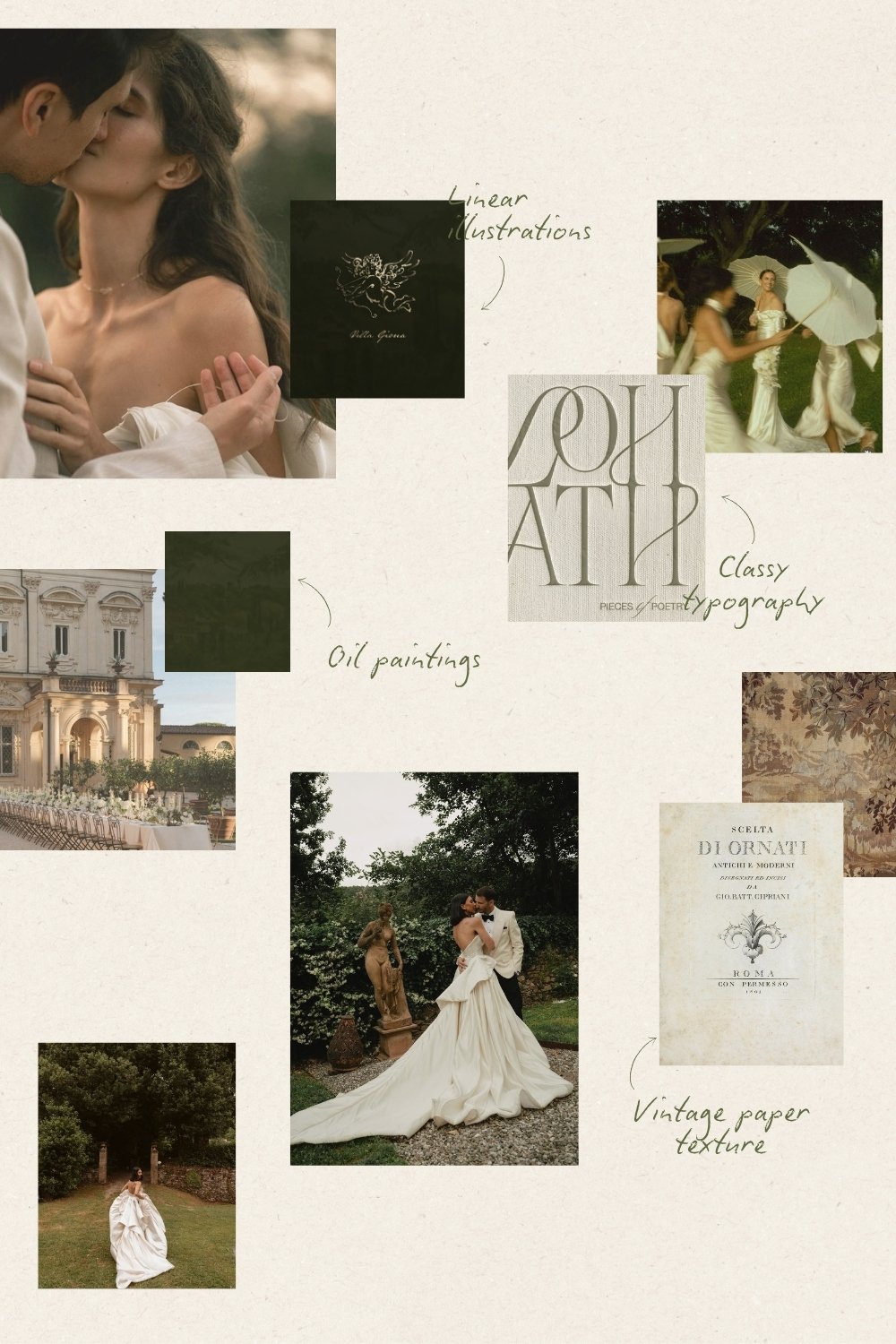
Mood board
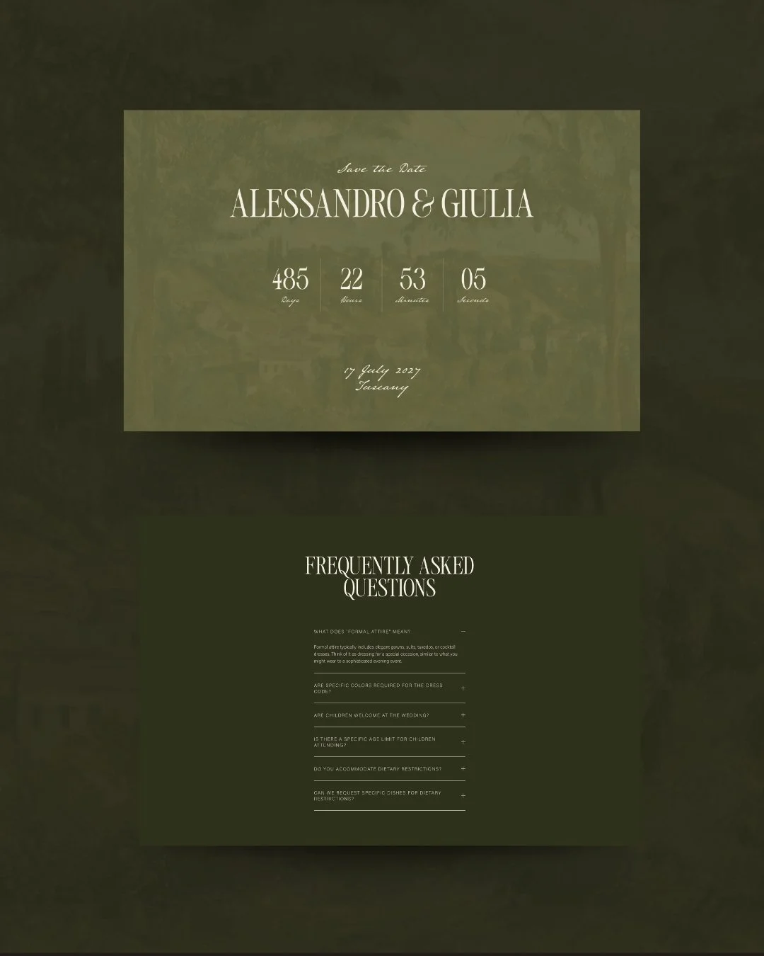
Save the date and FAQ pages
What it carries
Beneath the typography and the colour and the illustration, Giona carries a particular understanding of what an Italian destination wedding website actually needs to do.
When guests are travelling from London, New York, Sydney, or São Paulo to celebrate with you in a region they may never have visited, your wedding website is not simply a repository of information. It is the first experience of your wedding — the moment your guests begin to understand what they are travelling towards, months before the day itself. It is where they book accommodation, find the right airport, understand the dress code for a black-tie dinner held under the open sky. It is where they read the local guide and discover, perhaps for the first time, what makes this part of Italy worth the journey.
The Giona wedding website was designed to hold all of that without losing a single note of its atmosphere. The warmth of the welcome page. The intimacy of the love story. The practical clarity of the Travel & Stay section, which gives guests everything they need without ever feeling like a logistics document. The FAQ page that anticipates every question a guest might hesitate to ask. Nine thoughtfully designed pages — Welcome, Our Story, Travel & Stay, FAQs, Event, Registry, Menu, RSVP, Save the Date — each as considered as the last, each contributing to a complete and coherent guest experience.
This is what a luxury Italian wedding website design can be, when it is approached with the same intention as everything else you have chosen for the day.
The new edition
Giona has been part of Avelã White since the very beginning — one of the first collections we designed, and one that has always drawn exactly the couples it was made for. The new edition deepens what was already there: more considered typography, a more refined palette, a more assured illustration style. The same world, taken further into itself.
The demo site is open to explore, and we are currently taking enquiries for the Giona Collection across both the Light (from €950) and Core (from €1,500) packages.
If you are planning a wedding in Italy — or a wedding that carries that particular warmth, history, and quiet elegance — Giona may be exactly what you have been looking for.
read more