Behind the Design: The Seine Collection — Parisian Wedding Website Inspiration
There is a particular kind of elegance that belongs to Paris and nowhere else. It is not the elegance of grand gestures or obvious glamour. It is the elegance of restraint — of a perfectly proportioned room, a well-chosen typeface, a colour that does not announce itself but simply feels entirely right. It is the elegance of things that have been considered carefully and then allowed to appear effortless.
The Seine Collection was designed around that idea
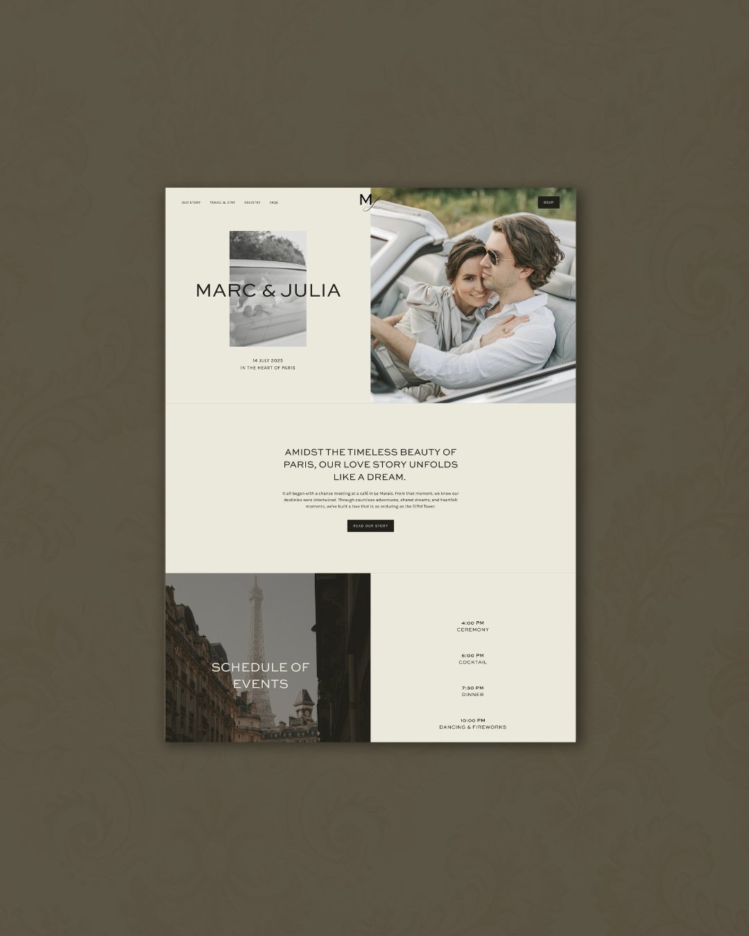
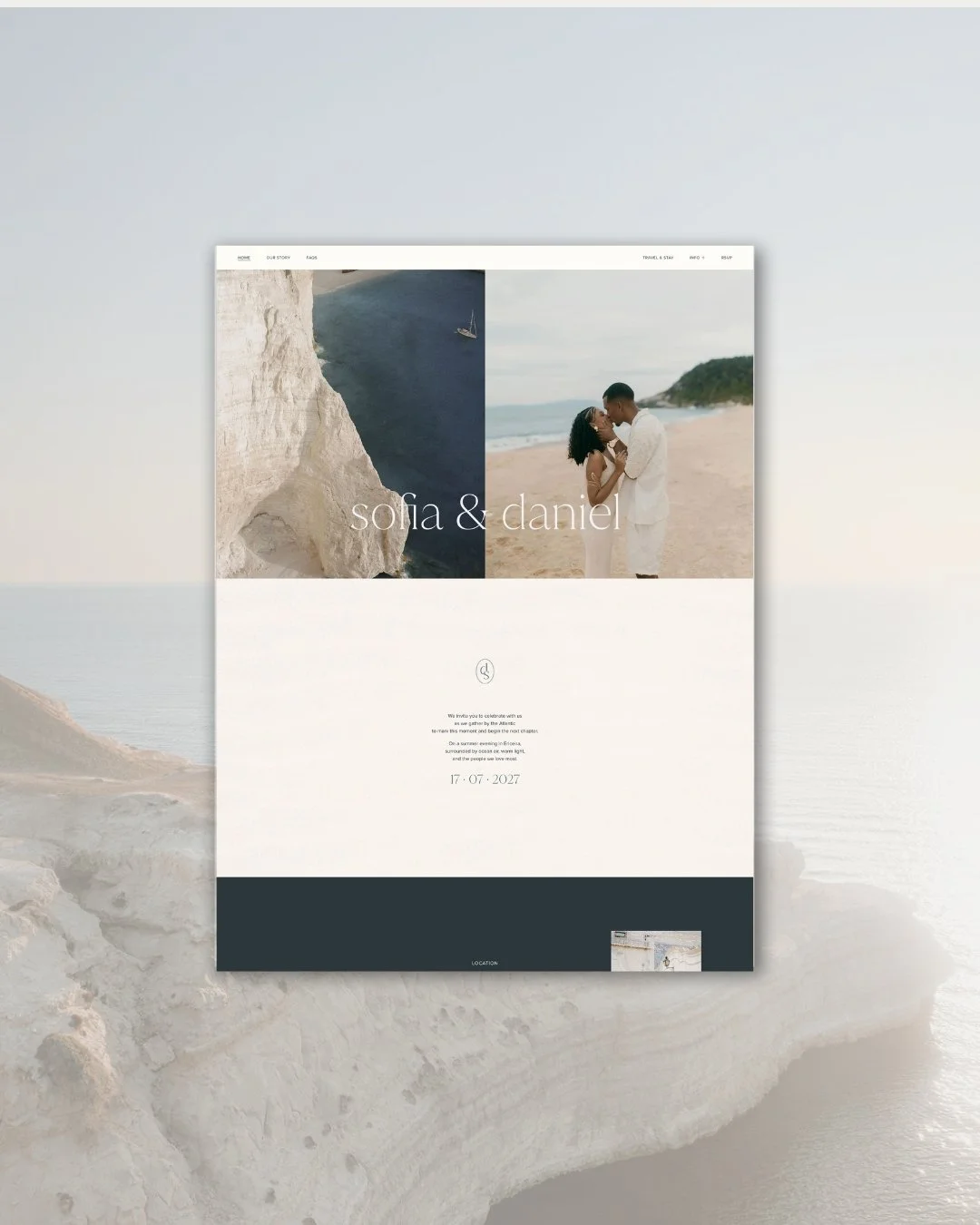
Home page
What Paris actually looks like
Most things described as Parisian are not really Paris at all. They reach for the obvious — the tower, the red lips, the clichéd romance of a city that has been imitated so many times the imitations have become the reference. The Seine Collection is not that.
The Paris that inspired this collection is quieter and more specific. It is the particular warmth of Haussmann stone in afternoon light — that golden, slightly amber tone that makes the city glow in a way no other city quite manages. It is the clean lines of a well-proportioned façade, repeated endlessly across wide boulevards, where the beauty comes not from any individual detail but from the whole. It is the atmosphere of a good restaurant at eight in the evening, the light low and warm, everything unhurried. It is the Seine itself at dusk — the water dark, the bridges lit, the city going quietly about its business around you.
This is the Paris the collection holds. Not a postcard. A feeling.
About Page
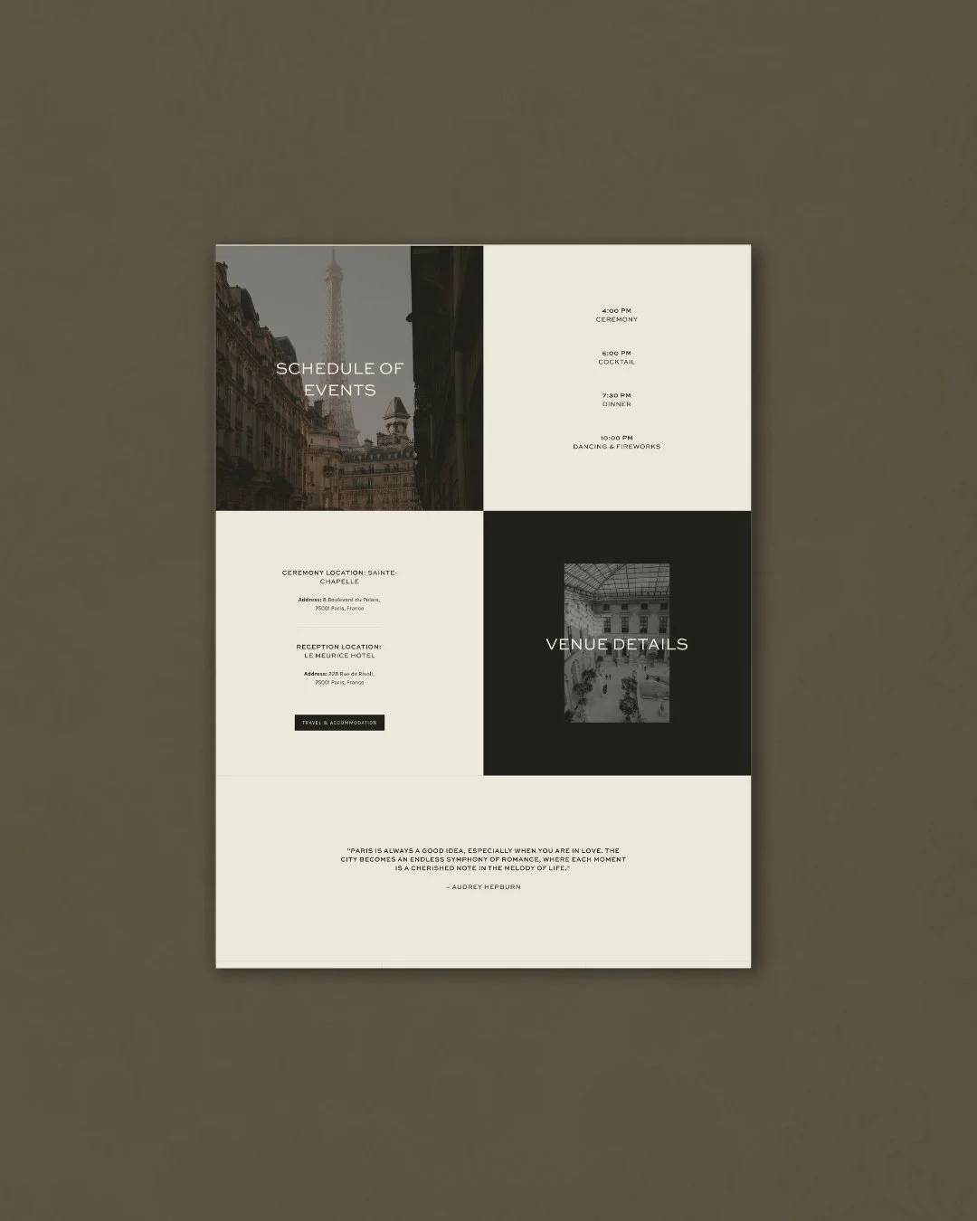
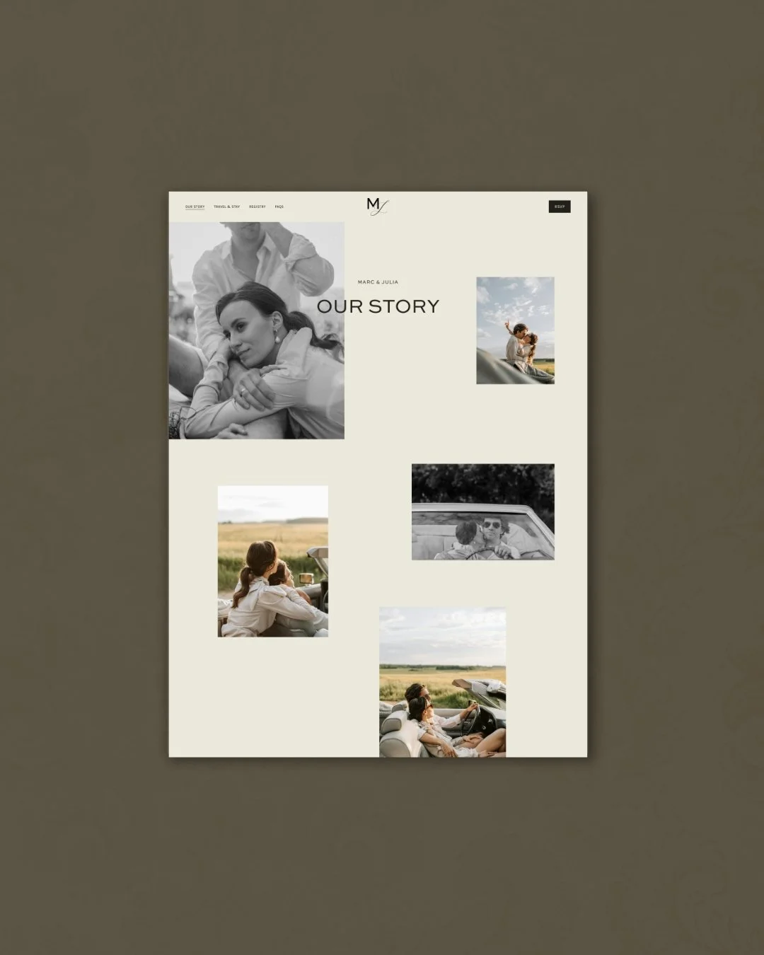
Events Page
Colour
The palette begins with architecture. The warm, creamy stone of Parisian buildings — not quite white, not quite gold, but somewhere in between — provides the foundation. It is a tone that reads as sophisticated without being cold, warm without being heavy. It has the quality of something that has been standing for a long time and intends to stand for much longer.
Against this, the deeper tones of Parisian evening: the particular shade of a shadow on a stone wall, the colour of the Seine in fading light, the warm neutrals that make the city feel inhabited and alive rather than designed for display.
What the palette avoids is equally important. There is no blush. No dusty rose. No sage green borrowed from a trend that will have passed by the time the wedding photographs are framed. The Seine Collection was built to look as considered in five years as it does today — which required choosing colours that belong to no particular moment, only to a particular feeling.
The colours are used structurally throughout the website layout — what we call colour blocking — not as decoration but as architecture. Each section of the page is defined by tone rather than line, the eye moving naturally from one to the next without effort or instruction. It is a technique drawn directly from the proportional logic of Parisian facades, where harmony comes from considered division rather than ornament.
Typography
The typographic decision for the Seine Collection was Sweet Sans Pro — a geometric sans-serif that is minimal without being cold, clean without being clinical. It is the kind of typeface that does not draw attention to itself. It simply makes everything around it look better.
This restraint was entirely deliberate. In a collection defined by quiet elegance, expressive or decorative typography would have broken the atmosphere immediately. Sweet Sans Pro holds the design together from the inside — giving it structure and clarity while remaining completely in service of the content it carries.
The result is a website that reads effortlessly. The hierarchy is clear. The navigation is intuitive. Nothing competes for attention because nothing is trying to. The typography, like the best typography always does, disappears into the reading experience — and what remains is the feeling of a website that simply works, beautifully.
This is also what makes Seine particularly well-suited to couples who want their wedding content — the love story, the schedule, the local guide — to be the thing guests remember, rather than the design itself. The design makes space. The words fill it.
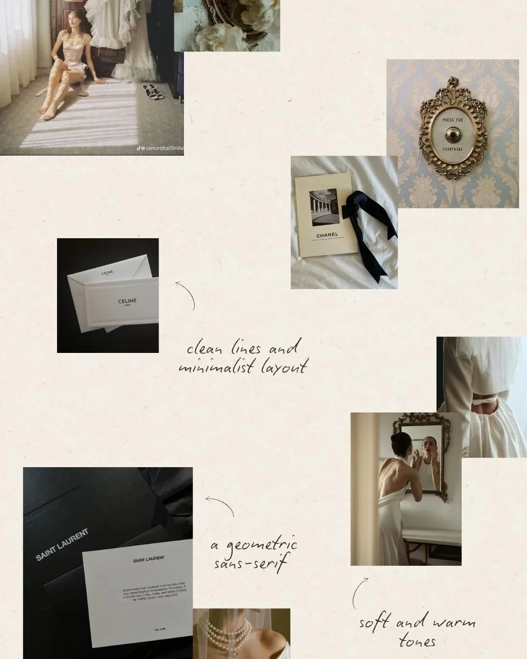
Mood Board

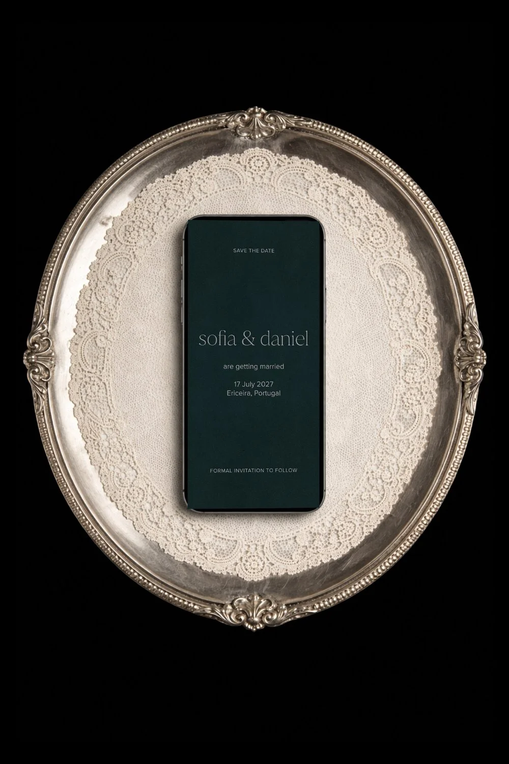
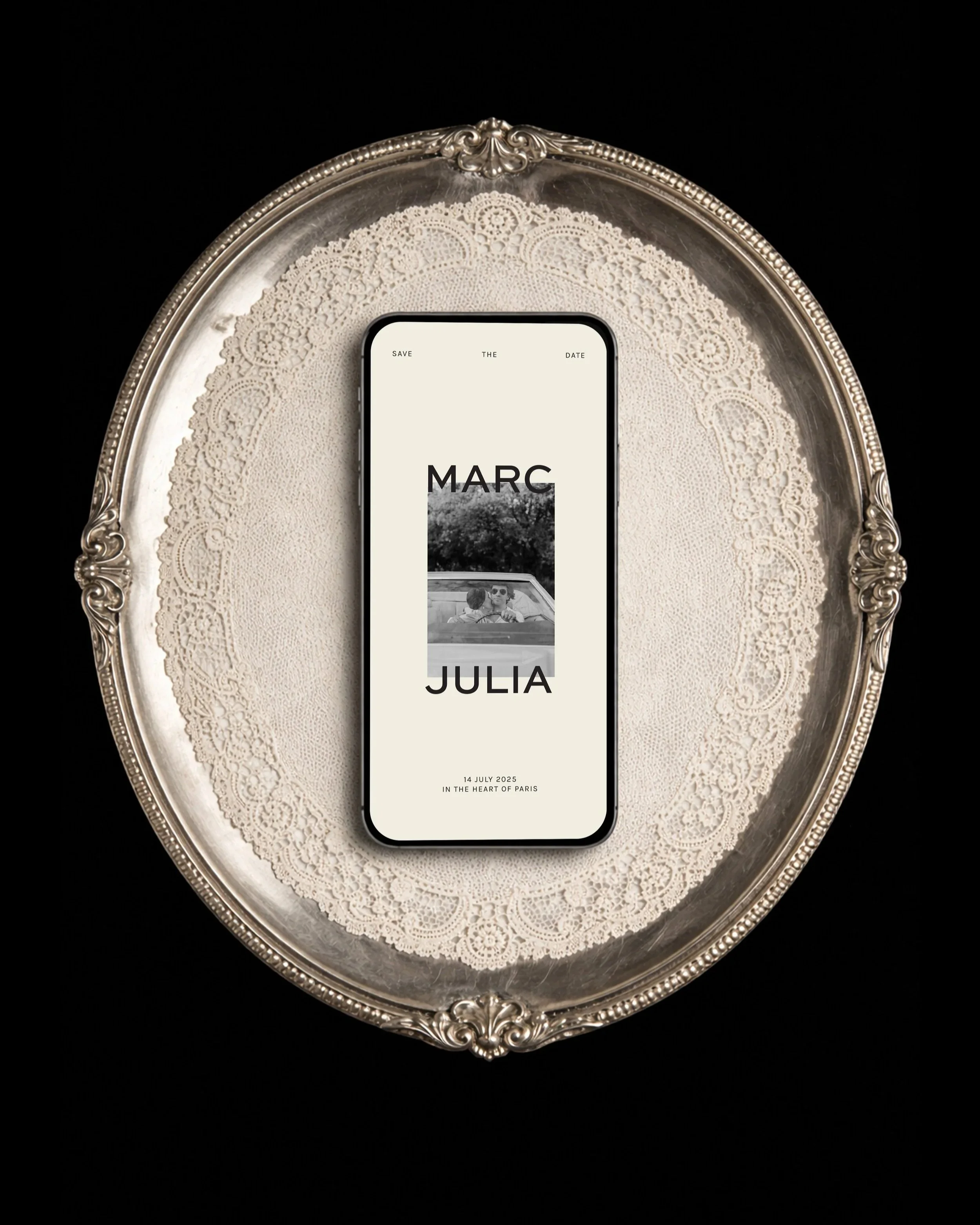
Home Page (mobile view)
Layout
The clean lines and minimal structure of the Seine layout were not a stylistic choice so much as a philosophical one. Parisian interiors, at their best, are not sparse — they are selective. Every object earns its place. Nothing is present without reason. The effect is a kind of calm that feels generous rather than austere, because the space itself becomes part of the experience.
The Seine website follows the same logic. The layout gives each section room to breathe. The navigation is considered rather than comprehensive. The information hierarchy is clear enough that a guest arriving on any page knows immediately where they are and what to do next.
Functionality and elegance are not in tension here — they are the same thing. A website that is difficult to navigate is not elegant, however beautiful it looks. A website that is easy to use but visually ungainly is not functional in the truest sense, because it fails to set the right tone for the celebration it represents. Seine was designed to do both simultaneously, without either being compromised by the other.

RSVP Page
Mobile optimisation
The stationery suite
The Seine Collection extends beyond the website into a complete suite of digital and printed pieces — and it is in the stationery that the design reaches its fullest expression.
The digital save the date carries the same palette and typographic logic as the website: clean, warm, immediately recognisable as part of the same world. For couples who want to begin setting the tone from the very first communication — before the website is even visited — a Seine save the date does exactly that.
The printed invitation suite takes the collection into physical form: foil printing, minimal fonts, the particular quality that comes from something designed to be held as much as read. Foil was chosen not for drama but for depth — the way it catches light differently depending on the angle, the way it makes a surface feel considered without feeling excessive. It is, in its own small way, entirely Parisian.

Travel and Stay Page

Travel and Stay Page (Accommodation)
The couple Seine was made for
Seine suits a specific kind of couple — one who knows what they like and does not need to explain it. They are drawn to things that are considered rather than conspicuous. They appreciate quality in the details that most people never notice: the weight of good paper, the spacing between letters, the way a room is lit. Their wedding will be beautiful, and it will be beautiful in a way that does not require anyone to be told so.
They may be marrying in Paris, or in the south of France, or in a converted townhouse in London, or at a vineyard in Lisbon. The location matters less than the feeling — and the feeling is one of quiet romance and effortless refinement, the sense that everything has been attended to without anything having been fussed over.
If that is the atmosphere you are building towards, Seine was designed for you.
A collection that ages well
The deliberate choices behind Seine — the restrained palette, the geometric typography, the architectural layout — were made with longevity in mind. Wedding design that chases trends dates itself within a season. Design that is rooted in something more enduring — the proportions of a Haussmann building, the calm of a well-made room — remains as relevant the day after the wedding as the day the website launched.
Seine will look as beautiful in your wedding photographs as it does on your guests' phones the week before. That is not an accident. It is the point.
The demo site is open to explore, and we are currently taking enquiries for the Seine Collection across both the Light (from €950) and Core (from €1,500) packages.
read more