The name means white. But Shiro was never really about the colour.
It is about what white represents in Japanese design philosophy: purity, clarity, the space that allows everything else to be seen. Shiro is a collection built not around an aesthetic but around a way of thinking — one that Japan has been refining for centuries, and that we have been drawn to for as long as we can remember.
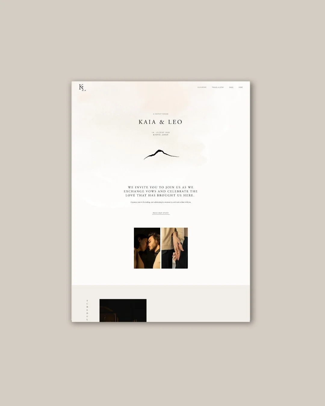
Home page
The Inspiration
Japanese culture and philosophy have shaped the way we think about design more than anything else. Not as a visual reference borrowed from the surface of a tradition — but as a genuine approach to making things. The idea that beauty lives in imperfection. That asymmetry, properly understood, is more harmonious than symmetry. That the mark left by time and use is not damage but depth. That a thing made with attention to the materials, the process, and the intention behind it is different in kind from a thing merely made.
Shiro grew from all of that — from years of returning to these ideas and finding them true in practice as well as in principle. The collection draws on several specific references from within Japanese design and craft: Kintsugi, the art of repairing broken ceramics, often using gold, where the repair is not hidden but celebrated; the tradition of harmonious asymmetry in Japanese composition, where balance is achieved through careful imbalance rather than mirrored symmetry; and the particular quality of natural materials — handmade paper, linen, unglazed clay — that carry the trace of their making in their surface.
These are not decorative references. They are structural ones. Each shaped a specific design decision.
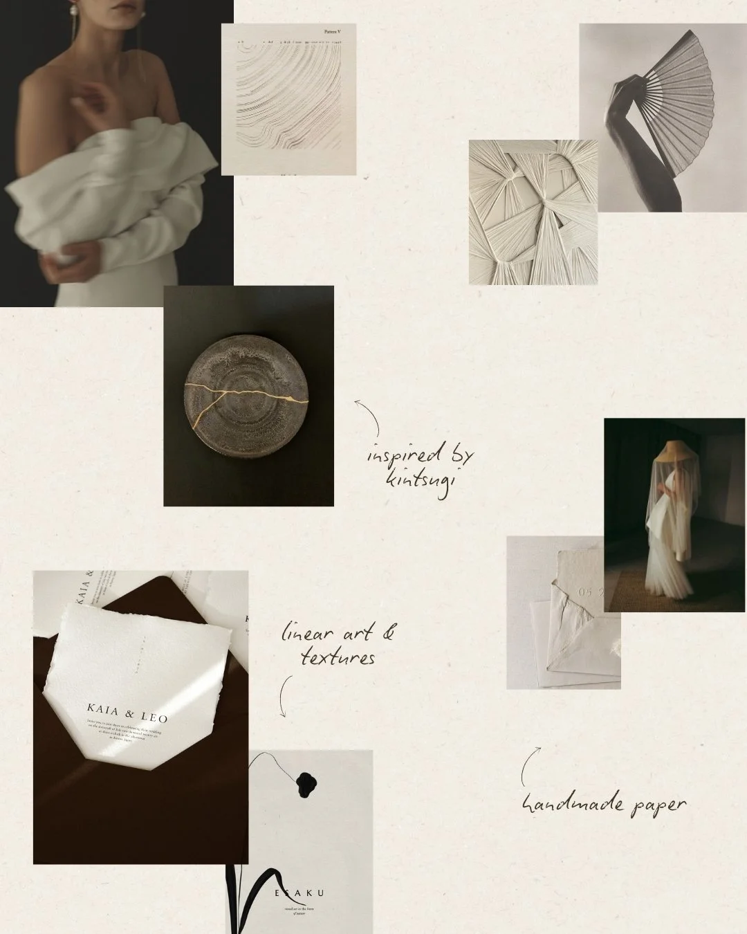
Mood board
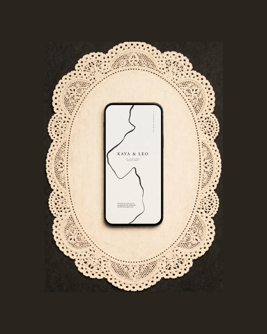
Mobile view
What the Collection Is For
Shiro was designed for the couple who is drawn to Japan not as a destination but as a sensibility — who finds the Japanese approach to beauty more compelling than the Western one, who values the made over the manufactured, the considered over the abundant.
They may be planning a wedding in Japan — in Kyoto, where every surface and every silence seems intentional, or in the countryside, where the architecture disappears into the landscape rather than competing with it. Or they may be marrying in a minimalist space anywhere in the world — a linen-walled room, a converted studio, a garden with no decoration beyond the garden itself — and finding in Shiro exactly the design language they had been trying to describe.
They are patient people, in the best sense. They are not trying to impress. They are trying to create something that feels right — that their guests will remember not because it was spectacular, but because it was considered in a way that very few things are.
The Design
The palette begins where Japan's design tradition so often does: with the earth.
Warm cream — the particular tone of handmade washi paper, of unglazed ceramic, of linen that has been washed many times — forms the foundation. It is not white. It is closer to what white becomes when it has been lived with, handled, made by hand rather than manufactured to a specification. Against this, deep brown — almost the colour of aged wood, of strong tea, of the marks left by a calligraphy brush on natural paper — provides the contrast. The two together create a palette that is warm without being soft, sophisticated without being cold. A palette that feels as though it has always existed and was simply found rather than chosen.
The textured background is one of the most important decisions in the collection. Digital design tends toward the smooth and the flat — surfaces that declare their own artificiality. Shiro goes in the opposite direction entirely. The background imitates paper: not perfectly, but honestly, with the grain and irregularity of a surface that has been made rather than generated. This texture is what gives the website its warmth, its depth, the quality of something you want to touch even through a screen. For the stationery suite, this logic extends into the physical world: handmade paper, chosen specifically for its surface, its weight, its visible making.
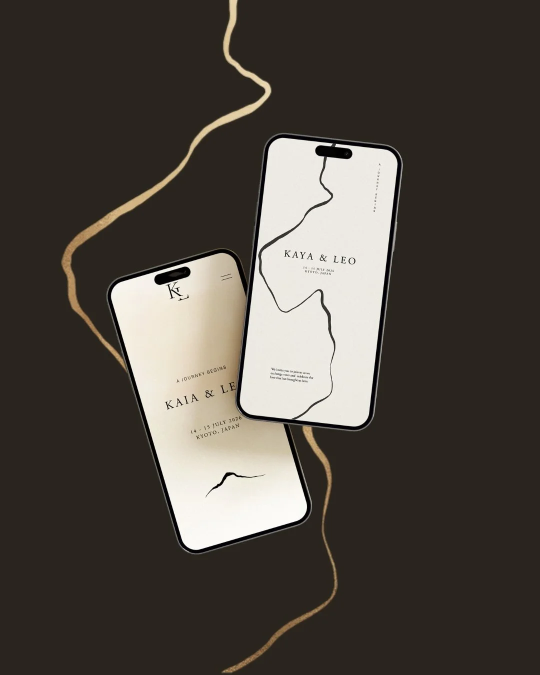
The graphic lines that run through Shiro were directly inspired by Kintsugi. In the Japanese ceramic tradition, broken objects are repaired — often with gold — and the repair is not concealed. It is displayed, celebrated, understood as the most beautiful part of the object. The lines in Shiro carry that same philosophy: precise, deliberate, placed where something has been joined or defined. They are not decorative. They mark where the design has been thought about most carefully.
The composition throughout follows the principle of harmonious asymmetry — the Japanese understanding that balance achieved through deliberate imbalance is more alive, more interesting, and more true to nature than the rigid symmetry that Western design often reaches for. Elements are placed off-centre with intention. Space is distributed unevenly, on purpose. The result is a layout that feels considered rather than constructed — organic without being accidental.
Typography in Shiro is where the collection's philosophy becomes most fully expressed. Adobe Garamond Pro — one of the great classical serifs, refined over centuries into a typeface of complete assurance — carries the entire collection. Not paired with anything. Not supplemented by a script or a sans-serif. Just Adobe Garamond Pro, used throughout, played with through spacing, weight, and direction.
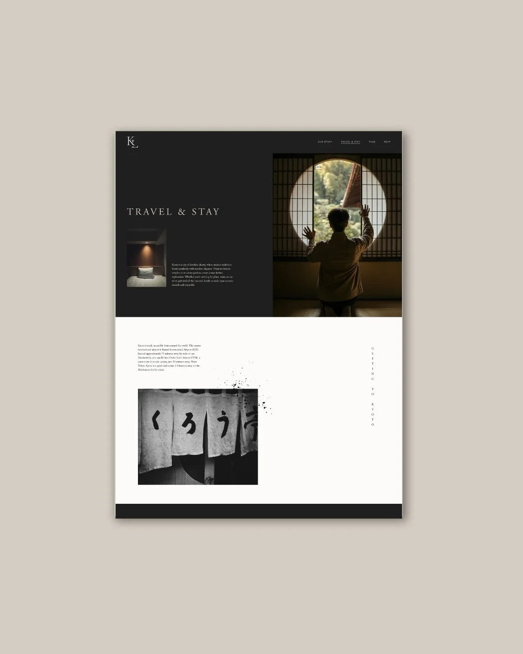
Some text runs vertically — a gentle nod to Japanese design, where the orientation of text has always been understood as expressive rather than fixed. A word turned on its axis says something different, not merely looks different. Used with the same restraint as every other decision in the collection, it adds a quiet distinctiveness that feels natural rather than decorative. Classy, calm, and entirely in keeping with the world Shiro inhabits.
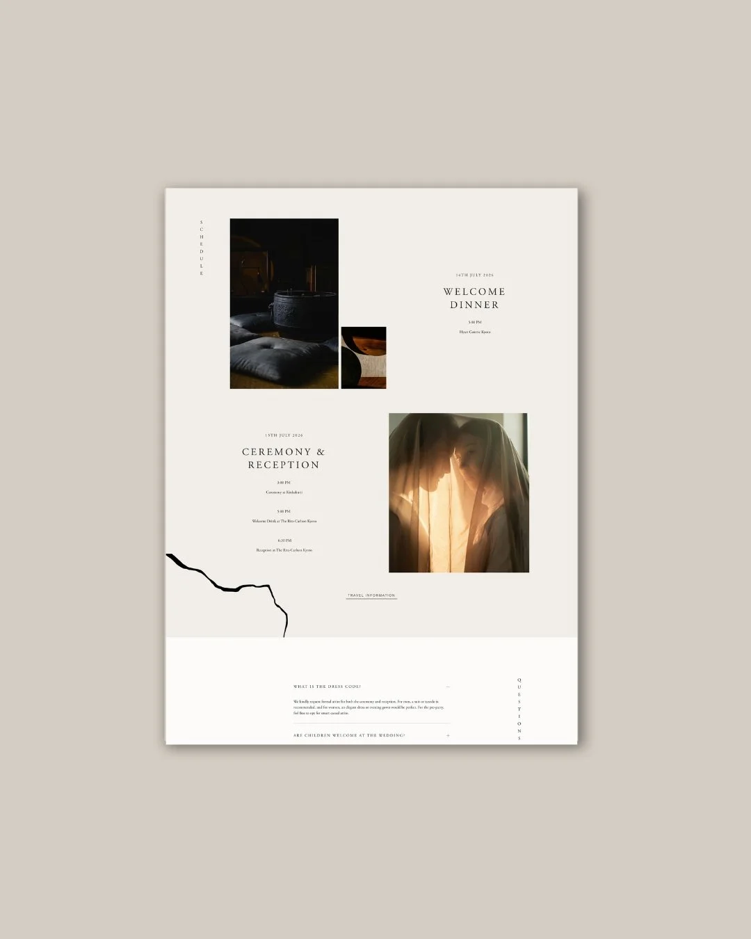
Schedule and FAQ Page
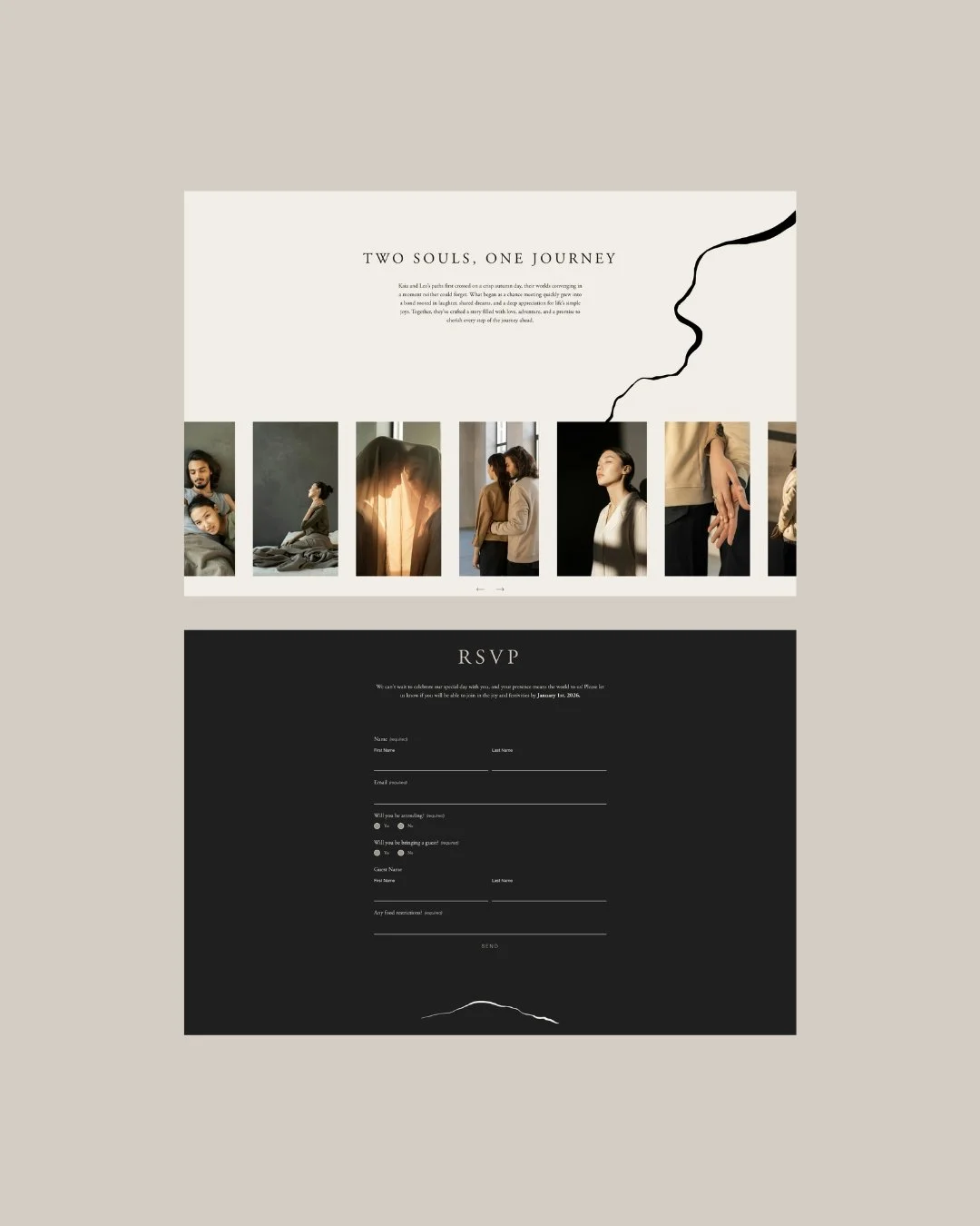
About Page
What It Carries
The Shiro moves through its nine pages — Welcome, Our Story, Travel & Stay, FAQs, Event, Registry, Menu, RSVP, Save the Date — with the unhurried composure of a design that is entirely at ease with itself. The vertical text appears as an accent: a name running alongside an image, a section label turned to face a different direction. The graphic lines define and divide without imposing. The textured background holds every page together as a coherent, tactile world.
The experience of being a guest on the Shiro website is, in a small way, the experience of encountering Japanese design for the first time: the sense that something here is very carefully made, that the rules it follows are unfamiliar but correct, that beauty is present in ways you have to slow down to see properly.
That slowness is the gift the collection gives. And it is, in the end, exactly what a wedding website should offer.
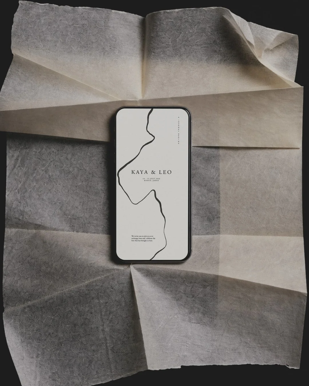
Home Page. Mobile view.
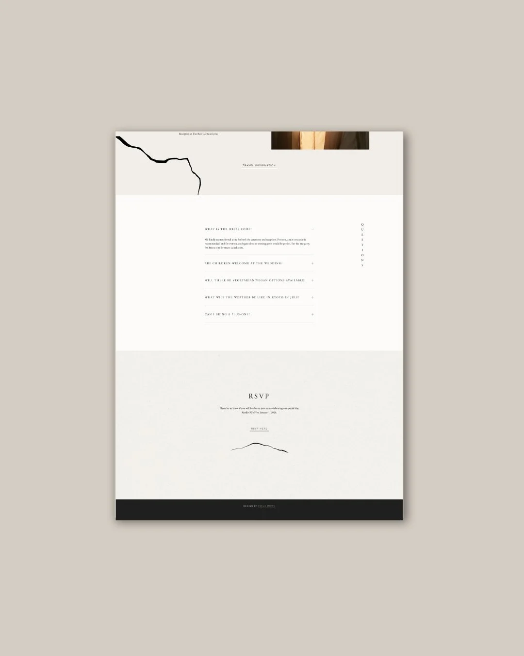
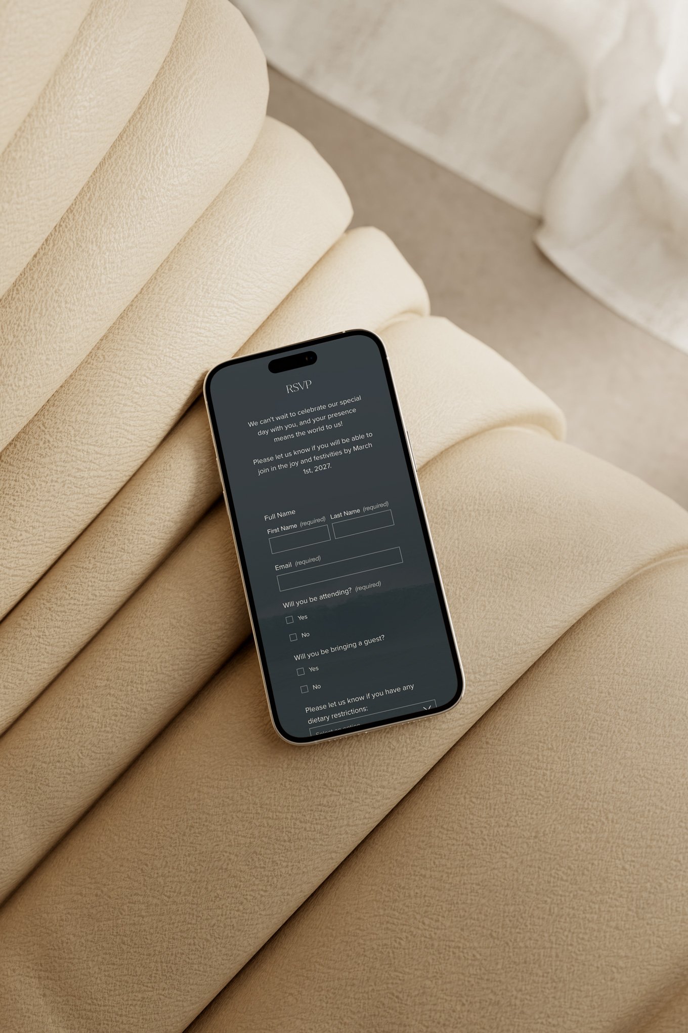
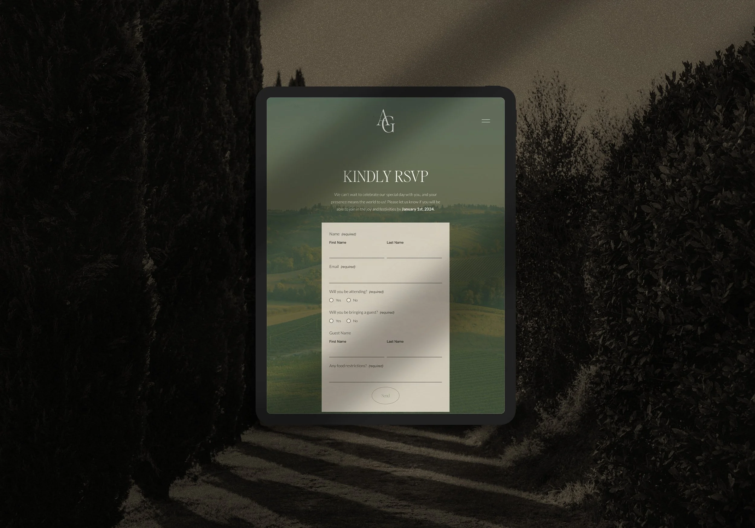
RSVP
A Collection with a Point of View
Shiro is for the couple who has spent time in Japan and felt something shift. Or who has never been, but who recognises in Japanese design philosophy a way of seeing the world that matches their own. Who wants a wedding that is remembered for the quality of attention behind every detail — the right paper, the right weight, the right silence between things.
If that is the celebration you are making — if you are drawn to warm cream and dark brown and the precise beauty of a Kintsugi line, to a typographic system that plays with direction and space, to a design that feels handmade because it was thought about as though it would be — Shiro was made for you.
The demo site is open to explore, and we are currently taking enquiries for the Shiro Collection across both the Light (from €950) and Core (from €1,500) packages.
read more