The Psychology of Colour at Weddings: What Each Palette Signals to Guests
Colour is one of the first things your guests will notice about your wedding — long before they read the menu, take their seat, or step onto the dance floor. It sets the tone quietly but powerfully, shaping how the celebration feels from the very first impression.
Your wedding colour palette is not just a visual choice. It communicates atmosphere, emotion, personality, and intention. A soft all-white palette might suggest elegance and serenity. Deep red can feel romantic and dramatic. Green instantly connects the celebration to nature, while orange brings warmth, energy, and joy.
Of course, colour meanings are never universal. They shift across cultures, settings, seasons, and personal experiences. But understanding the psychology of colour can help you create a wedding design that feels cohesive, intentional, and emotionally aligned with the experience you want to give your guests.
Below, we explore what different wedding colour palettes often signal — and how to use them beautifully.
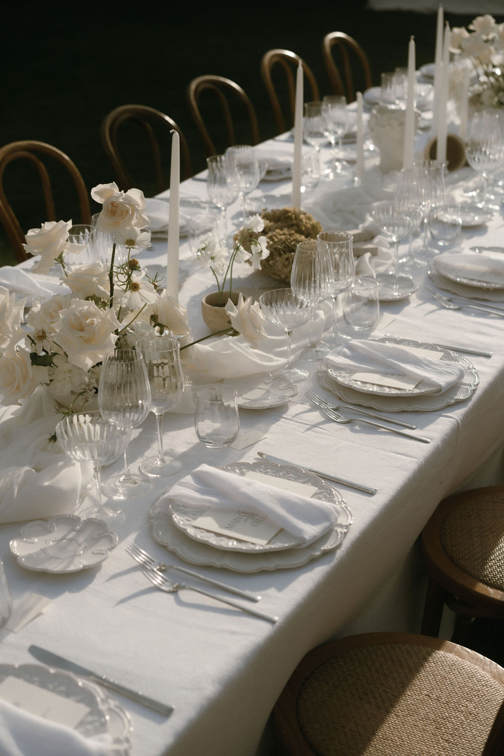
White: Calm, Elegance and Quiet Luxury
A white wedding palette signals purity, simplicity, and timeless elegance. It creates an atmosphere that feels calm, refined, and effortlessly sophisticated.
White is often associated with new beginnings, which makes it a natural choice for weddings. But beyond tradition, it also offers a sense of visual clarity. When used with texture — handmade paper, layered florals, pleated fabric, linen, stone, or silk — white becomes anything but plain.
To guests, an all-white palette often feels serene, considered, and luxurious. It suggests a celebration where every detail has room to breathe.
Best for: minimalist weddings, classic celebrations, modern luxury, elegant destination weddings.
Image @bestdayever_es
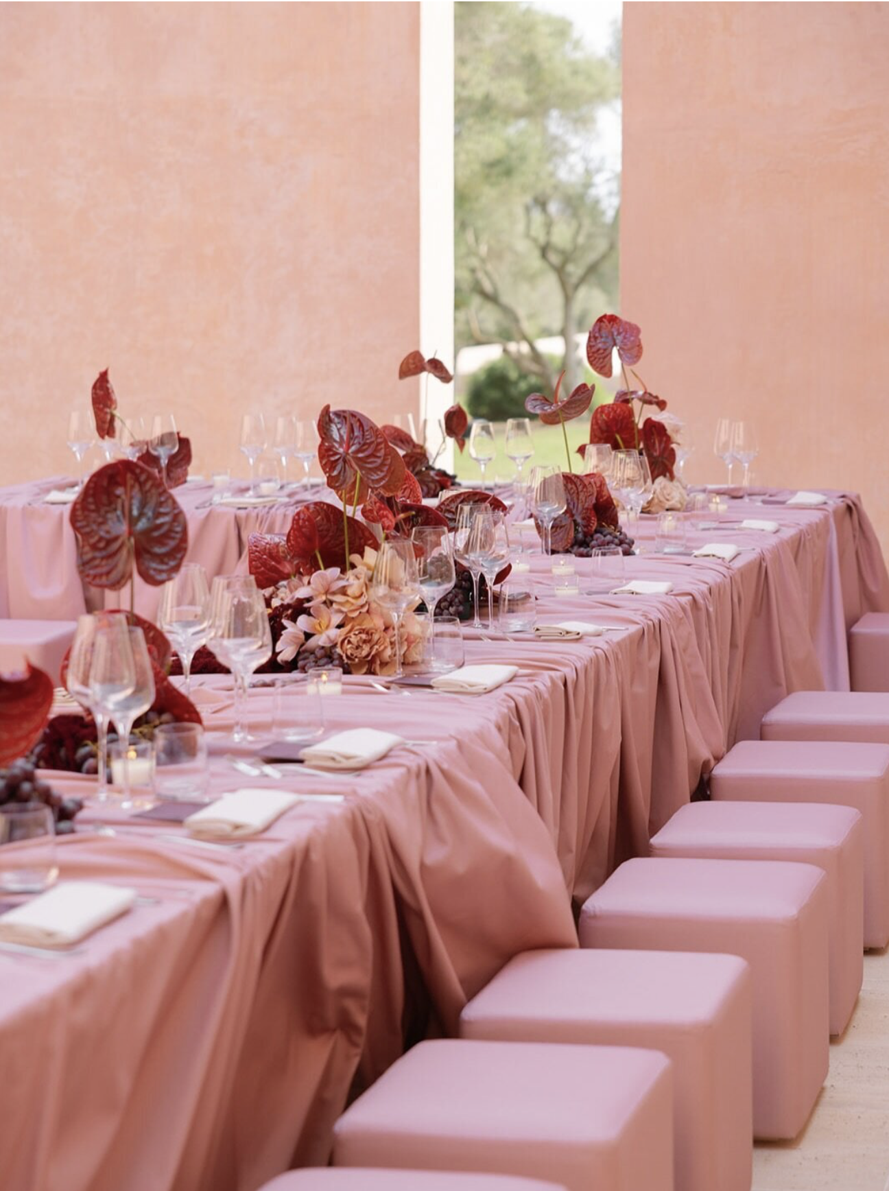
Pink: Romance, Warmth and Emotional Softness
Pink is one of the most emotionally expressive wedding colours. It signals tenderness, affection, romance, and warmth.
Soft shades like blush or almond pink feel delicate and graceful, while deeper shades like dusty rose or canyon clay create a more grounded, modern atmosphere. Pink can feel sweet, but when paired with ivory, chocolate brown, sage, burgundy, or gold, it becomes much more sophisticated.
To guests, pink often suggests intimacy and emotional connection. It creates a wedding atmosphere that feels warm, personal, and heartfelt.
Best for: romantic garden weddings, feminine but modern aesthetics, soft destination palettes, intimate celebrations.
Image @alicewilkes_design
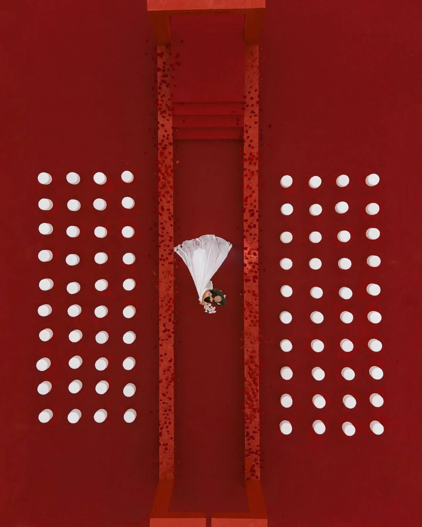
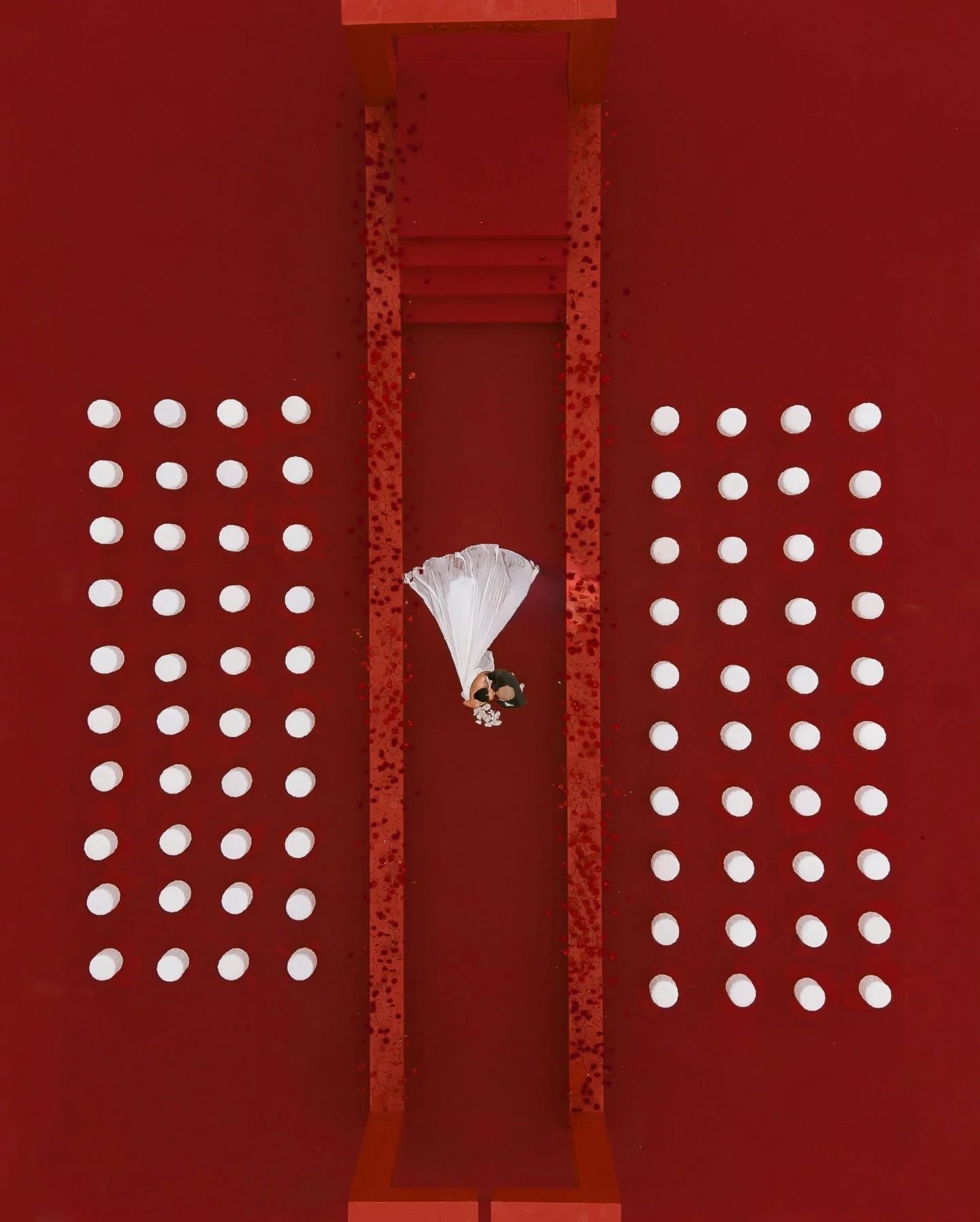
Red: Passion, Drama and Celebration
Red is powerful. It immediately signals love, energy, intensity, and celebration.
In many cultures, red is deeply connected to weddings, prosperity, joy, and protection. In modern wedding design, it can feel bold and romantic when used through florals, candlelight, stationery, makeup, or statement decor.
Deep red tones like wine, ruby, and mahogany feel luxurious and dramatic, while brighter reds create amore playful, expressive energy. Red tells guests that the celebration is emotional, confident, and full of life.
Best for: evening weddings, winter celebrations, fashion-led couples, dramatic florals, bold stationery moments.
Image @theflab.weddingplanner
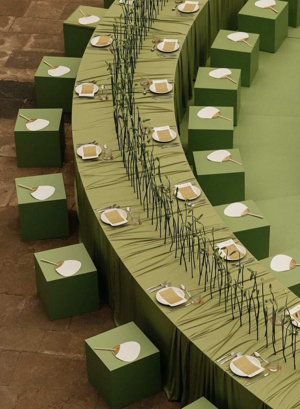
Green: Balance, Nature and Ease
Green is one of the most grounding colours in wedding design. It signals harmony, renewal, calm, and connection to nature.
Because green is so present in the natural world, it often feels effortless. Olive, sage, eucalyptus, and forest tones can all create very different moods — from relaxed Mediterranean elegance to moody countryside romance.
To guests, green feels calming and organic. It suggests a wedding that is natural, relaxed, and beautifully connected to its surroundings.
Best for: garden weddings, Italian villas, countryside estates, outdoor ceremonies, organic modern palettes.
Image @______granada
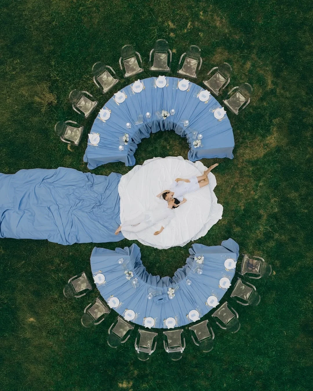
Blue: Trust, Serenity and Timelessness
Blue is calm, steady, and quietly powerful. It signals trust, loyalty, peace, and emotional depth — which is why the tradition of “something blue” still feels so meaningful.
Soft sky blue creates an airy, romantic feeling, while cobalt adds a bold editorial edge. Royal navy feels refined and formal, perfect for elegant evening settings or coastal celebrations.
To guests, blue often feels composed and graceful. It creates a sense of serenity while still feeling polished and timeless.
Best for: coastal weddings, formal celebrations, elegant stationery, destination weddings, classic-with-a-twist palettes.
Image @zavasevent
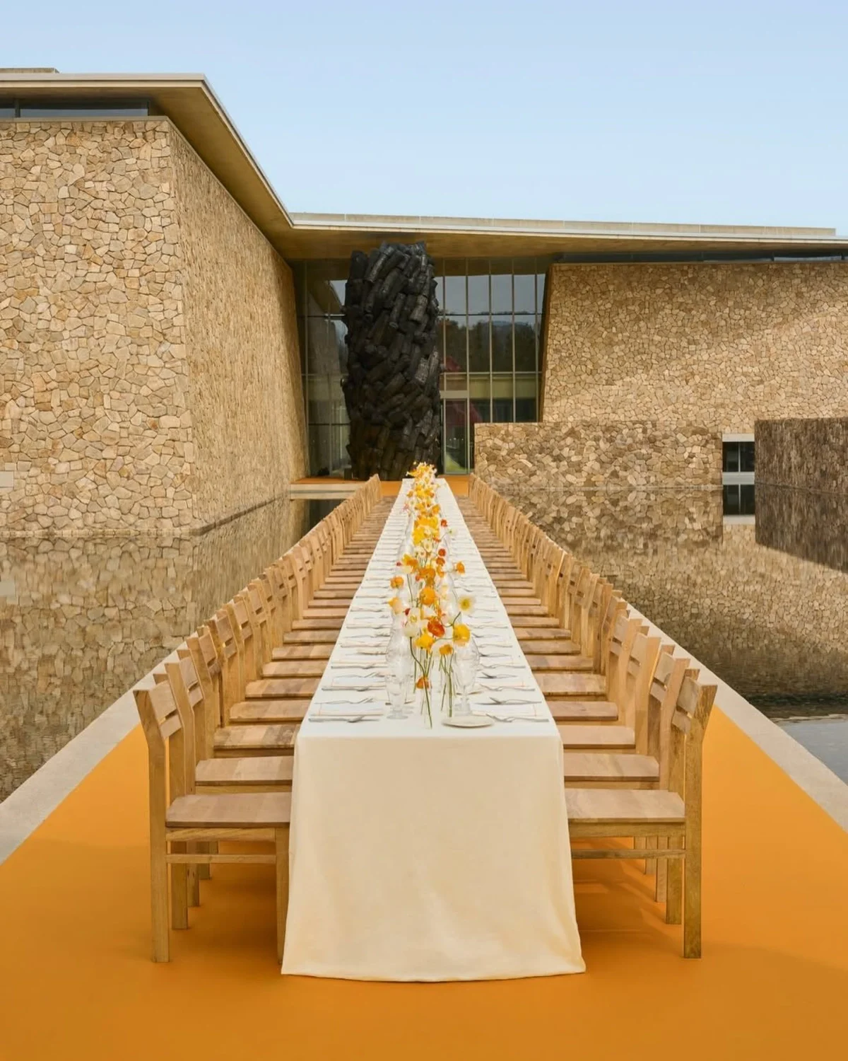
Yellow: Joy, Optimism and Sunlit Warmth
Yellow brings instant warmth to a wedding palette. It signals happiness, optimism, creativity, and celebration.
In softer shades — butter yellow, champagne, lemon cream, or golden honey — it feels refined and sunlit rather than loud. Yellow works especially beautifully when inspired by natural elements: lemons, mimosa, beeswax candles, golden textiles, or warm evening light.
To guests, yellow feels welcoming and joyful. It creates an atmosphere of ease, sunshine, and relaxed celebration.
Best for: summer weddings, Mediterranean settings, garden receptions, citrus-inspired details, joyful colour palettes.
Image @jacquemus
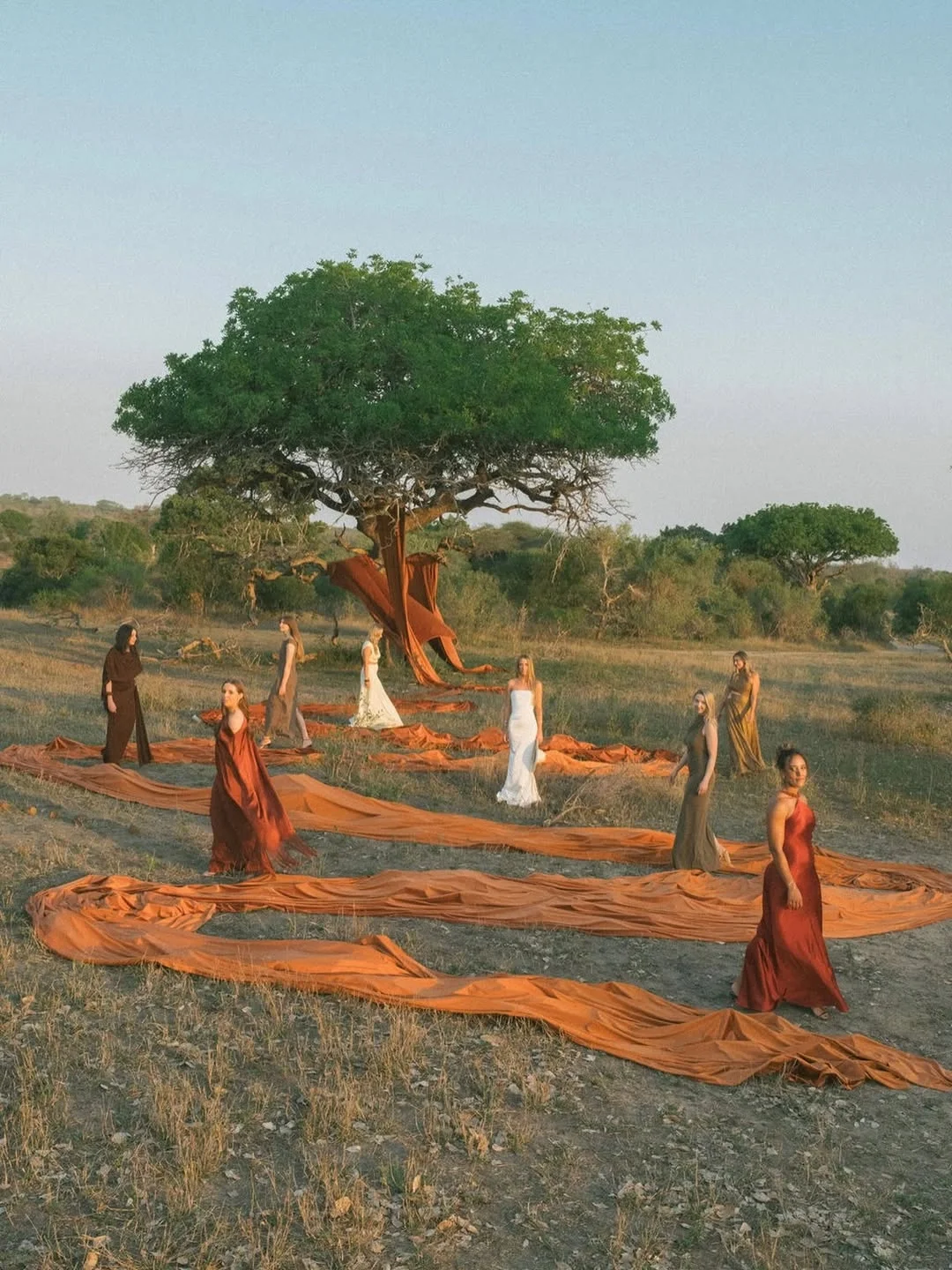
Orange: Warmth, Energy and Golden-Hour Atmosphere
Orange is one of the most underestimated wedding colours. It signals warmth, creativity, vitality, and celebration.
From Orangeade to Pureed Pumpkin and Orange Peel, orange can feel bright and joyful or earthy and architectural. It naturally evokes terracotta villas, citrus trees, glowing candlelight, Aperol Spritz, and sun-drenched landscapes.
To guests, orange feels alive and inviting. It creates a warm, energetic atmosphere that encourages conversation, gathering, and celebration.
Best for: Mediterranean weddings, autumn-inspired palettes, editorial celebrations, terracotta decor, warm lighting, destination weddings.
Image @lesvaques
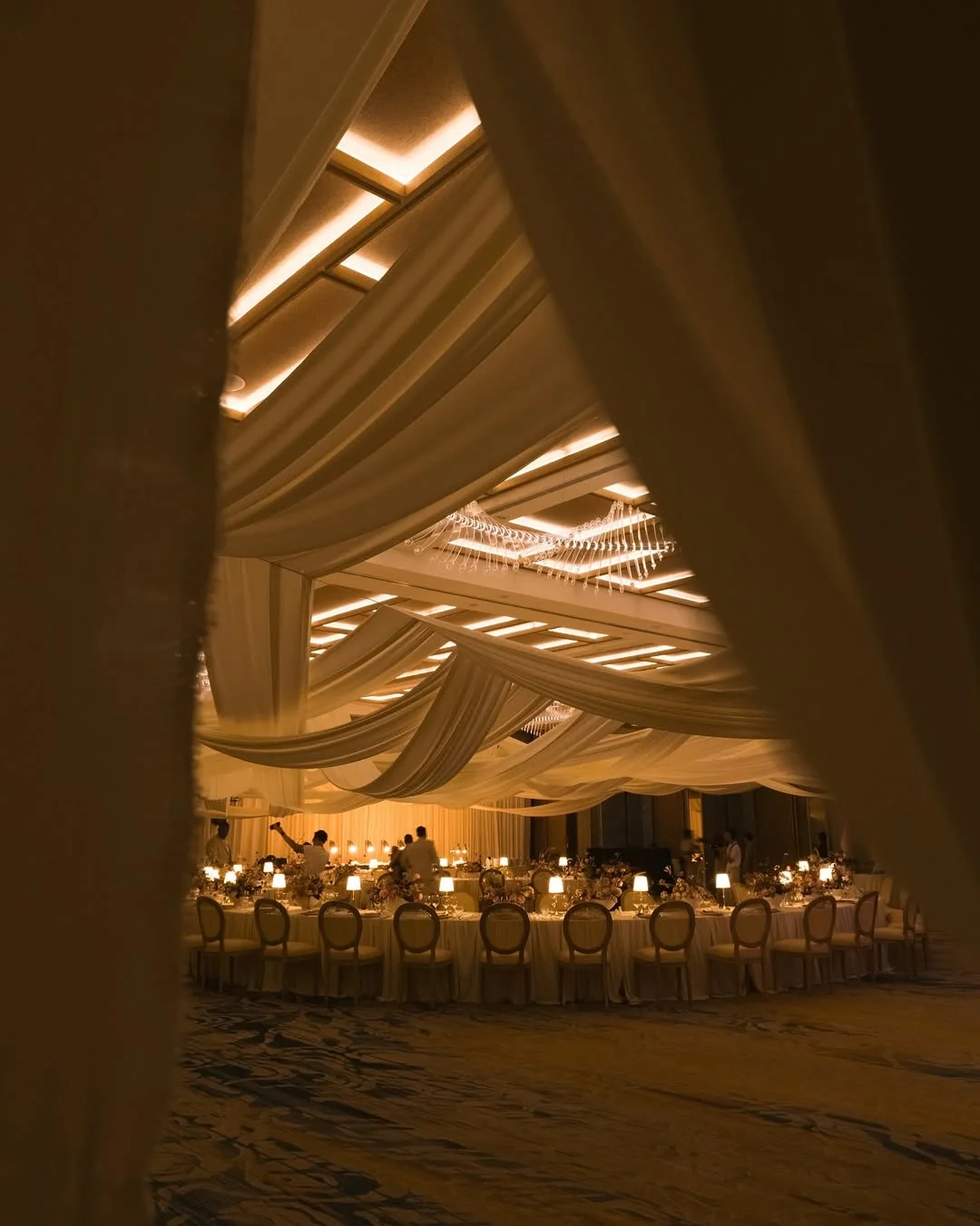
Brown: Depth, Comfort and Understated Luxury
Brown is increasingly becoming one of the most sophisticated wedding colours. It signals warmth, stability, comfort, and quiet luxury.
Chocolate, espresso, walnut, mocha, and cognac tones feel rich and tactile. They work beautifully with cream, blush, gold, rust, or deep green, creating a palette that feels grounded and fashion-forward.
To guests, brown suggests intimacy and refinement. It feels less expected than black, softer than navy, and warmer than grey.
Best for: autumn weddings, old-world venues, candlelit dinners, editorial styling, chocolate-toned stationery, earthy luxury.
Image @theflab.weddingplanner
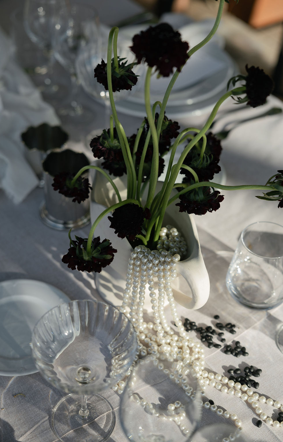
Black: Formality, Confidence and Modern Elegance
Black signals sophistication, confidence, and formality. It is bold, structured, and instantly elegant.
Used well, black creates contrast and definition. It can make typography feel sharper, florals feel more dramatic, and decor feel more intentional. Black-and-white palettes are especially powerful because they feel timeless while still being modern.
To guests, black often communicates a sense of occasion. It suggests that the wedding will be elegant, stylish, and carefully curated.
Best for: black-tie weddings, city celebrations, modern stationery, evening receptions, fashion-led couples.
Image @bestdayever_es
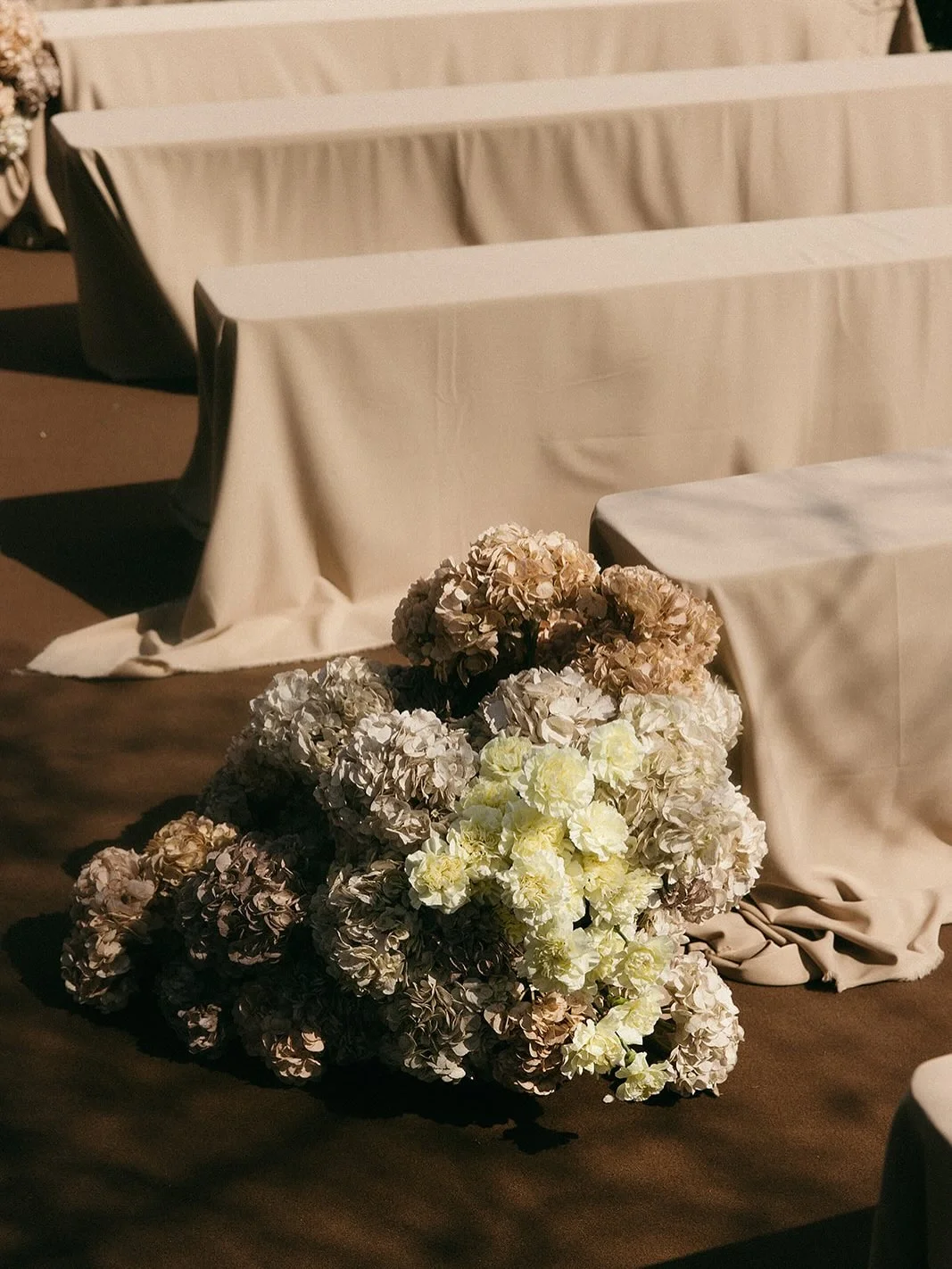
Neutrals: Softness, Restraint and Effortless Style
Neutral palettes — ivory, beige, sand, taupe, stone, and champagne — signal calm, restraint, and understated elegance.
They are often chosen by couples who want the setting, textures, and details to take centre stage rather than one dominant colour. Neutrals can feel minimal, organic, or luxurious depending on the materials used.
To guests, neutrals often feel sophisticated and easy. They create a gentle backdrop for emotional moments, natural beauty, and thoughtful design.
Best for: destination weddings, luxury minimalism, modern stationery, architectural venues, timeless celebrations.
Image @misslittlethings_
How to Choose the Right Wedding Colour Palette
When choosing your wedding colour palette, think beyond what looks beautiful on Pinterest. Ask yourself:
How do we want our guests to feel? Relaxed, excited, moved, energised, transported?
What does our venue already communicate? A Tuscan villa may naturally support green, yellow, or terracotta tones. A city ballroom may suit black, white, navy, or deep red.
What season are we working with? Spring may soften pink and green, while autumn naturally deepens orange, brown, and burgundy.
What colours feel like us? The best palettes are not just trendy — they feel emotionally connected to the couple, the setting, andthe story of the day.
Colour shapes memory. It influences how your guests experience the space, how your photographs feel, and how every design detail connects — from the first save the date to the final dinner menu.
Whether you choose soft whites, expressive pinks, Mediterranean oranges, calming greens, or dramatic reds, the most important thing is intention. A beautiful wedding palette should not just look good. It should feel like the world you want to invite your guests into.
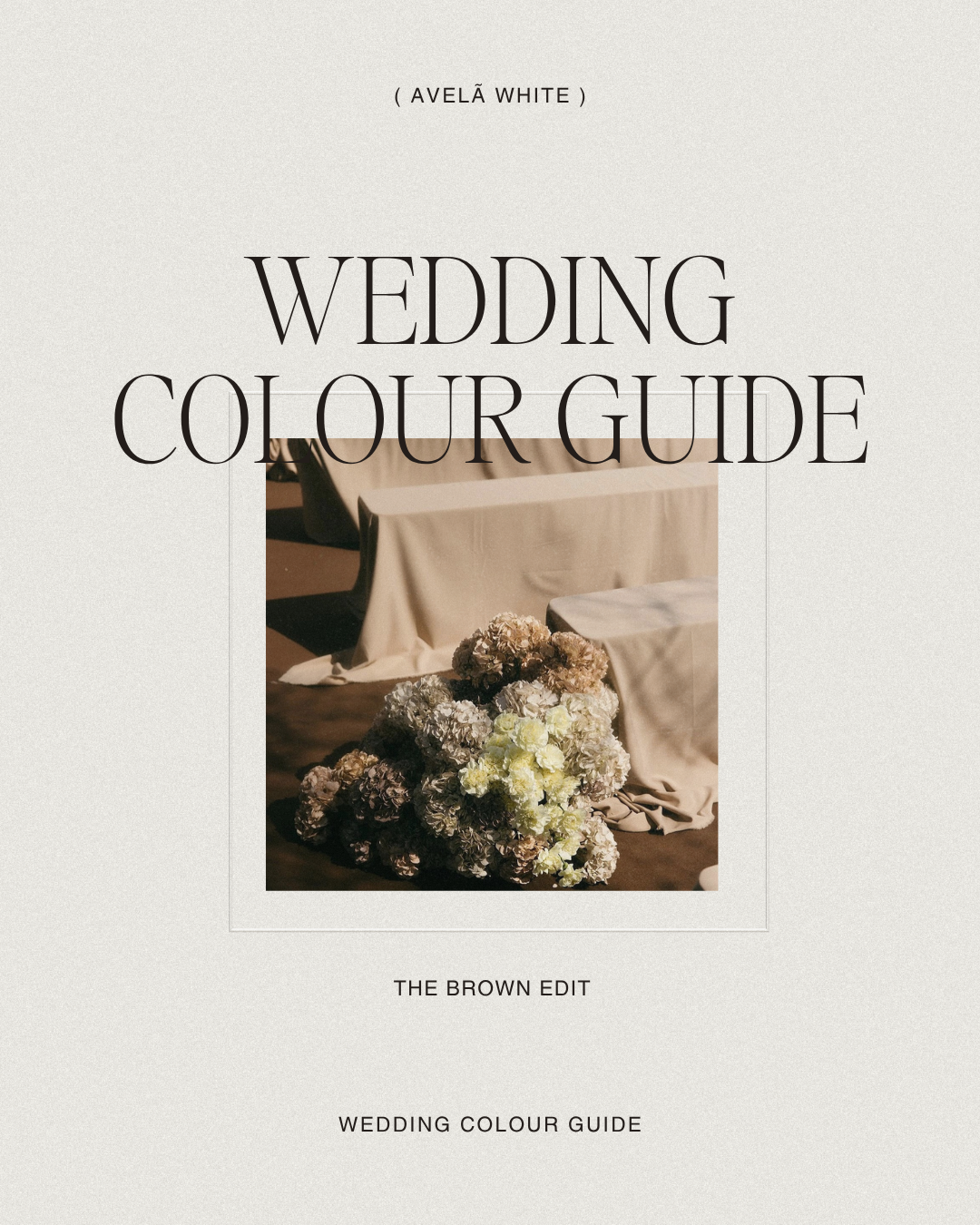
If you are beginning to define your wedding aesthetic, explore our Colour Edit series for more inspiration — or download our free Wedding Design Edit, featuring five curated wedding colour palettes and typography combinations to help you create a cohesive visual direction from the very beginning. Our full Colour Guide is also coming very soon — subscribe to be the first to know when it launches.
read more