How to Choose Your Wedding Colour Palette: A Designer’s Guide
Choosing wedding colours sounds simple until you actually have to do it.
You save a pale yellow table setting. Then a deep red invitation. A photograph of an olive-green dinner party. Something powder blue. A room filled with burgundy flowers. Somehow, you love all of them — but together they don't yet make a wedding.
That is usually where a colour palette begins: not with a perfectly coordinated set of swatches, but with a collection of things that make you feel something.
The job is not to find three colours that technically match. It is to understand what you are drawn to, why you are drawn to it, and how those colours can become one consistent visual language across the entire celebration.
Here is how we approach it at Avelã White.
Start With the Feeling, Not the Colour
Before choosing a shade, decide what you want the wedding to feel like.
Romantic and nostalgic?
Warm and Mediterranean?
Playful and slightly unexpected?
Quiet and understated?
Formal and dramatic?
Colour has a remarkable ability to establish atmosphere before a guest notices any individual design detail.
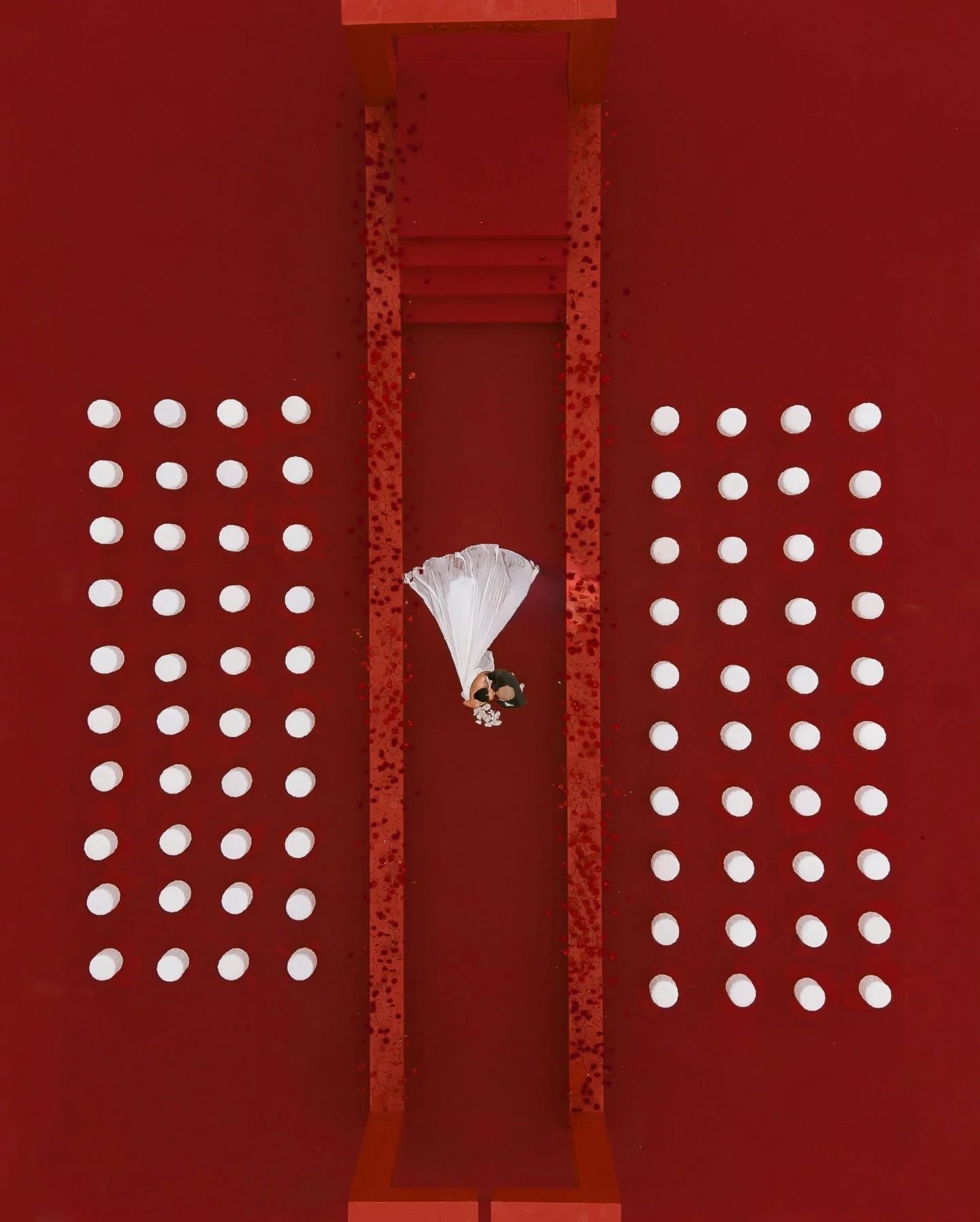
A deep wine red can feel ceremonial and old-world. Pale blue can feel delicate and traditional, or crisp and contemporary depending on what surrounds it. Bright orange can feel Mediterranean and relaxed, while a darker burnt orange can move immediately into something earthy and autumnal.
This is why we rarely begin by asking, “What is your favourite colour?” We are much more interested in the world you are trying to create.
Look Beyond Wedding Inspiration
One of the easiest ways to end up with a wedding that looks like everybody else's is to look exclusively at other weddings. Instead, collect references from places that genuinely reflect your taste.
Think about hotel interiors, restaurants, fashion collections, book covers, paintings, ceramics, architecture, packaging, gardens and places you have travelled.
You may discover that the combination you keep returning to is not one you would ever have found by searching “wedding colour palette” on Pinterest.
A burgundy chair against a powder-blue wall might become the starting point for your stationery. The faded yellow of an old Italian façade might lead to a warmer neutral palette. A lacquered red detail from a restaurant interior may become the accent colour that brings an otherwise restrained scheme to life.
The references do not need to be wedding-related. They simply need to belong to the same visual world.
Choose the Exact Shade
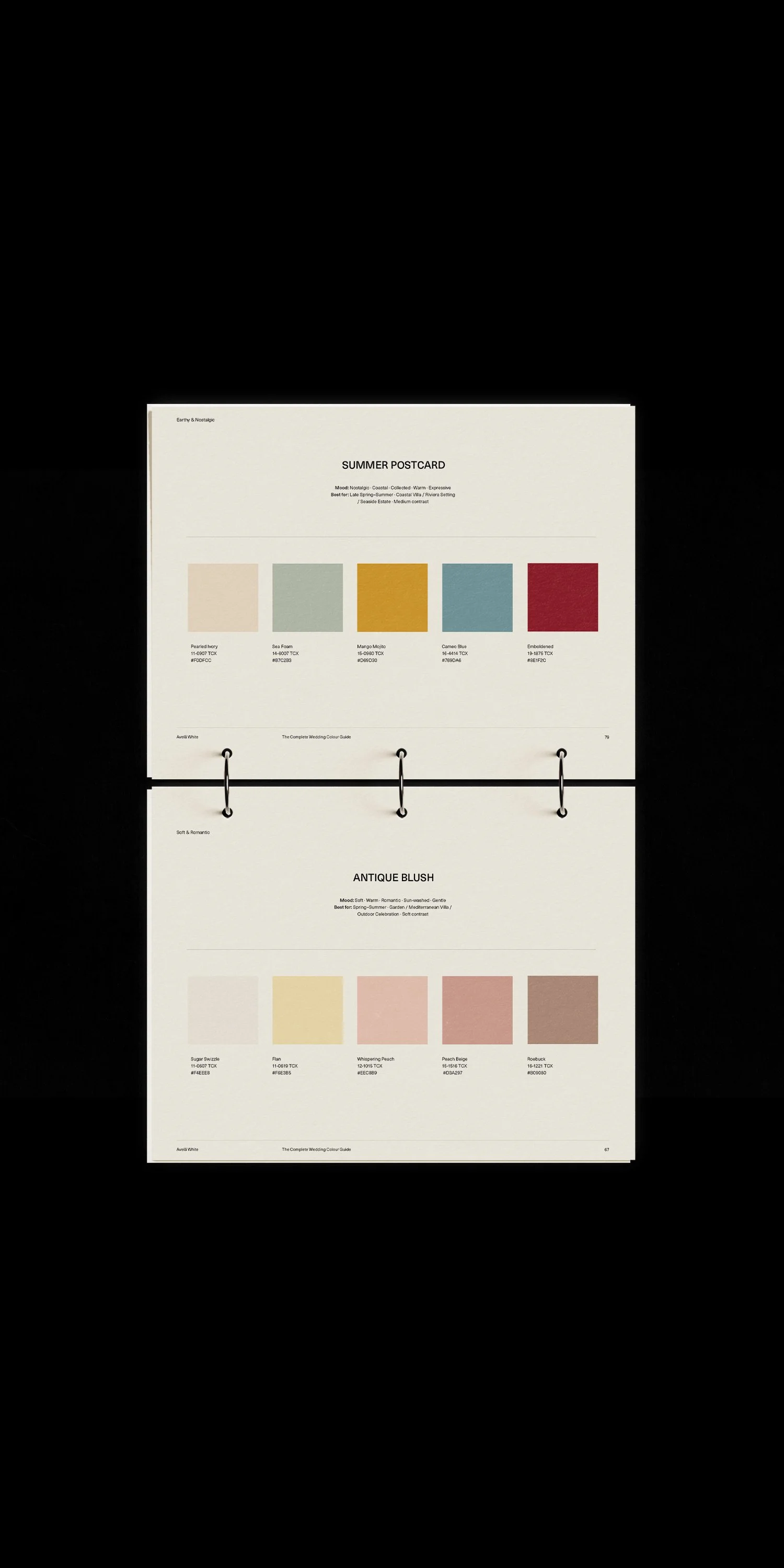
“Blue” is not really a colour palette. Neither is green, pink or red. The difference between an icy blue, a washed denim blue and a deep navy is enormous. Each carries a completely different mood and works with completely different supporting colours.
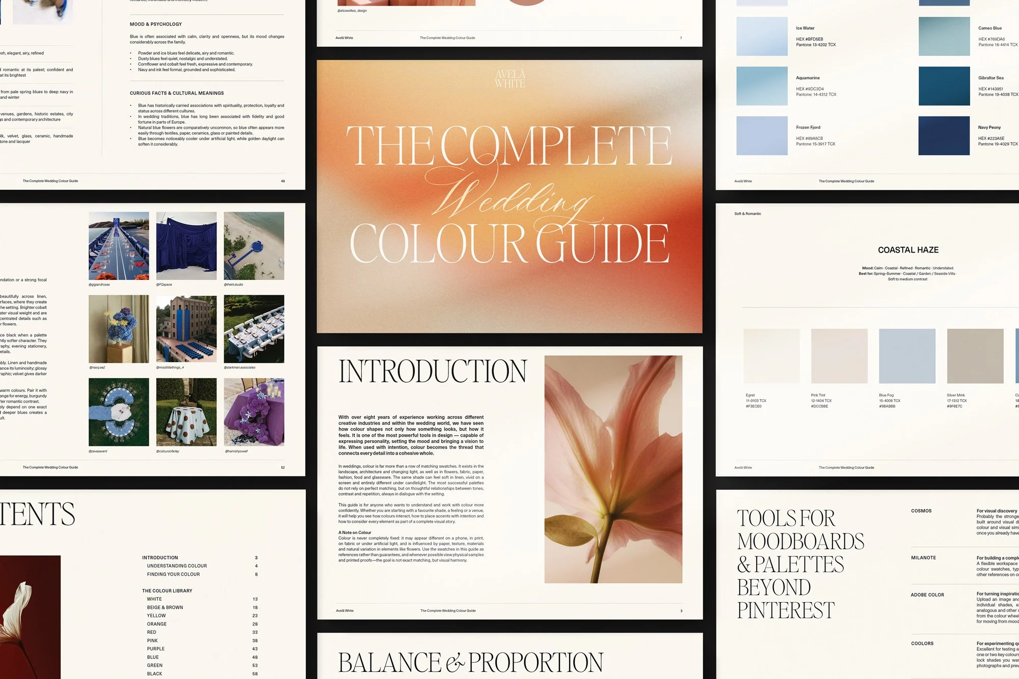
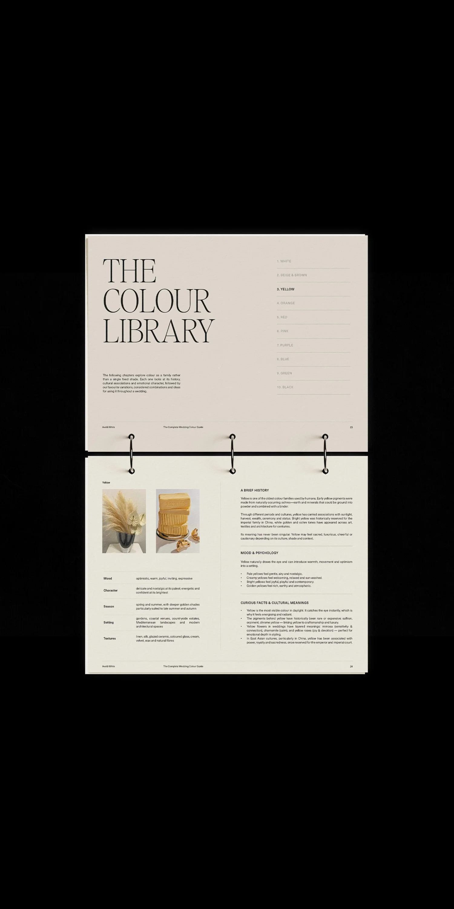
This is one of the areas we explored most closely when creating our Wedding Colour Guide.
Rather than treating each colour as one idea, we looked at individual shades and how their character changes depending on what they are paired with.
For example, a soft powder blue paired with cream feels very different from that same blue with deep burgundy. A peachy orange becomes sweeter beside cherry red, while burnt orange with muted green feels much more grounded.
Pay attention to temperature too. Is your shade warm or cool? Clear or muted? Pale or saturated? Does it have a grey, brown, yellow or blue undertone?
The more specific you are at this stage, the easier every design decision becomes later.
Build a Palette, Not a Set of Matching Colours
A good wedding palette does not require every colour to appear in equal measure. In fact, it usually works better when they don't. Think of your palette as having different roles.
You might have one dominant colour that establishes the overall atmosphere, a secondary shade that appears throughout the design, one or two quieter neutrals that create space, and a smaller accent colour that adds contrast.
A palette of deep red, pale pink and warm cream, for example, does not mean that every table needs equal amounts of all three.
Perhaps cream forms the foundation. Deep red appears in typography, florals and small details. Pale pink softens the overall composition.
The proportions are often more important than the colours themselves.
Think About Proportion & Balance
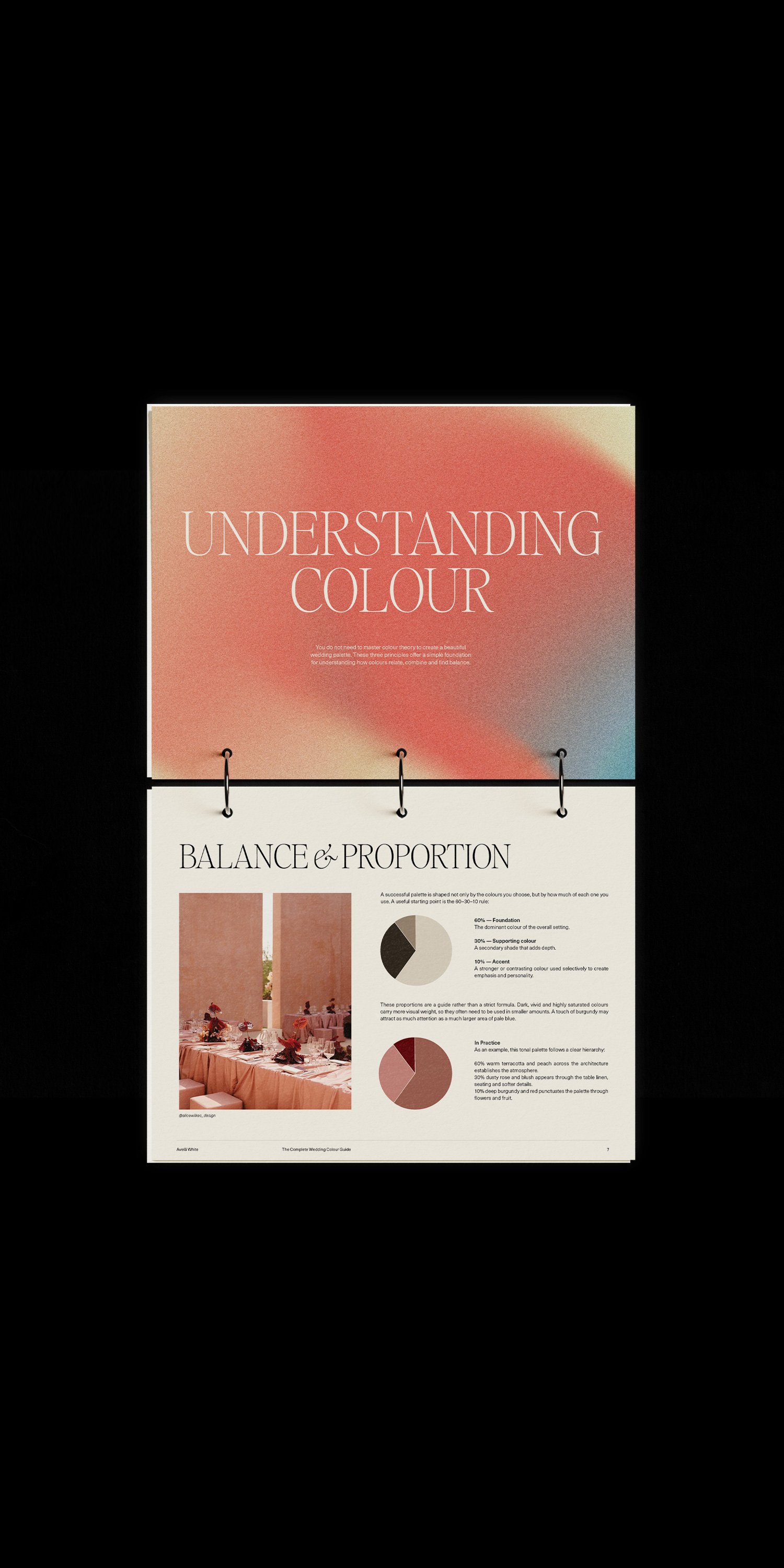
This is one of the most important — and most overlooked — parts of building a wedding colour palette. Three beautiful colours used in equal quantities can easily feel busy. The same three colours used with a clear hierarchy can feel considered and sophisticated.
Start by deciding which colour should do most of the visual work.
A neutral or softer shade might make up the majority of the wedding, giving stronger colours room to stand out. Or, for a more expressive celebration, the dominant colour might be something saturated, with quieter shades used to create breathing space around it.
Balance also comes from where colour appears. A bright red invitation, red bridesmaid dresses, red florals, red candles and red linens may begin to feel literal. Using that same red selectively — perhaps in the stationery, flowers and a small dining detail — can make it feel much more intentional.
Contrast matters too. If every shade has the same visual weight, the eye has nowhere to rest. A good palette needs moments of intensity and moments of quiet.
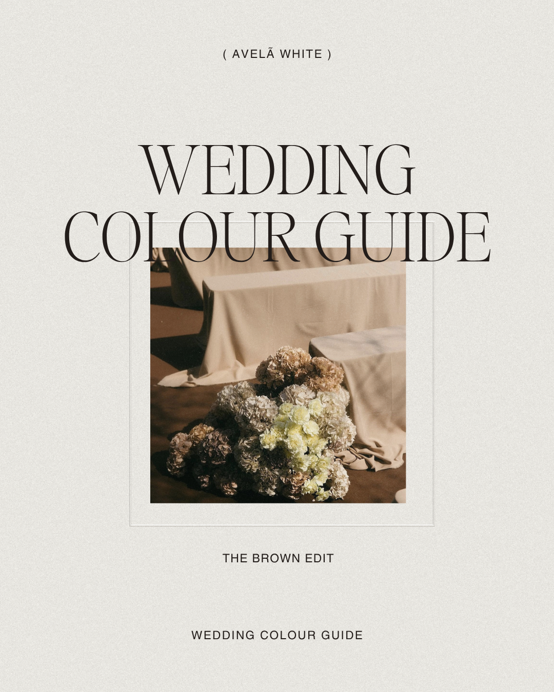
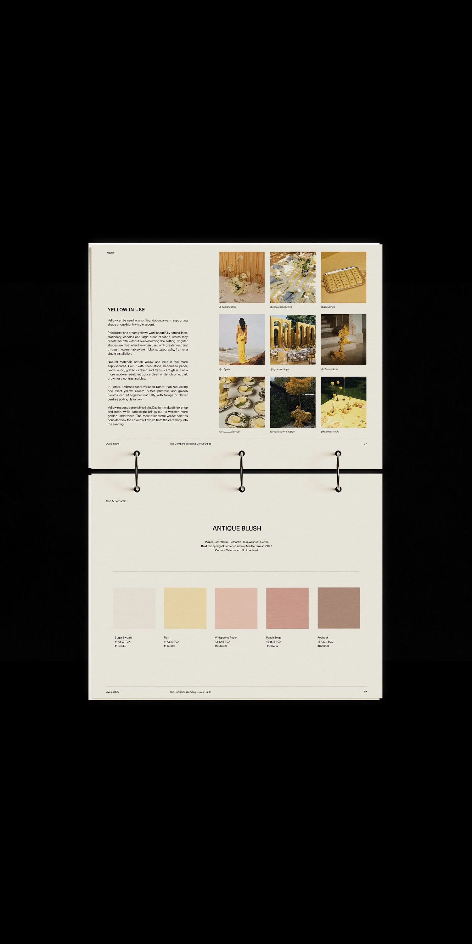
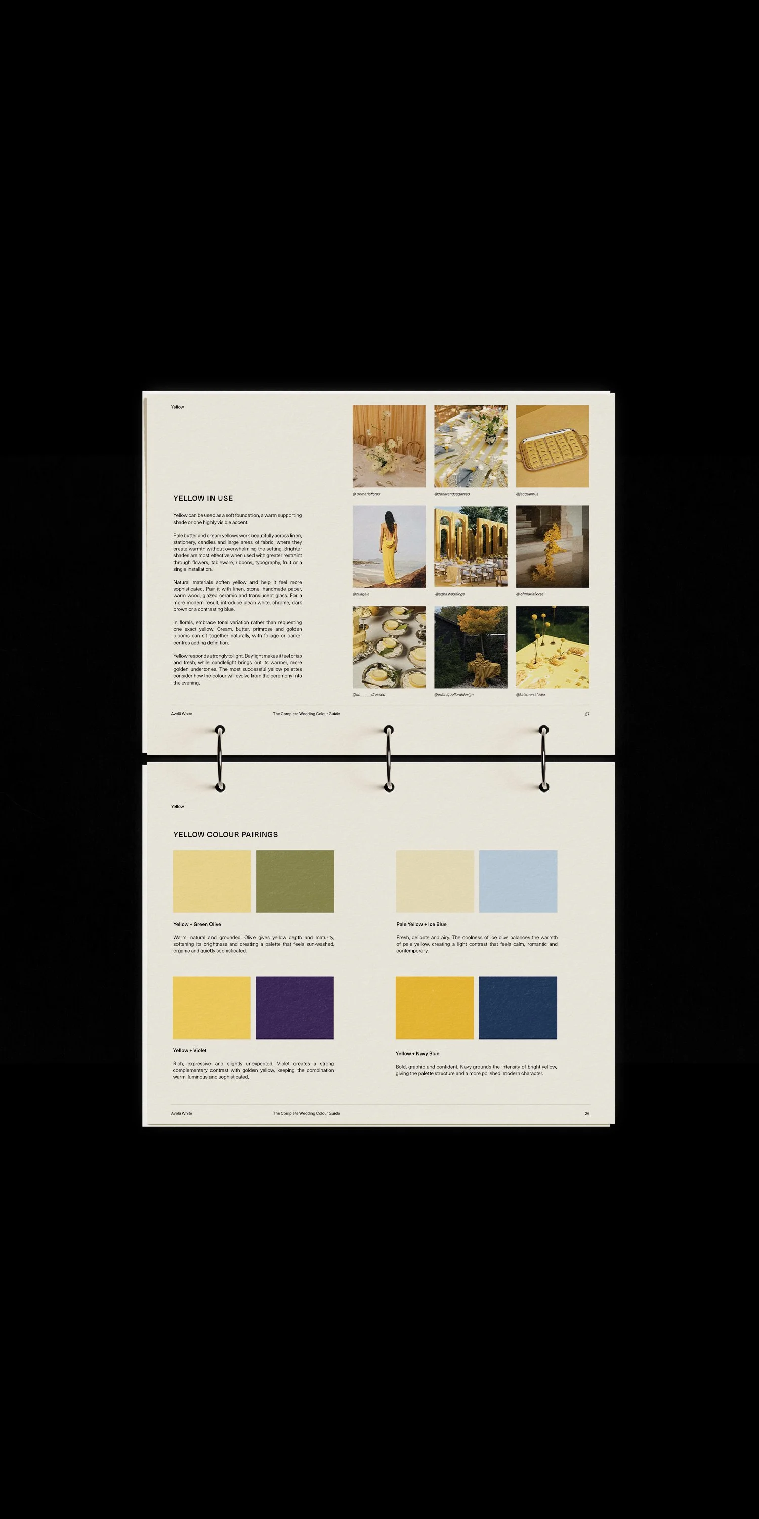
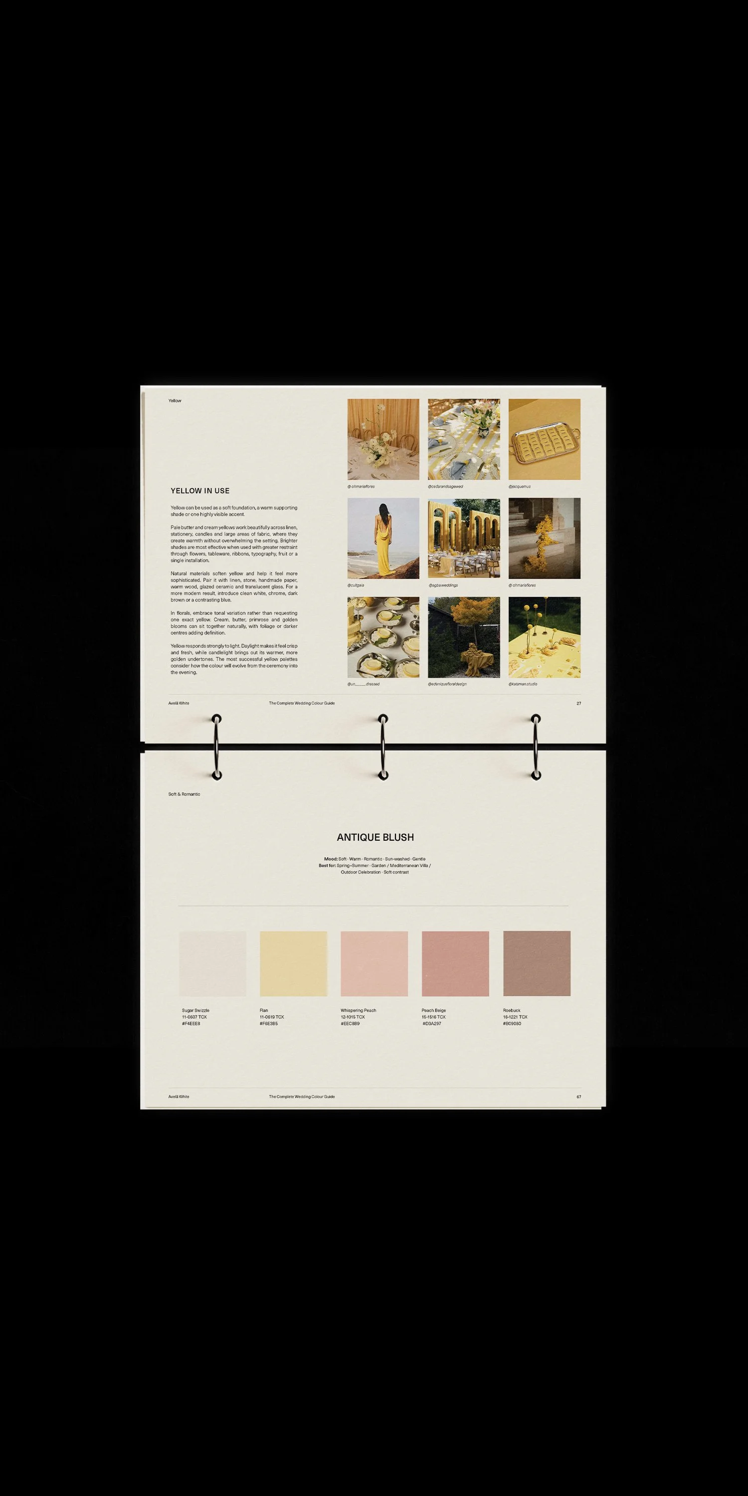
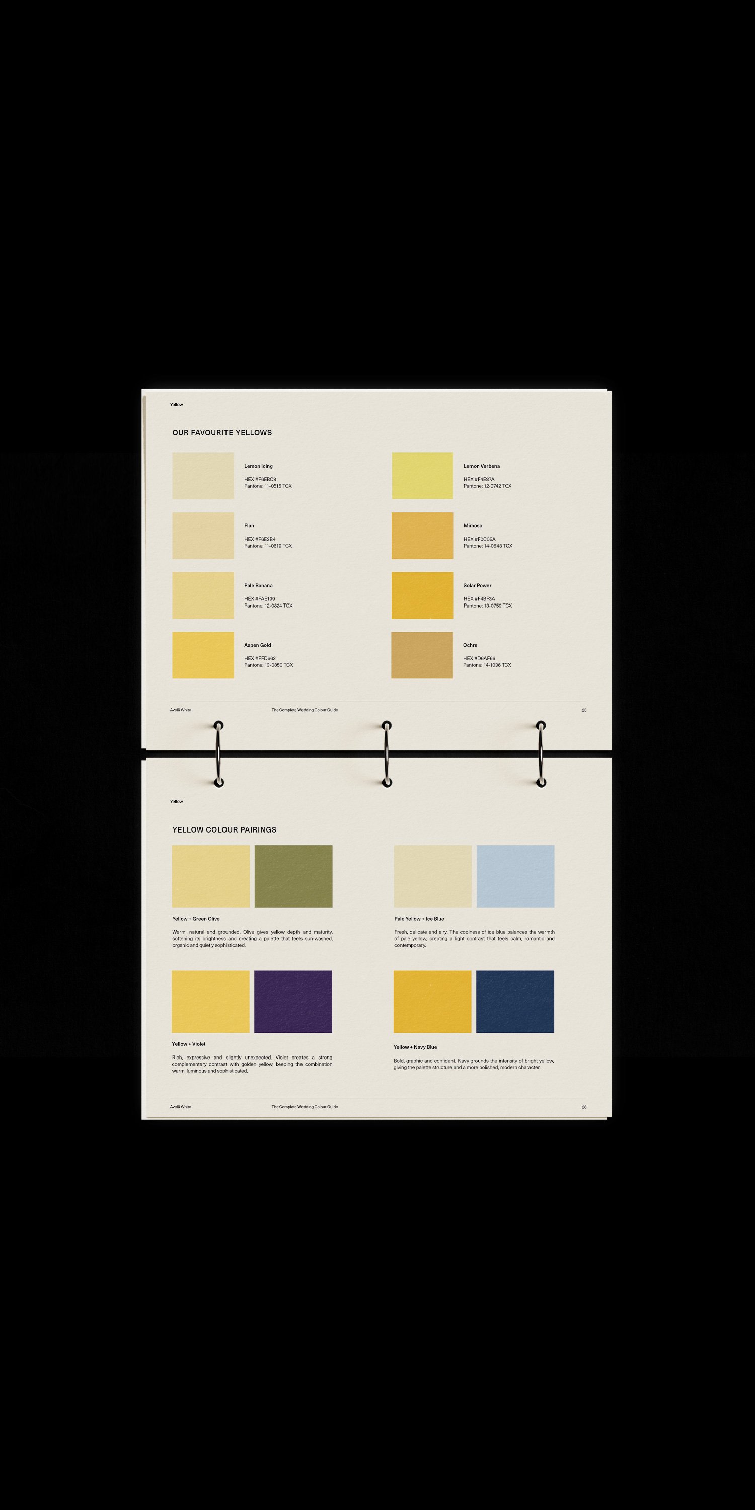
Explore the Avelã White Wedding Colour Guide
A designer-led guide to building a wedding palette with intention — from carefully selected shades and unexpected colour combinations to ideas for applying colour across stationery, websites, florals, fashion, tables, lighting and more.
Don't Be Afraid of an Unexpected Combination
Some of the most memorable palettes contain a colour that initially feels slightly wrong.
Deep purple with bright orange.
Berry with lime.
Cabernet with delicate blue.
Vanilla with a dusty blue-grey.
Light mahogany with deep wine.
These combinations work because they create tension. There is contrast rather than perfect coordination.
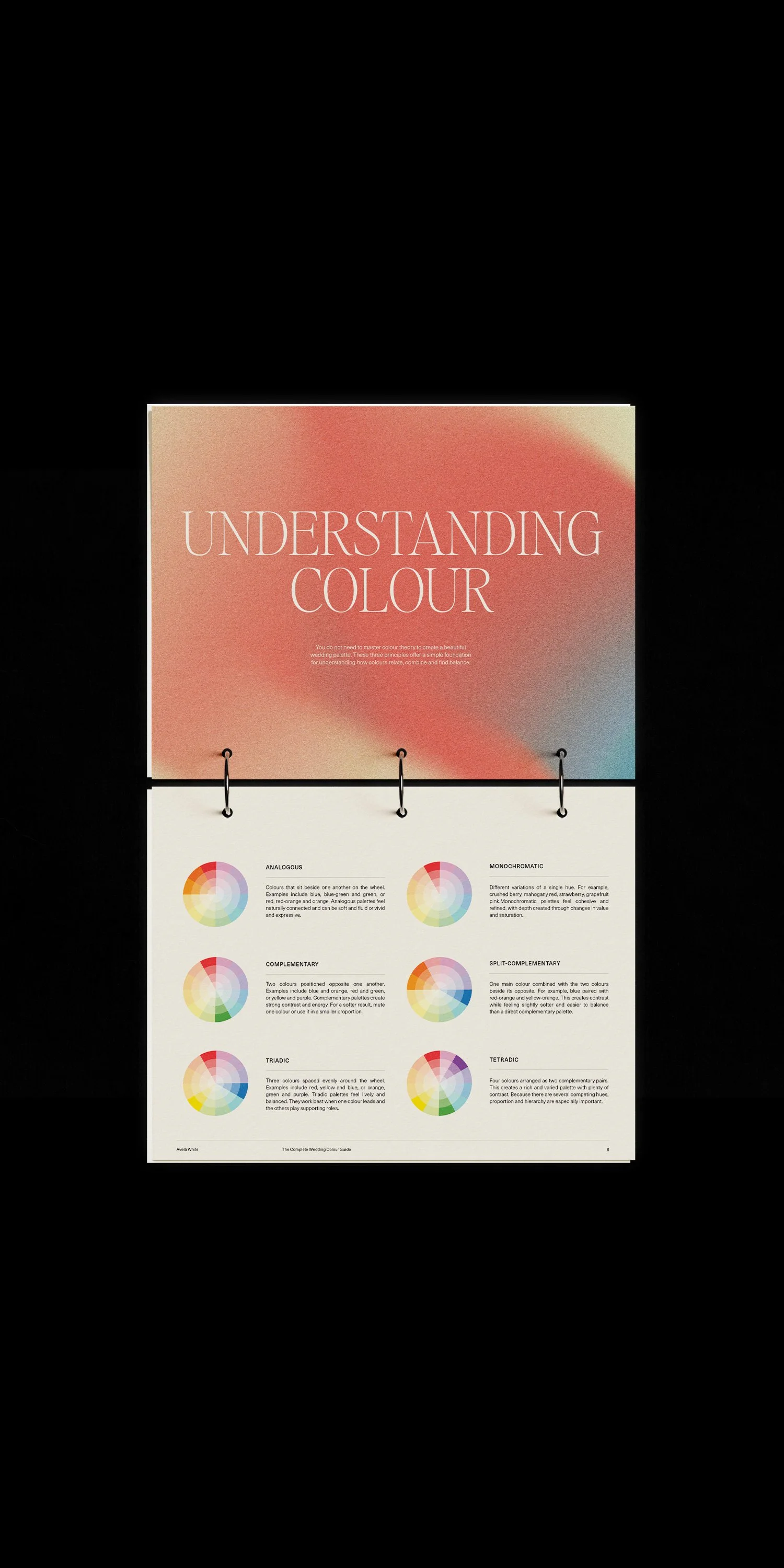
A wedding palette does not have to be made entirely from colours sitting neatly beside one another on a colour wheel. Sometimes the unexpected shade is what stops the entire celebration from becoming too predictable.
If a palette feels almost right but slightly flat, the solution may not be another neutral. It may be a small amount of something much brighter, darker or cooler.
Consider the Venue Before Finalising Anything
Your wedding does not exist on a blank white background. The venue is already part of the palette. Look at the colour of the walls, floors, stone, timber, surrounding landscape, furniture and permanent architectural features.
A palette that feels beautiful in a moodboard may behave very differently inside a terracotta villa, a dark-panelled city hotel or a bright coastal venue. Rather than fighting those existing colours, use them as part of the composition.
If a Tuscan venue already gives you warm stone, olive green and faded terracotta, you may only need one or two additional shades.
If the venue is extremely neutral, you have more freedom to introduce stronger colour through florals, linens, stationery and lighting.
The surroundings should feel like part of the design, not an obstacle to work around later.
Think About Light
Colour changes dramatically throughout the day.
A pale butter yellow in soft morning light may feel warm and almost creamy. Under artificial evening lighting, the same shade can become much more saturated.
Deep reds, browns and purples become richer after sunset. Cool blues can become sharper in very bright daylight. Candlelight adds warmth to almost everything.
This is particularly important when choosing colours for a celebration that moves between several spaces or from daytime into evening.
We like to think about colour together with lighting rather than treating the two separately.
Sometimes the most effective “colour decision” is actually how a room is illuminated.
Translate the Palette Across the Whole Wedding
Once the palette is established, the next step is deciding where those colours should actually live.
They do not need to appear everywhere.
Florals and tables
Flowers are often one of the most visible expressions of colour, but linens, ceramics, candles, menus and table surfaces matter just as much.
A restrained floral palette can sit against a much stronger linen colour, or vice versa.
Fashion
The wedding party does not necessarily need to match the décor exactly.
Instead, think about how clothing will sit within the wider palette. A complementary shade can often look far more sophisticated than an exact match.
For guest dress codes, colour can also help establish atmosphere without making everyone look overly coordinated.
Stationery
This is where you can be particularly precise.
Ink colours, paper stocks, envelopes, illustrations, edge details and typography all offer ways to use the palette in different proportions.
Sometimes the strongest stationery design uses very little colour at all — perhaps one distinctive shade against an otherwise neutral composition.
Your wedding website
The digital experience should belong to exactly the same visual world.
Colour can appear through typography, backgrounds, buttons, illustrations, photography treatments and subtle interactive details.
It does not need to reproduce the printed invitation exactly. The goal is consistency, not duplication.
Food and drink
Colour can even move into the sensory details of the celebration.
A particular wine, cocktail, fruit garnish, dessert or beautifully styled food station can become part of the visual story.
For an orange-led wedding, for example, an Aperol station feels entirely natural — not because every element needs to be orange, but because the colour is being expressed through experience as well as décor.
Test Your Palette With Photography
Before committing, place your colours beside the kind of photography you expect to have.
This is often overlooked.
Muted editorial photography, bright flash photography and warm film photography can make exactly the same palette feel completely different.
The imagery on your wedding website will also become one of the largest areas of colour in the design.
If you already have engagement photographs, venue imagery or destination photography, place your palette next to them.
Do they belong together?
If not, something may need adjusting.
Allow the Palette to Evolve
You do not need to decide every shade on day one.
A strong visual identity often becomes clearer as the venue, stationery, fashion, florals and other details take shape.
Start with a direction rather than trying to make every decision immediately.
Perhaps you know you want warm yellow and red, but the exact neutral comes later.
Perhaps deep green is central from the beginning, while the supporting shade changes once you see your florals.
Consistency does not mean rigidity.
The best palettes have enough structure to feel intentional and enough flexibility to evolve naturally.
The Final Test: Could You Recognise the Wedding Without Seeing the Couple's Names?
A truly cohesive wedding has its own visual language.
You could see the menu, invitation, website or table setting independently and still understand that they belong to the same celebration.
That does not come from repeating one colour everywhere.
It comes from making a series of decisions that share the same mood, proportions, balance and point of view.
Colour is only one part of that system — but it is often the part that brings everything else together.
Ready to Build Your Wedding Colour Palette?
The Avelã White Wedding Colour Guide was created to help you move from scattered inspiration to a palette that feels considered, balanced and entirely your own.
Inside, you’ll find carefully selected shades, unexpected colour pairings and designer ideas for using colour across your wedding — from stationery and websites to florals, lighting, fashion, tables and food.
Because choosing a wedding palette should be about much more than finding colours that match.
It should be about creating a world that feels unmistakably yours.
read more