Unexpected Wedding Colour Combinations ThatStill Feel Timeless
Some of the most memorable wedding colour palettes are not the ones that make immediate sense. Blue with cream will always be beautiful. Burgundy with blush feels naturally romantic. Green and white are almost impossible to get wrong. But often, the combinations that stay with you are the ones that introduce a little tension: pale blue beside cabernet, berry with lime, or aquamarine against a deep coffee brown.
These palettes feel interesting because the colours are not simply matching each other. They are balancing one another — warm against cool, saturated against soft, familiar against unexpected. The key is not only choosing the right shades, but deciding how much of each colour to use and where it should appear.
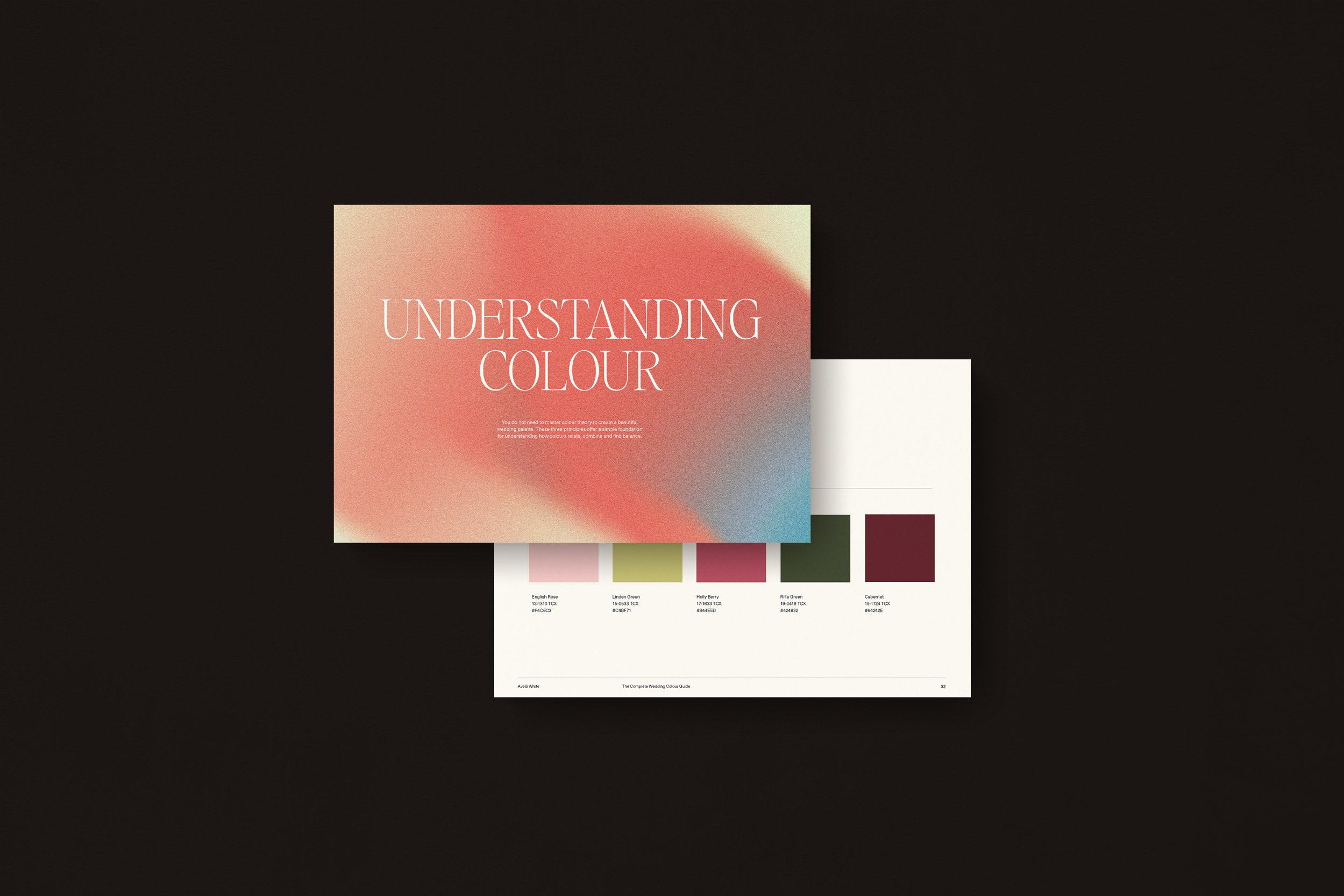
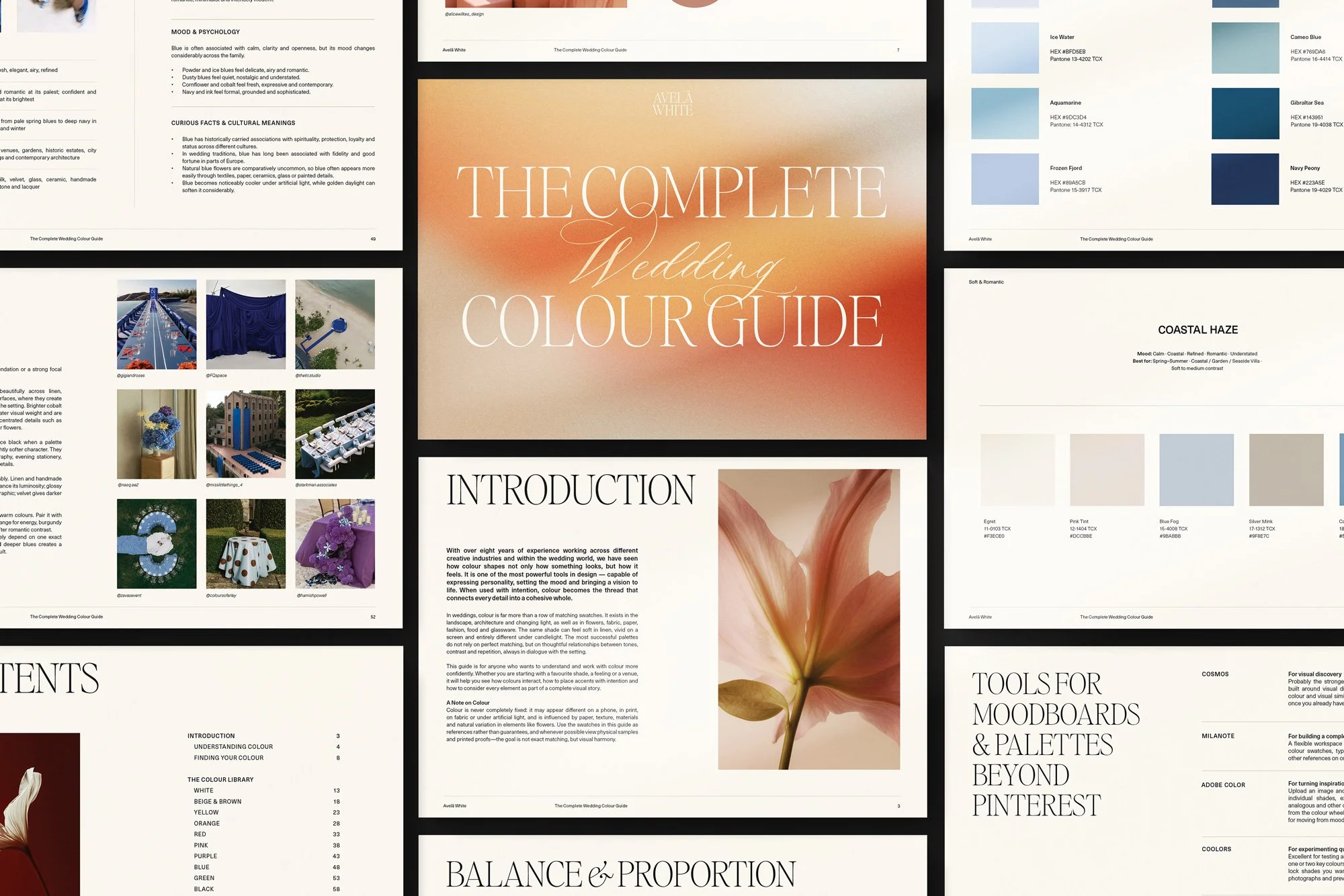
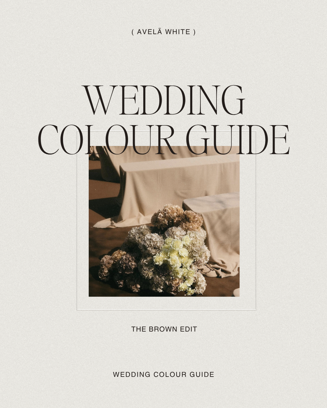
Here are six of our favourite unexpected combinations from the Avelã White Wedding Colour Guide, and why we think they work.
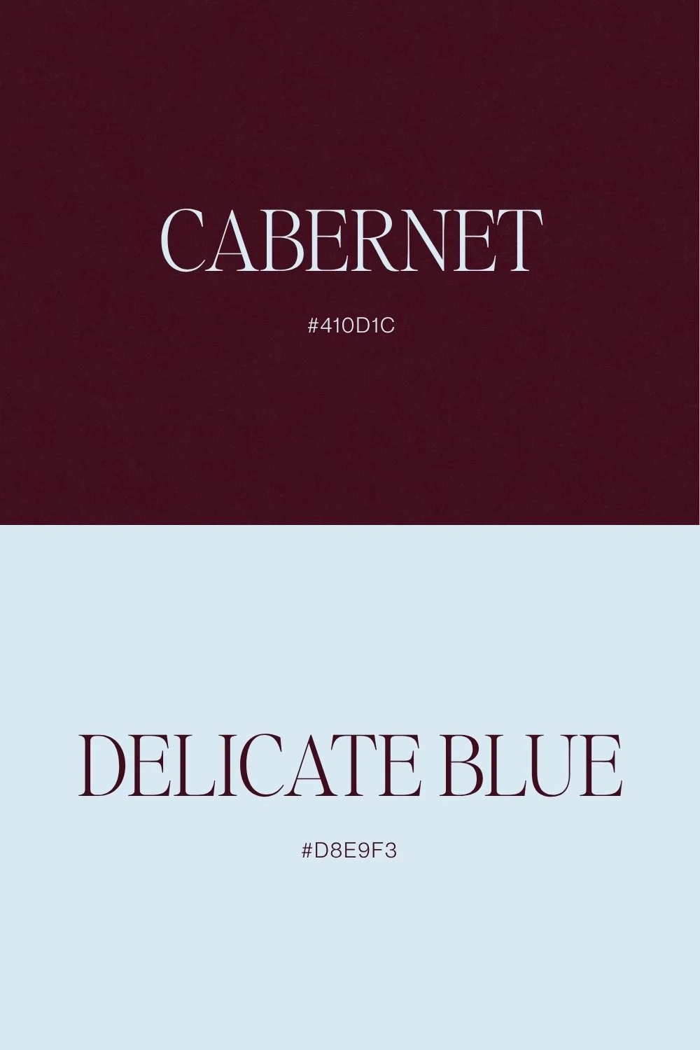
Cabernet + Delicate Blue
There is something particularly beautiful about placing a deep wine red beside a light, almost fragileblue. Cabernet brings richness, warmth and formality, while delicate blue introduces air and softness.Together, the result feels romantic without becoming overly traditional.
The pairing works because the colours sit at very different visual weights. Cabernet is dense and saturated; blue is light and cooling. That contrast allows each shade to feel more distinctive.
We would usually let the blue occupy more space and use cabernet with greater restraint:
delicate blue across stationery backgrounds or table linen
cabernet in typography, florals, ribbon or smaller details
warm cream or ivory as a quiet bridge between the two
The result can feel particularly beautiful for an old-world European venue, an autumn city wedding oran evening celebration filled with candlelight.
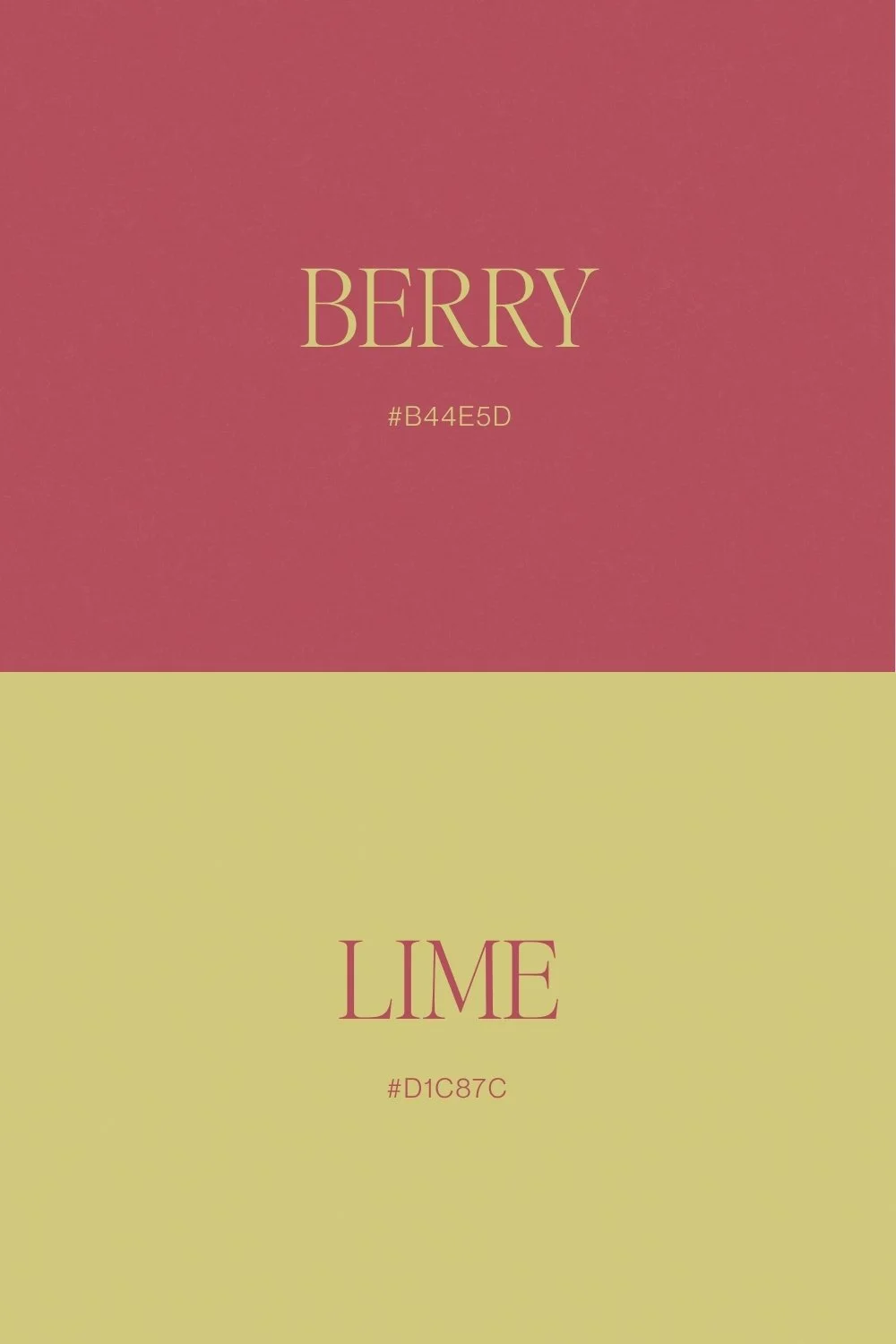
Berry + Lime
Berry and lime sound as though they should be louder than they actually are. When the shades arechosen carefully, however, the combination can feel remarkably sophisticated.
Berry has depth and sweetness, while lime introduces freshness and acidity. Rather than softening berry with blush or beige, the green gives it an entirely different energy and prevents the palette from becoming too romantic or predictable.
This is one of those combinations where proportion matters enormously. A small amount of lime can completely transform a predominantly berry palette, while equal amounts of both will create something much more graphic and playful.
We would use lime almost as punctuation: a menu card, a small typographic detail, seasonal fruit or flashes of fresh green amongst richer florals. The unexpected shade does not need to dominate in order to change the mood.
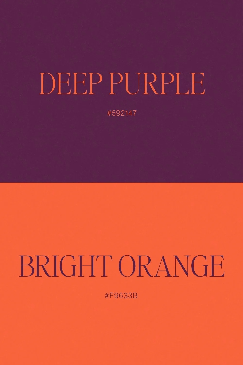
Deep Purple + Bright Orange
Deep purple and bright orange are both confident colours, but they play very different roles. Purple has weight, drama and an almost old-world richness, while orange introduces energy and movement.
That tension is precisely what makes the combination interesting. The trick is not allowing the two shades to compete equally for attention.
Choose one to lead and use the other more selectively. Deep purple might appear through stationery, textiles or darker florals, while orange comes through candles, fruit, smaller flowers or a cocktail moment. Cream, stone and warm white give the palette enough breathing room to remain sophisticated.
It is a bold combination, but bold does not automatically mean trend-led. When the shades themselves are rich and considered — rather than fluorescent or overly sweet — the result can feel surprisingly timeless.
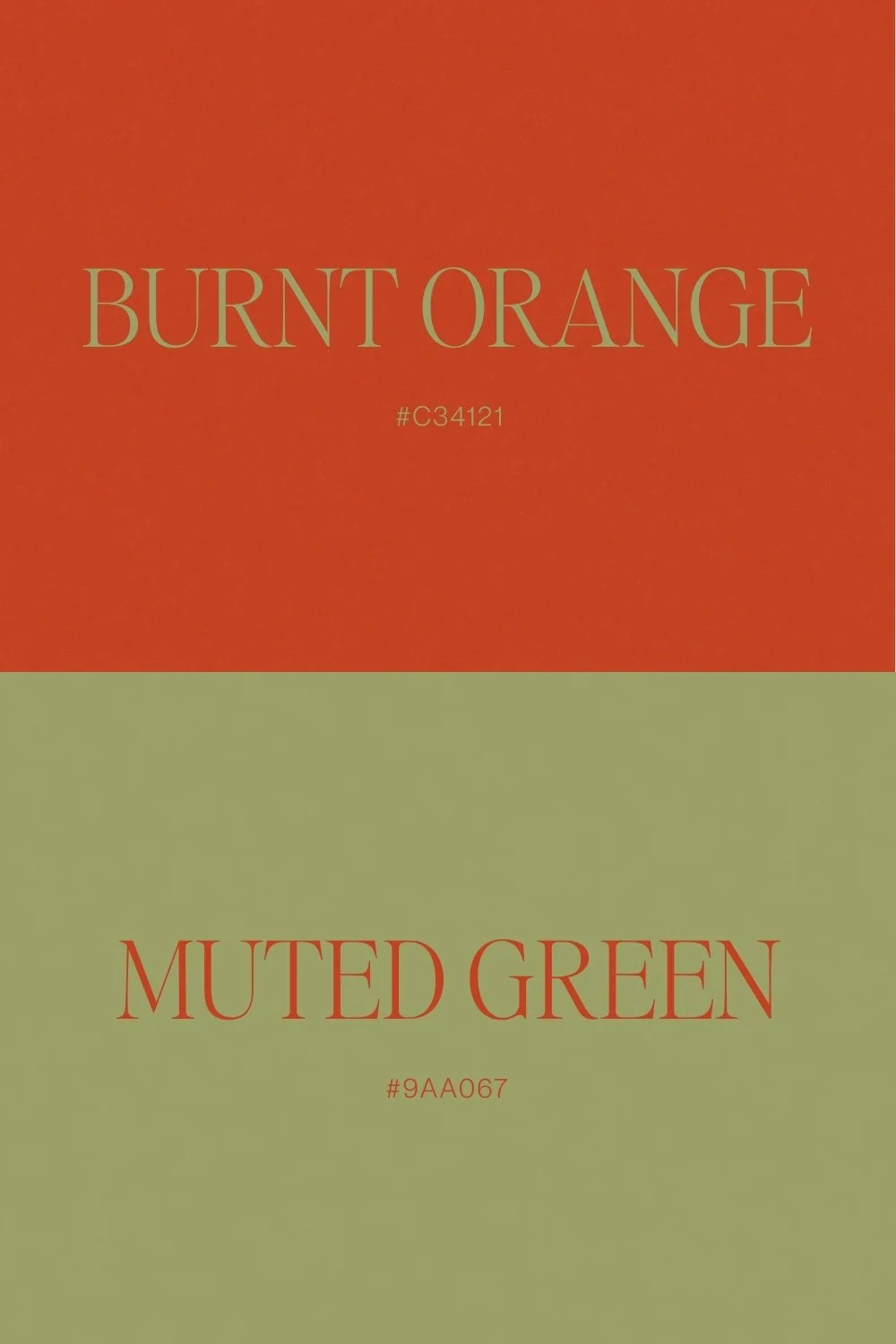
Burnt Orange + Muted Green
Burnt orange and muted green both come from the natural world, but together they feel much more interesting than a conventional earthy palette. Orange brings warmth, while green gives it calm and structure.
The sophistication of this pairing is largely down to ыaturation. Neither shade is overly bright, so their softened undertones allow them to sit together comfortably while still creating enough contrast.
We would build this palette through materials as much as colour:
natural linen
handmade ceramics
foliage
textured paper
warm wood
softly coloured flowers
candlelight
It works particularly well when the venue already contains stone, terracotta, timber or other warm architectural tones. Rather than introducing another strong colour, let the richness come from texture.
Looking for More Than the Expected Palette?
The Avelã White Wedding Colour Guide explores carefully selected shades and unexpected colourcombinations, with ideas for bringing each palette into stationery, websites, flowers, fashion, lighting,tables and more.
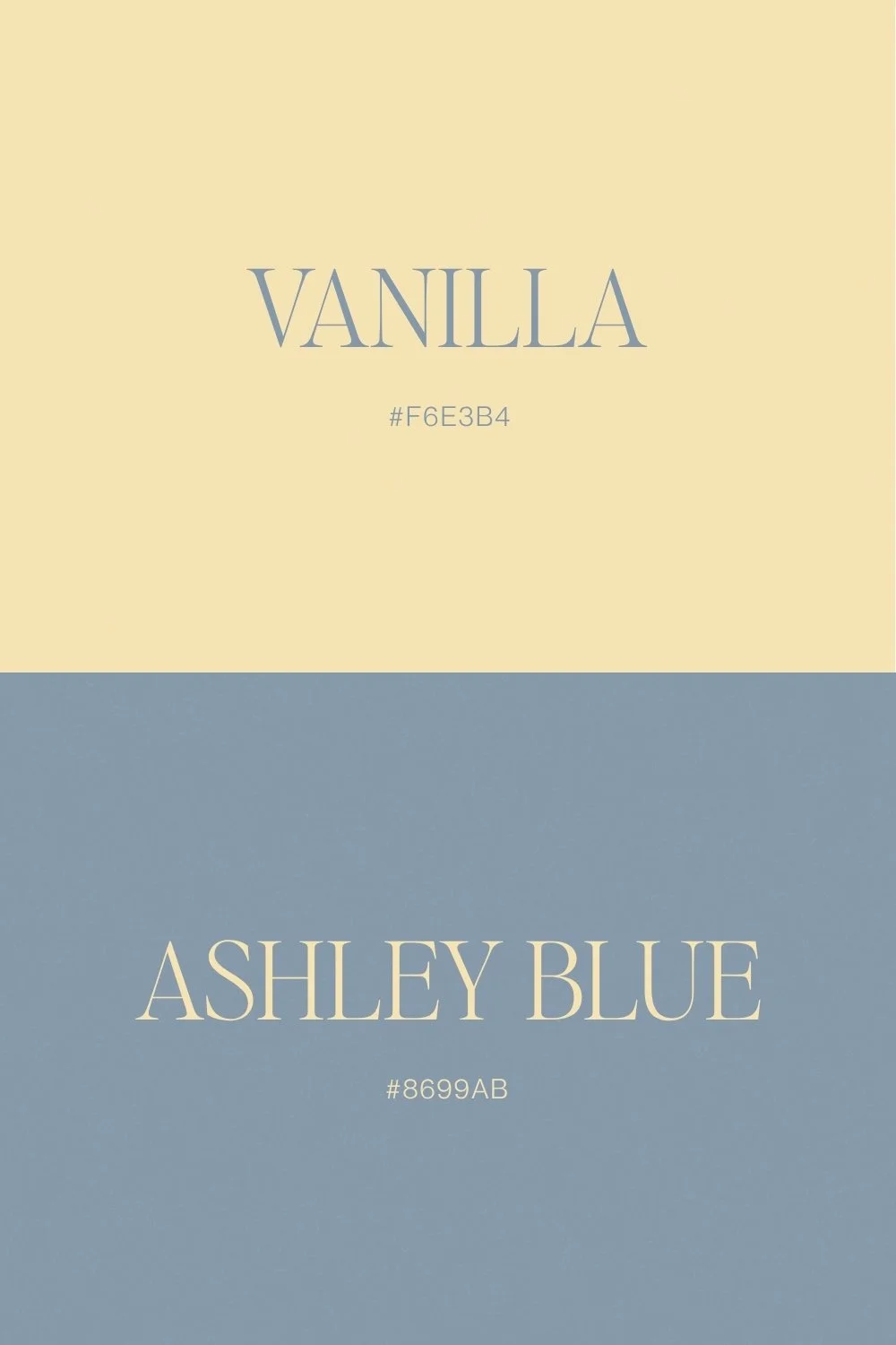
Vanilla + Ashley Blue
Vanilla and Ashley Blue are gentle colours, but the pairing feels more nuanced than classic pale blue and white. Vanilla introduces warmth and age, while Ashley Blue brings coolness without becoming icy.
The result is quiet, nostalgic and slightly faded. The warmer neutral stops the blue from feeling overly sweet or traditional, while the blue gives vanilla enough definition that the whole palette does not disappear into beige.
We especially like this combination for stationery and table design. Think vanilla paper with dusty-blue typography, soft blue linen, cream flowers, vintage silver and natural candlelight.
It is also extremely adaptable. The same palette could feel romantic in an English country house, relaxed on the Italian coast or beautifully restrained for an intimate city wedding.
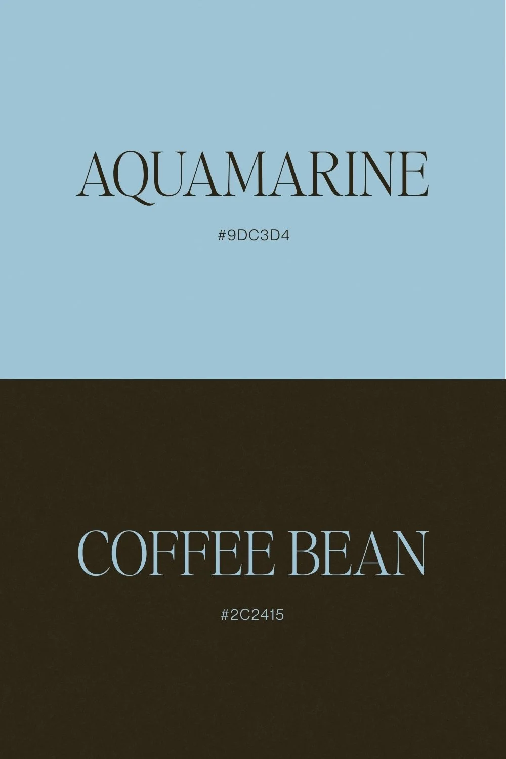
Aquamarine + Coffee Bean
Aquamarine is often placed alongside predictable coastal shades: white, sand, perhaps another pale blue. Pairing it with Coffee Bean, a very dark brown, changes its personality completely.
Suddenly the aquamarine feels less beachy and much more editorial.
The brown gives the blue weight, while aquamarine gives the dark neutral freshness. Coffee Bean can effectively replace black throughout the design — in typography, menus, tailoring or furniture details —while aquamarine occupies larger, softer areas.
Cream, brushed metals and tactile natural materials work particularly well alongside the pair. It is a good example of how changing the neutral in a palette can completely transform a familiar colour.
Why Unexpected Wedding Colour Combinations Can Still FeelTimeless
An unexpected wedding palette does not mean choosing unusual colours simply for the sake of beingdifferent. The combinations that age well usually contain something familiar — a classic red, a natural green, a soft blue, a warm cream — but place it beside something slightly less expected.
What ultimately determines whether the combination works is proportion and balance.
Think of the palette as a hierarchy rather than a row of equal swatches:
Dominant colour: establishes the overall atmosphere and occupies the most visual space.
Supporting colour: appears frequently enough to build a clear relationship with the dominantshade.
Accent colour: is used more sparingly to introduce contrast, tension or surprise.
Neutral: creates breathing room and helps stronger colours feel intentional.
The same colours can tell completely different stories depending on those proportions. Berry with a tinyamount of lime can feel sophisticated; equal amounts become far more playful. Cabernet usedsparingly against delicate blue feels romantic and editorial, while a room dominated equally by bothbecomes richer and more dramatic.
There is no universal formula. The right balance depends on the venue, light, materials, season andatmosphere you want to create.
Don't Ask Only Whether the Colours Match
A more useful question is: what does one colour bring out in the other?
Does it make the palette warmer or fresher? More contemporary or more romantic? Does it remove some sweetness from a softer shade? Does it give something quiet more energy? Does it add depth to a palette that otherwise feels too safe?
Sometimes the strongest colour combination is not the one that looks most harmonious when presented as a neat row of swatches. It is the one that creates the most interesting world once you begin imagining it across an entire wedding.
Build a Palette That Feels Like Yours
The Avelã White Wedding Colour Guide was created for couples looking beyond the expectedwedding palette.
Inside, we explore individual shades, designer-selected colour combinations and practical ways totranslate colour across stationery, websites, flowers, tables, fashion, lighting, food and drink.
Not a list of colours you have to use, but a starting point for finding combinations you may not haveconsidered.
read more