Behind the Design: The Onda Collection — Coastal Wedding Website Design Inspired by Portugal
Some collections arrive with a brief. A palette already chosen, a reference board assembled, a direction that feels almost pre-formed.
Onda arrived on a morning in Ericeira.
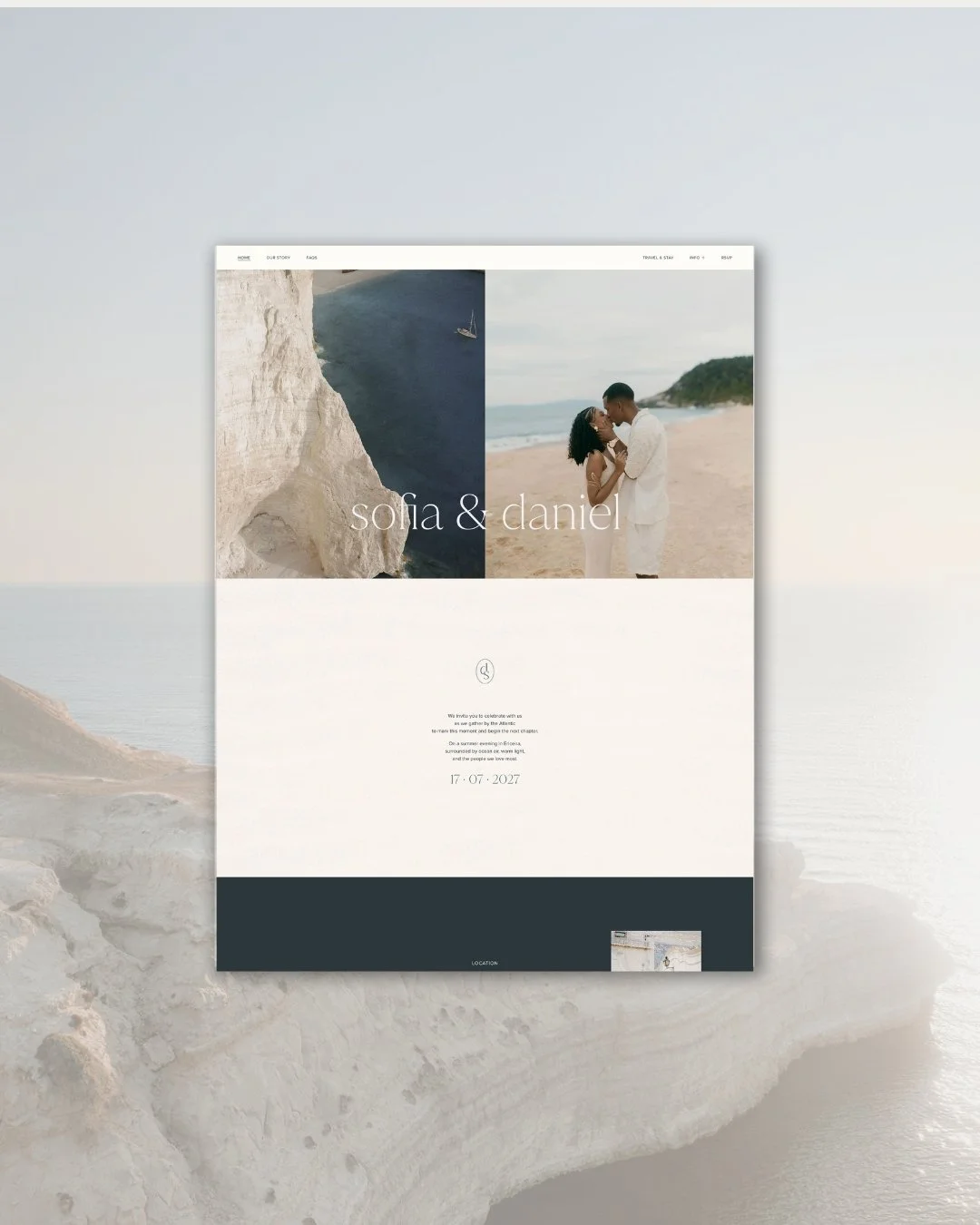
Home page
The place
Ericeira is a seaside town forty minutes from Lisbon. Cobblestoned streets, white and blue houses stacked above the sea, the Atlantic arriving in full force against the rocks below. It holds the distinction of being Europe’s first World Surfing Reserve, and carries all the character that brings with it: surfers and yogis and beach lovers, an unhurried pace, a strong relationship with the water and the light that comes off it.
It is the kind of place that returns you to yourself. Standing above the Atlantic there, watching something enormous and unhurried, you understand very quickly what it means to give a design room to breathe.
Onda came from that.
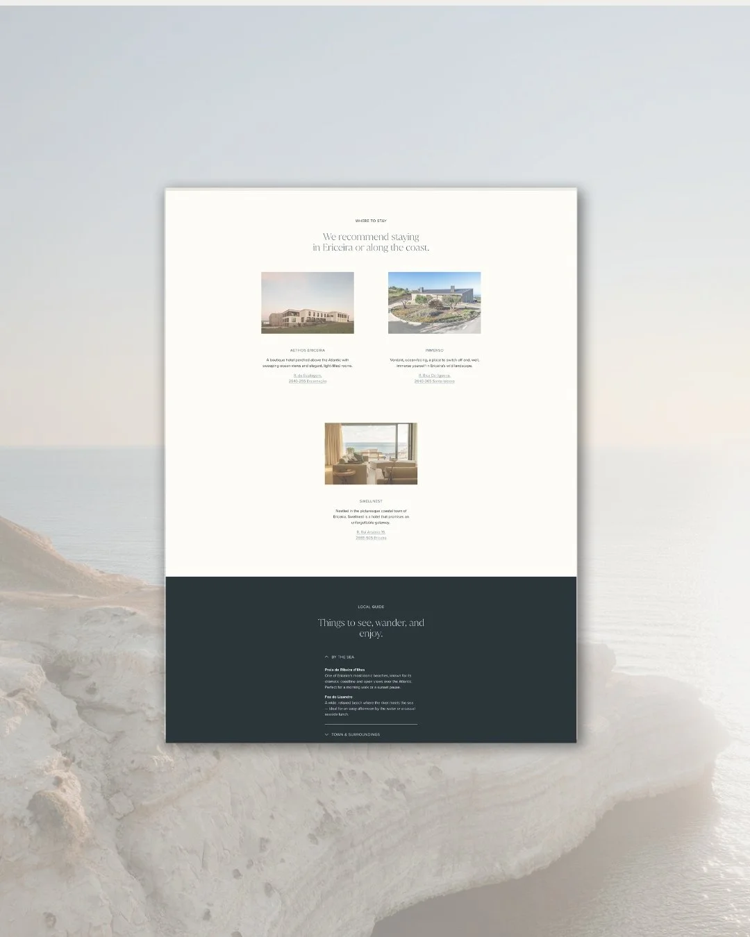
Travel and Stay page
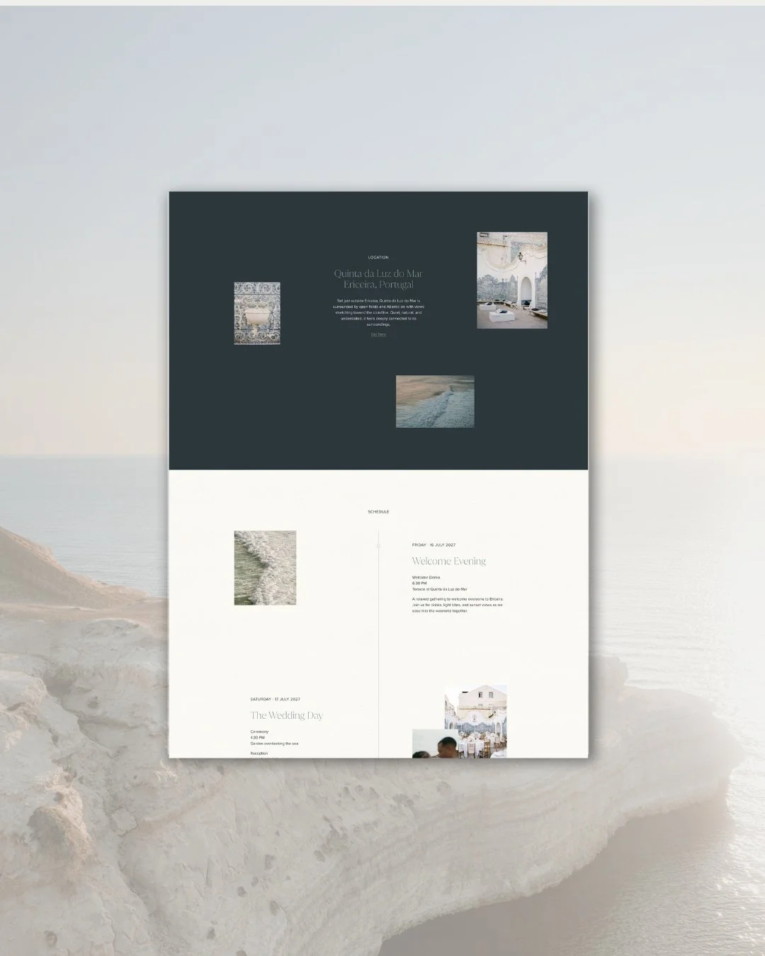
Home page (Schedule section)
The name
Onda means wave in Portuguese. Not a wave as drama or force. As movement. The particular logic of a wave arriving and receding with an inevitable, unhurried rhythm, shaping everything around it slowly, without effort.
That quality runs through every decision in this collection. Movement that does not demand attention. Elegance that is felt before it is seen.
What the collection is for
Onda was designed for a couple drawn to the coast not for the postcard of it, but for the feeling. The particular freedom of a sea wedding: the air, the light, the sense that the world is wider than usual. Couples planning celebrations along Portugal’s coastline, in Ericeira or the Algarve, in the Azores. Couples marrying by the sea in Cornwall, Mallorca, the Amalfi coast, or Sydney. Couples whose aesthetic lives somewhere between contemporary and natural, who want their wedding to feel airy and considered without tipping into the cool remove of a hotel interior.
This is not a collection for everyone. It is for the couple who would rather let a page breathe than fill it.
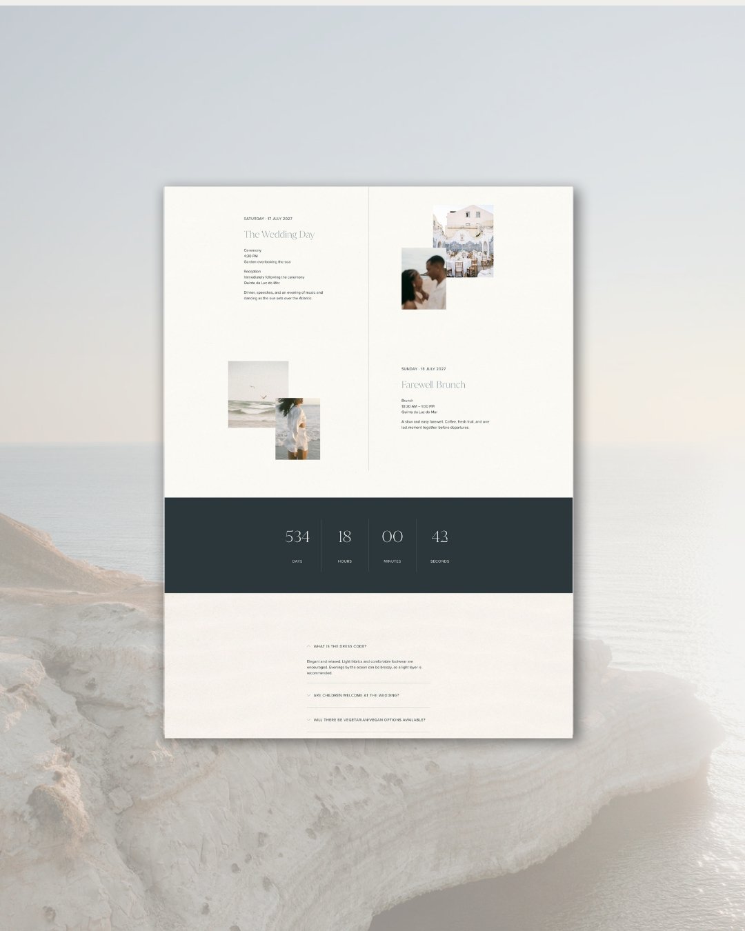
Home page (Countdown section)
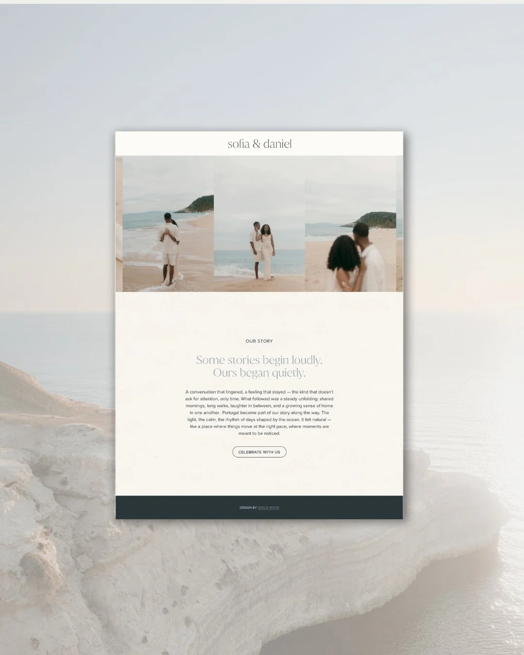
About page
The design
The first decision, and the one from which everything else followed, was restraint.
There are too many coastal wedding websites that reach too hard for the sea: shells and anchors, blue everywhere, a visual language that announces its theme rather than inhabiting it. We wanted Onda to go further. To carry the quality of the Atlantic coast in the design itself, in the space between letters, the weight of the palette, the movement of the scroll, so that the feeling is present in the design system and not only in the imagery.
Typography was the entry point. Juana is a typeface with something uncommon in it: simultaneously strong and quiet, with a geometry that feels contemporary without coldness. It holds its own on a page without competing with the space around it. Paired with a clean, unornamented sans-serif, it creates a system entirely without decoration. No scripts, no flourishes. Just the letterforms, the air between them, and the content they carry. In a collection about space, the typography had to understand restraint before anything else did.
That principle runs through the entire collection. Layouts are built around deliberate pause and generous white space. Content does not fill the page; it settles into it. An interactive scroll guides the experience the way water moves: with direction and quiet momentum, never urgency. Sections open gradually, transitions unfold softly, and the overall effect is one of calm continuity. Nothing declares itself. Everything is simply, already, in the right place.
Colour is precise and evocative. Pearl and cream, the tones of a shoreline in the early morning, are anchored by a deep ocean blue that carries real weight. Not a sky blue, not a washed-out coastal palette. A true, saturated blue: the colour of Atlantic water at depth. The contrast between those pale, luminous tones and that deep blue gives the collection a richness that pure minimalism would not. It grounds the lightness and gives the air something to push against.
The textured backgrounds complete it. A fine sand texture, used with real restraint, adds the material quality of the coast. Depth without heaviness. A surface you feel before you consciously notice it.
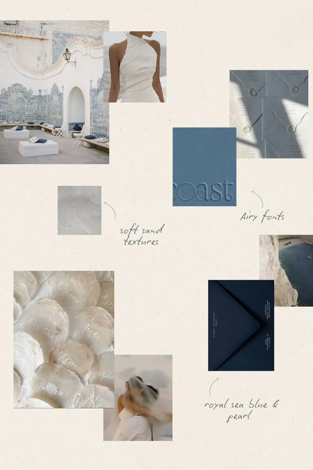
Mood board
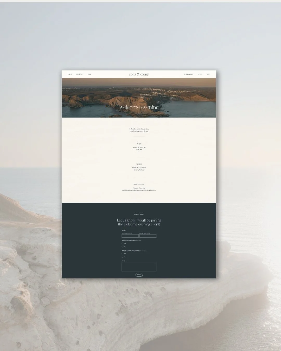
Event page
What it carries
Beneath its apparent simplicity, Onda carries a precise understanding of what a coastal destination wedding website needs to do.
The couples who come to this collection are often planning weddings in places that are, in themselves, extraordinary. A clifftop quinta above the Atlantic. A restored farmhouse on the Algarve coast. A sea-facing estate on a Portuguese island. The website for a wedding like this is not a neutral document. It should communicate, before a single guest arrives, that they have been invited somewhere worth travelling to.
Onda does this not through drama but through atmosphere. The space in the layout communicates ease. The typography communicates intelligence. The movement communicates care. Together, they tell guests: the people who made this have thought about everything, and that includes you.
Nine thoughtfully designed pages: Welcome, Our Story, Travel & Stay, FAQs, Event, Registry, Menu, RSVP, Save the Date. Each as considered as the last, each contributing to a complete and coherent guest experience.
The new edition
Onda is the newest addition to the Avelã White family, designed and launched this year. It represents something we have been moving towards for some time: a collection that proves what restraint can achieve when it is applied with real conviction. That a wedding website does not need to fill every corner to feel complete. That the most considered thing in a design is often the space.
If your wedding lives by the sea, or simply carries that quality of openness, freedom, and air, Onda may be exactly what you have been looking for.
The demo site is open to explore, and we are currently taking enquiries for the Onda Collection across both the Light (from €950) and Core (from €1,500) packages.
read more